More and more individuals are shifting towards digital channels to accomplish any and everything. Seeing this shift, the Van Gogh Museum understood that it needed to elevate its digital presence and ensure it was accessible to everyone. So they asked DEPT® to turn their existing website into a work of art.
Designing a new website worthy of Van Gogh’s art
The Approach
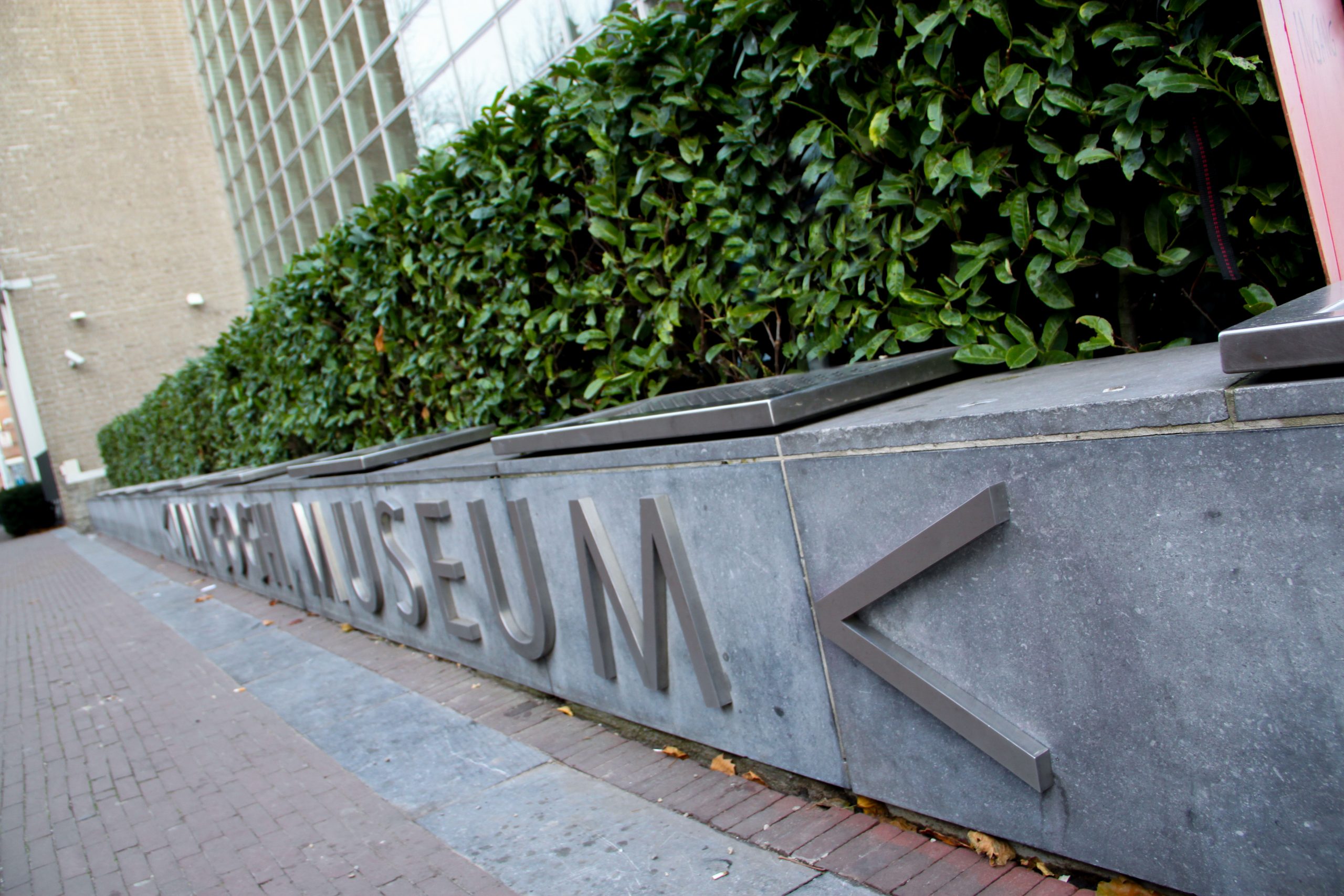
The iconic Van Gogh Museum in Amsterdam, dedicated to displaying the works of Vincent van Gogh, is one of the most important museums in the Netherlands. With over 200 paintings, 400 drawings, and 700 letters by the artist, it’s the largest Van Gogh collection in the world. To meet the demands of the digital world, the museum has partnered with DEPT® for the last two years. Together, we have created a new visual identity for the museum and developed the Unravel Van Gogh mobile app. But it was time to take it up a notch and design a new website worthy of Van Gogh’s art.
When you think of Van Gogh, colourful sceneries come to mind. So this was our starting point. We wanted the website to resonate with the user and leave an impression while, at the same time, being modest and simple in appearance. So, to kick off our design process, we started with an analysis which would enable us to make concrete recommendations for the museum’s future website. We researched the user journey and delved into any challenges they may face while browsing the current website, paying special attention to any difficulties those with a disability may encounter.
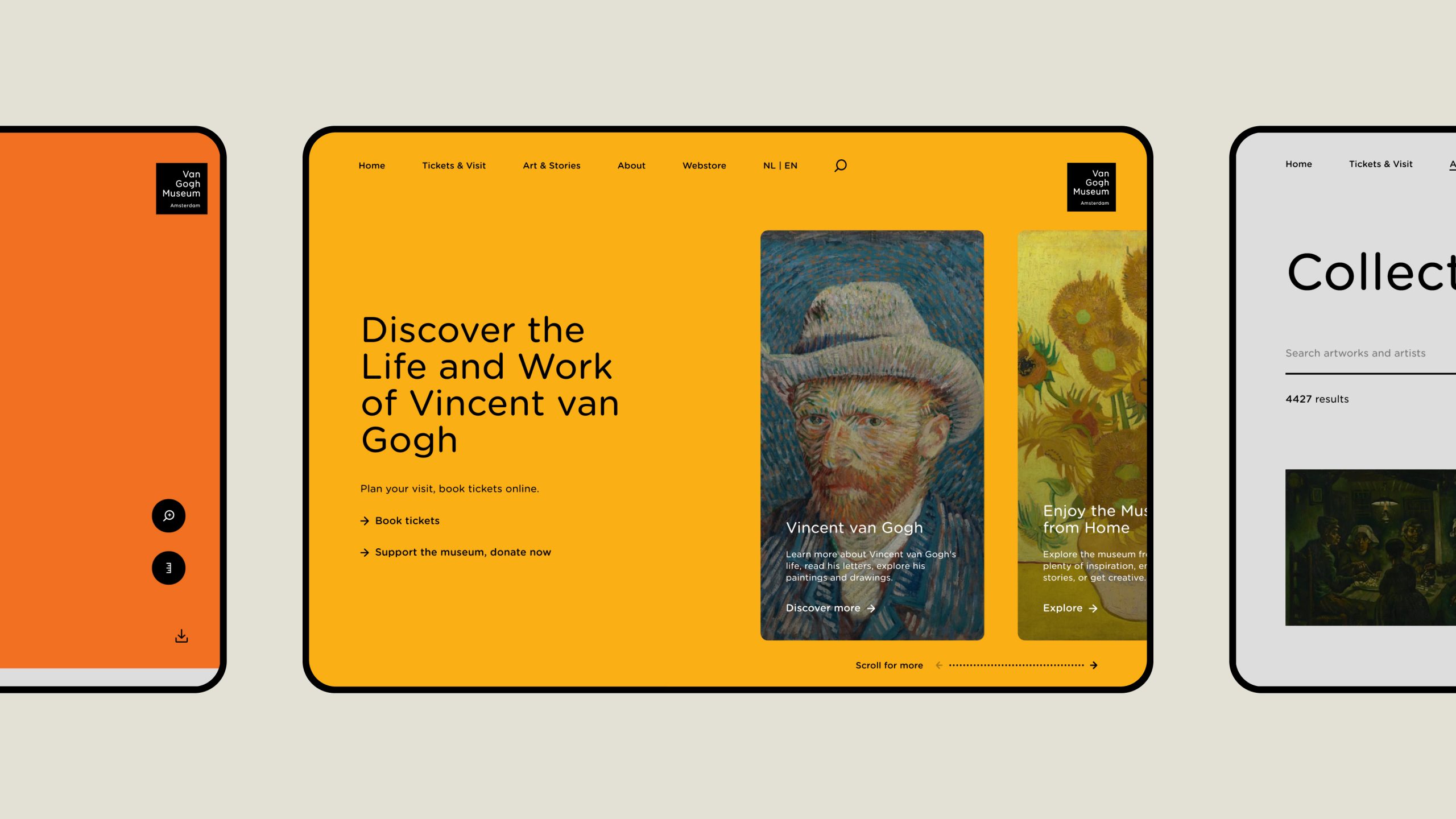
Behind the brushstrokes
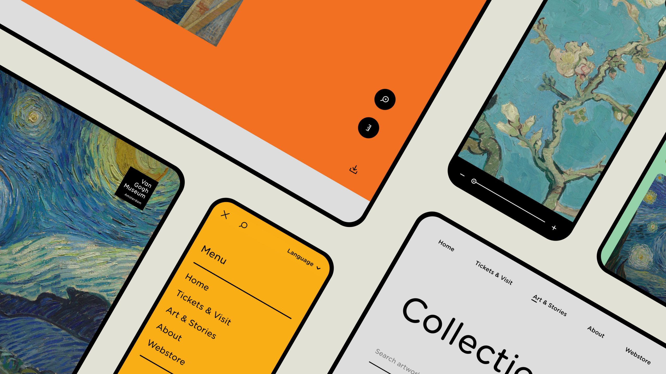
To ensure the content stood out and that the design did not compete with the work of Van Gogh or other work featured on the website but instead complimented it, we kept the design clean and minimalistic, giving it a timeless feel. We embraced the museum’s new identity, which was designed by Studio Dumbar (part of Dept) in 2018, by using similar colours and typography. We assigned each page to a different colour which was adapted to the work of art displayed on it, a feat rarely done amongst the white backgrounds of various museum websites. We also implemented subtle interaction animations and transitions to make the website feel light and engage the user.
The museum website not only aims to inspire and entice visitors but also educate and delight them. However, the old story format didn’t promote users to read the content in its entirety. So we updated the website’s story format by simplifying the layout while making it more snappy and interactive as the user scrolls down. This made the articles more appealing to read, especially for users coming from social channels. It also enabled editors to create and post content in a much quicker fashion.
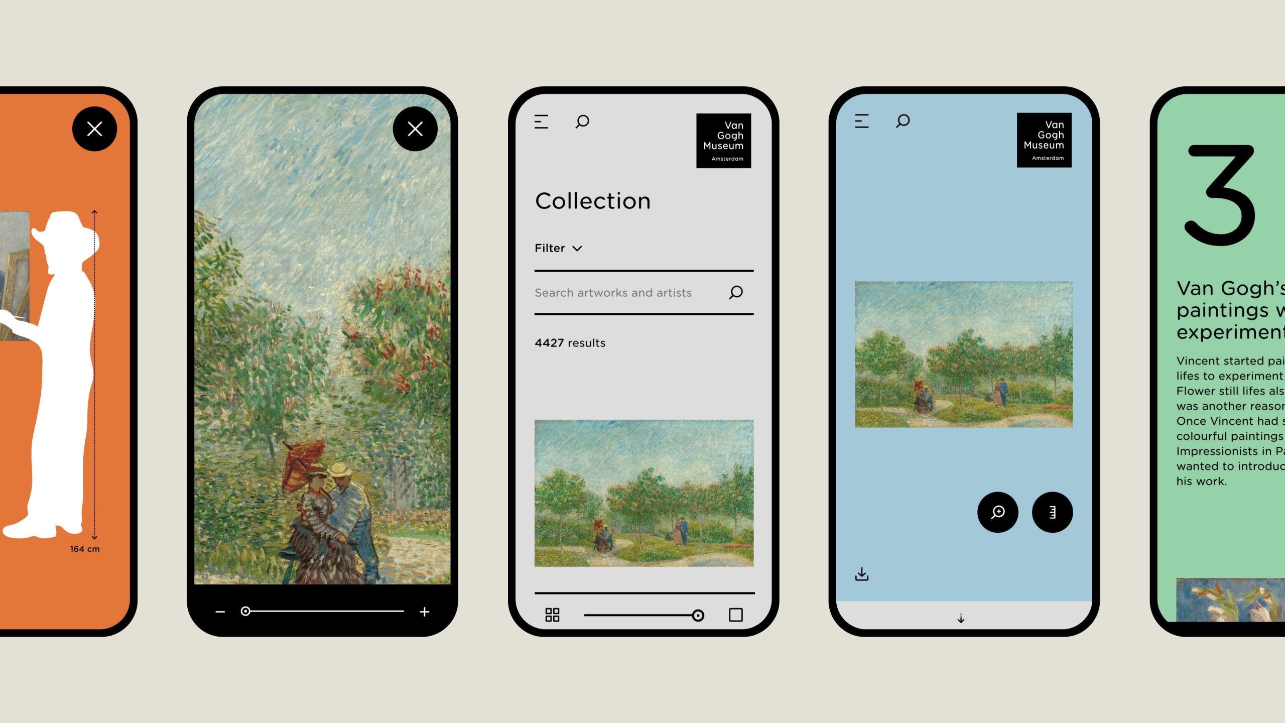
Revealing the details of Van Gogh’s paintings digitally
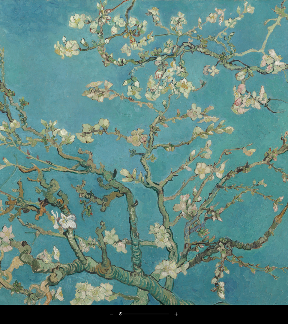
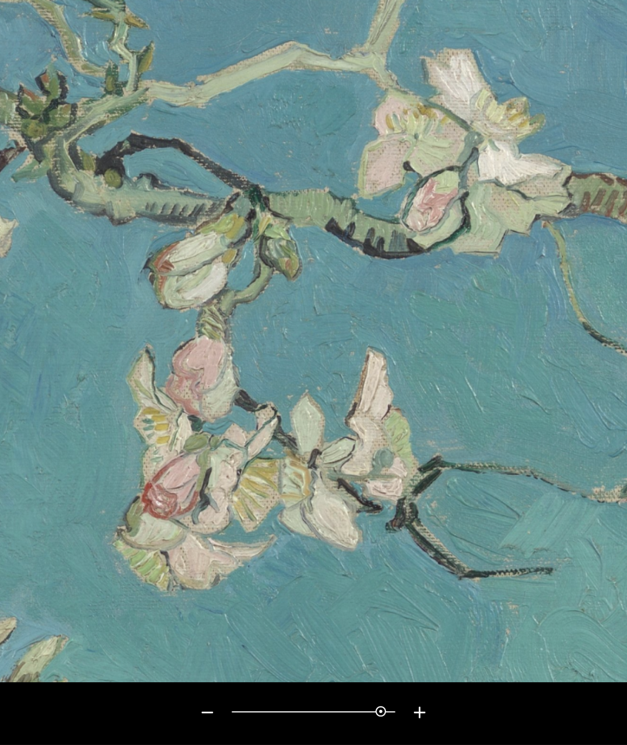
The museum’s new website embarks in a voyage of discovery and inspiration, helping guide art lovers to the world of Vincent van Gogh. Ensuring users all around the world are inspired by how Van Gogh influenced art’s history and can connect with the museum in a desirable digital manner.
Experience the website
Questions?
UX Design & Research Lead
Franklin Schamhart
Descubrir más
