Bevi
Refreshing an eco-friendly B2B brand website

Bevi is a leading manufacturer of smart water dispensers, incorporating touchless technology that enables you to customise your beverage, check your environmental impact, and view nutrition info right from your phone. Bevi is more than a smart water dispenser, it’s a step towards a more sustainable future. With every drink you pour, you’re not only saving a plastic bottle, but you’re also reducing the oil and emissions needed to manufacture and ship it. Founded in 2014, the company has secured $60.1M in funding and is on a mission to transform how beverages are delivered. Its stand-up and countertop water dispensers are used in the global offices of Volkswagen, Apple, Uber, Trip Advisor, and Netflix, and many more. Bevi partnered with DEPT® to refresh its brand website and bring its values and purpose to the fore.
Strategic brand discovery
Brands rooted in purpose with technical B2B products have a lot to say, but often struggle to communicate their message in the most effective way. how Bevi is perceived as a business has a massive impact on its ability to resonate with prospects and retain long-term customers. Bevi’s brand communications focus on the positive environmental impact its products have, the cool features and broad flavour variety, rather than concentrating on specifics tied to functionality and installation, which sets it aside from its competitors.
DEPT® analysed the business to fully understand its positioning, which informed the next stages of the project. This involved a google analytics review, website audit, competitor research and stakeholder workshops. Deliverables included:
- Map of Bevi’s business model identifying key customer segments, user journeys, channels, partners and more.
- Five customer personas outlining motivations, triggers and content requirements to empathise with the audience’s needs.
Designing a website to unbottle the future
Making an impact with design
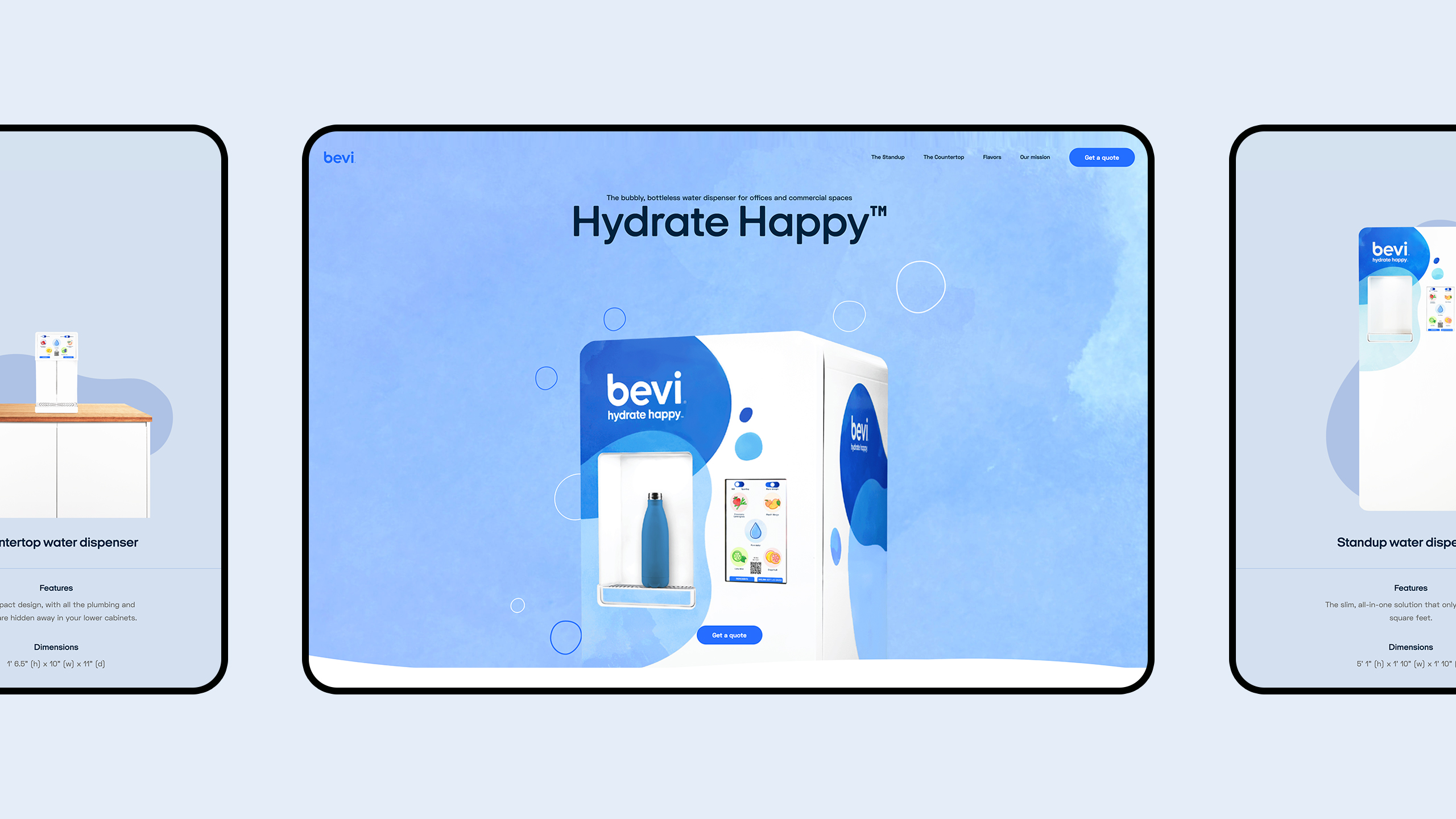
The new Bevi website was designed to reflect the brand’s forward-thinking approach to hydration. Taking creative inspiration from the aesthetic of its smart products, DEPT® designers infused the interactive nature of the water dispensers into its website design.
Bevi’s colour palette, resembling the four elements of fire, water, earth, and air, were used throughout. Misty blue and white tones with curved lines created a cloud-like base layer, while splashes of pastel colours showcased the refreshing fruit flavours. Animations bring the design to life; illustrated bubbles rise up the home and flavour pages, as they would in a fizzy glass of water, to create a strong initial impact and draw the user in. hover effects highlight call-to-action buttons and subtle motion elements keep users engaged.
Creating a clear codebase
DEPT® built the website in word press and created a reusable, custom library for all of the components using green sock, a robust java script toolset that helped us deliver optimum performance across all devices. From our analytics research, we knew there is a fairly even split between mobile and desktop users. Therefore, DEPT® developers optimised all points of entry for User experience And conversions with a bespoke set of components and solutions to respond to each screen size. When adding animations and video to the website, we balanced flare and functionality, ensuring smooth user-journeys and fast site-speed to optimise google’s rankings.
Search optimisation was a top priority throughout the build. DEPT®’s team of digital consultants and search experts oversaw the project from a performance perspective, and teamed up with Bevi to fuel the website with Seo-optimised content.
The yoast word press plugin was added to the cms, enabling Bevi to continuously optimise the website as new content is added. Our developers reinforced these practices by implementing schema.Org custom blocks, which adds context to the code, acting as a translator to populate google. By structuring data in sections such as the fa qs, new users searching for solutions are able to easily find the answers they’re looking for.
A sparkling future
Bevi’s new website clearly communicates its vision and brings its value proposition to the surface. It encapsulates the uniqueness of Bevi, and stands out against its corporate counterparts, just like its eco-friendly water dispensers. Eye-catching animations keep users engaged, while the introduction of information and product pages adds depth. Presented in a highly consumable format, these pages not only inspire users to pursue a sustainable future, but also encourages them to find their custom beverage. Users can set their preferred level of fizz, flavour or combinations, and enhance their experience with caffeine or electrolytes. By connecting to a mobile device, its touchless technology makes the entire process seamless.
We’re happy to be part of Bevi’s journey, helping the world reduce waste and plastic consumption through state-of-the-art office water dispensers. DEPT® is continuing to work with Bevi to maintain and evolve its website. Pardot forms were implemented into the website, which will underpin future campaigns and converting prospects.
Questions?
VP of Growth, Experience and Engineering
Lizzie Powell
Descubrir más
