Ann Summers
A diverse commerce customer experience

Ann Summers is a British multinational retailer specialising in sex toys and lingerie. Since its first store opened in London in 1970, the brand has trailblazed its way to dominating the industry with innovative product development and a daring brand proposition. Ann Summers now operates 144 high street stores supported by a growing e-commerce business. As Ann Summers’ digital estate evolves, the retailer wanted to ensure it fully reflected its brand values. It turned to DEPT® to redesign its website and onsite customer experience, in line with its 2020 brand refresh.

Designing for a broad audience
Ann Summers is a brand for everybody; it has been advocating for sexual liberation and fighting against body image preconceptions since its inception. The design of its website needed to communicate this message with an inviting aesthetic that appeals to a diverse audience. Our designers embraced an image-heavy approach to express its brand personality in an energetic real-life context, celebrating different types of relationships and body types.
A collection of images and videos were shot specifically for the website, depicting various adult age groups, body shapes and skin colours. These were strategically placed throughout the website, appearing natural in a visual hierarchy supported by alike information, allowing the user to easily find what they’re looking for.


A website designed to push buttons

Creating a dynamic brand experience
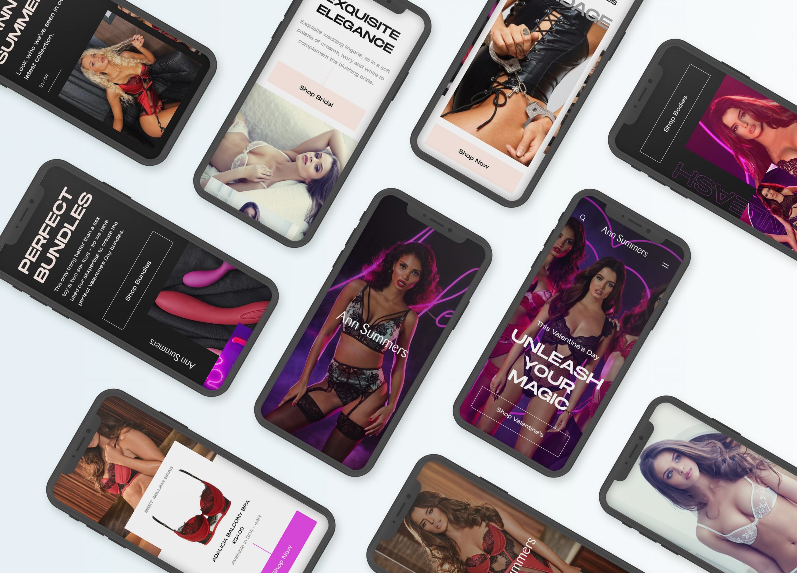
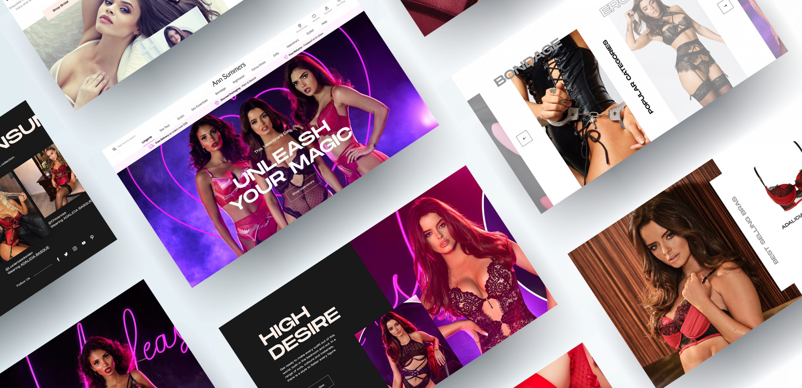
Two website interface designs were created to enrich the user experience, adding an element of surprise as they browse through collections. The core brand pages and more mainstream collections were launched in the ‘light mode’, with a clean white background and soft greys and subtle pink. In the more niche sections of the website, the entire brand experience changes as ‘dark mode’ is activated. The primary colour turns to black with sultry reds and dark shadows alongside bold, alluring messages like Welcome to the Wild Side.
Creating the two interchangeable themes throughout the website has enabled Ann Summers to set the mood for its customers based on the types of products they’re viewing. The design concept plays up the crossover between ‘day to night’ or ‘naughty and nice’, creating an intriguing experience that reflects the thousands of products on the website and the diverse styles of shoppers that visit.

Optimising functionality
DEPT® and Ann Summers have a long-term partnership, having originally built its e-commerce platform in 2015. As part of the redesign, DEPT® has also enhanced the functionality of the website. Using Ann Summers’ existing Salesforce Commerce Cloud platform, the team removed underutilised features, allowing the website to operate more efficiently and save costs. Furthermore, the website was made fully responsive across all devices.
In line with the company’s international growth strategy, new capabilities were implemented to automate currency conversion and shipping information. New payment methods were also integrated including Klarna, Amazon Pay, PayPal and ApplePay to cater to all shoppers needs and streamline the checkout process.
A winning formula
Right from the start of this project through to the website going live, our creative team were dedicated to pushing the design concept one step further. This mentality was echoed by Ann Summers’ internal team, who wanted to break away from typical model imagery that’s so prevalent in this industry. Their openness to innovate combined with our creative approach was the formula to create this exceptional re-design that perfectly conveys Ann Summers’ dynamic brand.
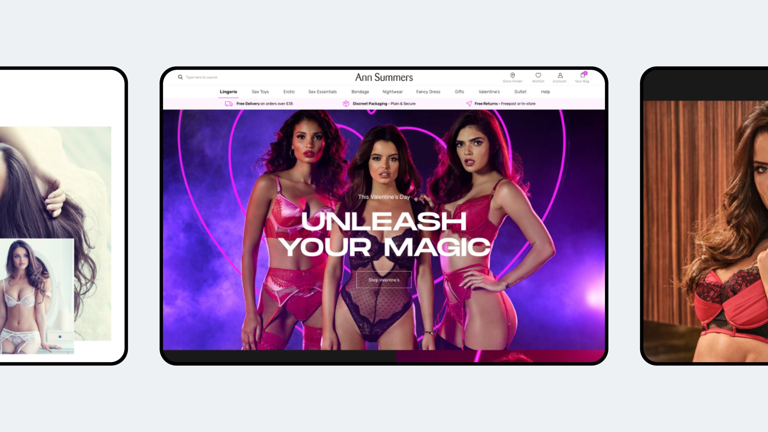
As an e-commerce website, the layout needed to be simple, grid-based and intuitive, with clearly marked categories; design should never be a hindrance to finding key information or distract from a path to purchase. With a brand as fresh and interesting as Ann Summers, it needed to provoke a response whilst continuing to adhere to the principles of e-commerce. The multi-tone website achieves this perfectly, setting the stage for various products to shine.
Questions?
Descubrir más


