Before you create a design system, do these three things
Information architecture
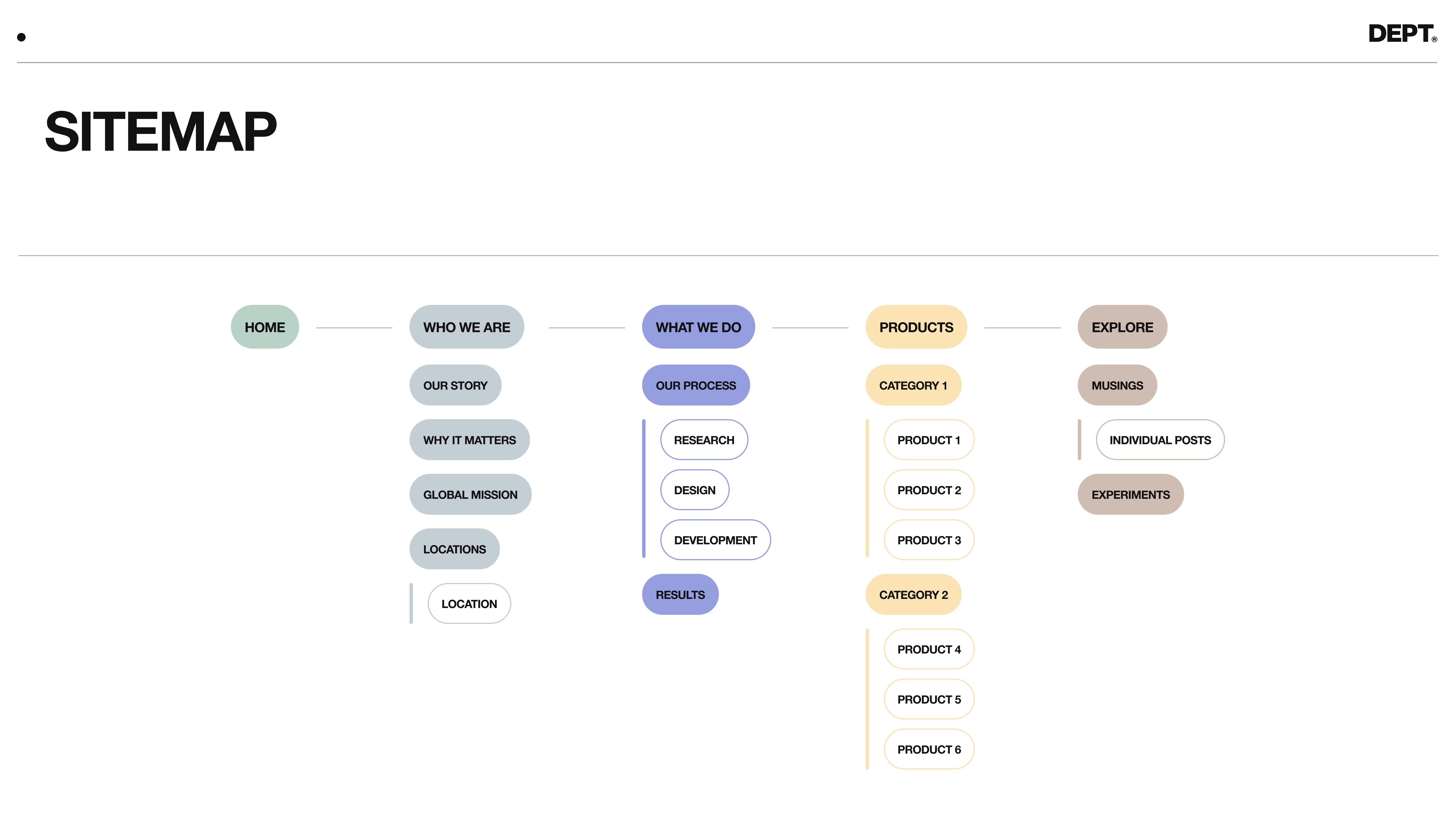
The information architecture answers three important questions
1. Approximately how many website pages do we need?
2. What is the natural hierarchy of these pages?
3. How will users interact with and flow through the site?
If you start designing without knowing the answer to these three questions, you can easily miss the mark.
By knowing how many pages you have and establishing the hierarchy of those pages, you can start to imagine how many custom pages, templatized pages, and modules you will need. A good design balances uniqueness, consistent themes, and scalability. By understanding which pages are most important, it gives you more context and colour over how you will design.

For example, think about a SaaS company and the architectures you commonly see (like the image above).
Sometimes you see a single product page that summarises everything the user needs to know in one page. Other times, you see a product overview page and then sub-pages underneath that go further into product features or use cases. You won’t know what you need until you’ve gone through an IA workshop.
If a user experience team discovers that a single product page is best for users, its future design will need to achieve different things compared to architecture with multiple sub-pages.
This is how information architecture starts to inform your designs.
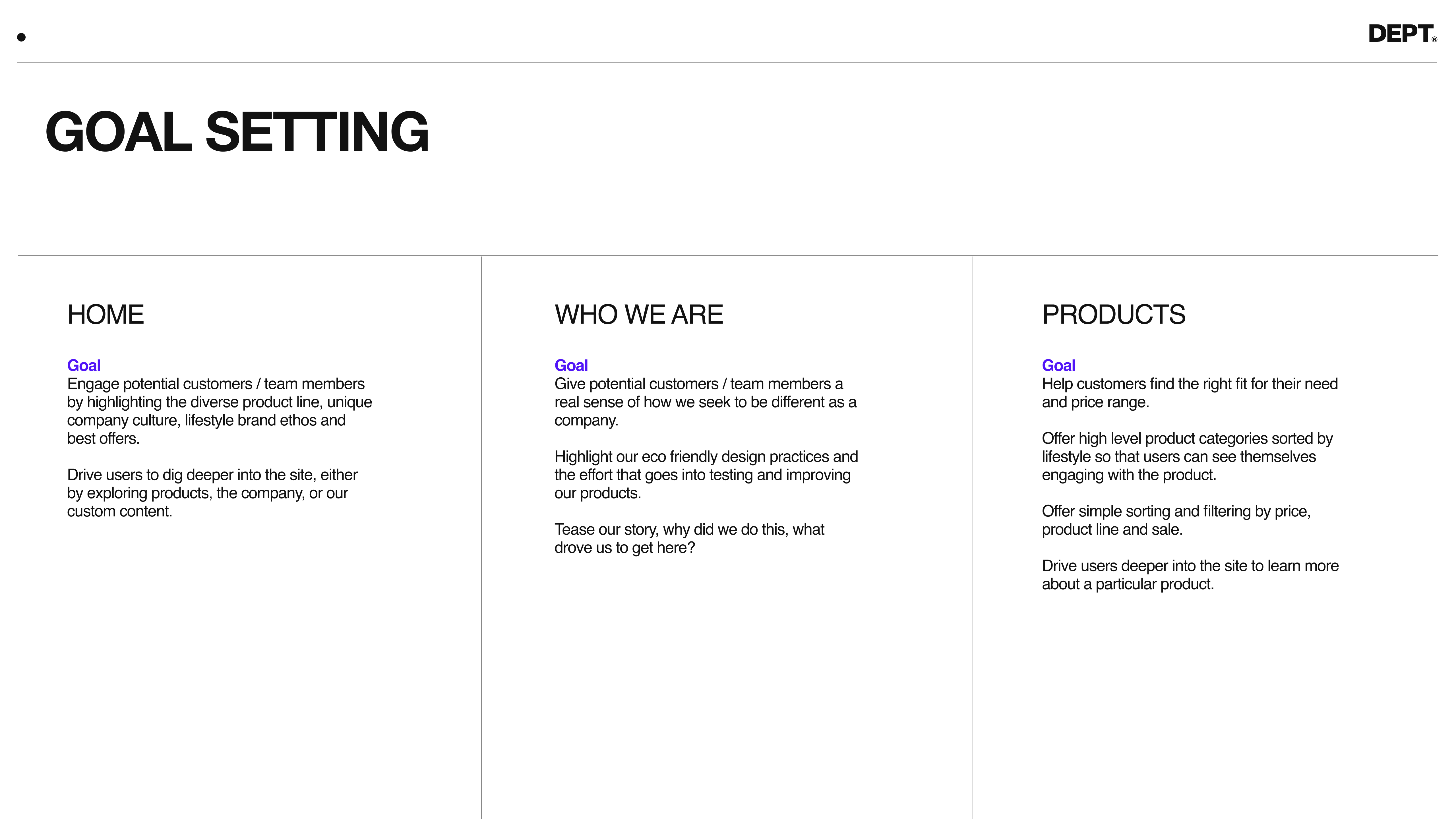
Define the goal of your pages
Your website has several goals, both qualitative and quantitative. Increased traffic, purchase frequency, demo sign-ups, app downloads, etc.
And of course, some pages are more inclined to facilitate conversions of these goals.

Let’s go back to our example of a single product page, where the goal might be to encourage demo sign-ups. Other pages on this website could have goals like:
– Increase trust in product and brand
– Navigate to the product demo contact form
– Spark excitement about the product
Outlining the goals of each page keeps designers focused on strategic outcomes and the holistic user experience. Goal setting also helps designers stay grounded and design for what the given page needs to accomplish rather than indulging in design exploration.
Zonal definitions
Once you have an accurate picture of the total pages, core pages, and the goals for all pages, move on to zonal definitions.
Zonal definitions answer the question, “how will we achieve the goals of each page?”
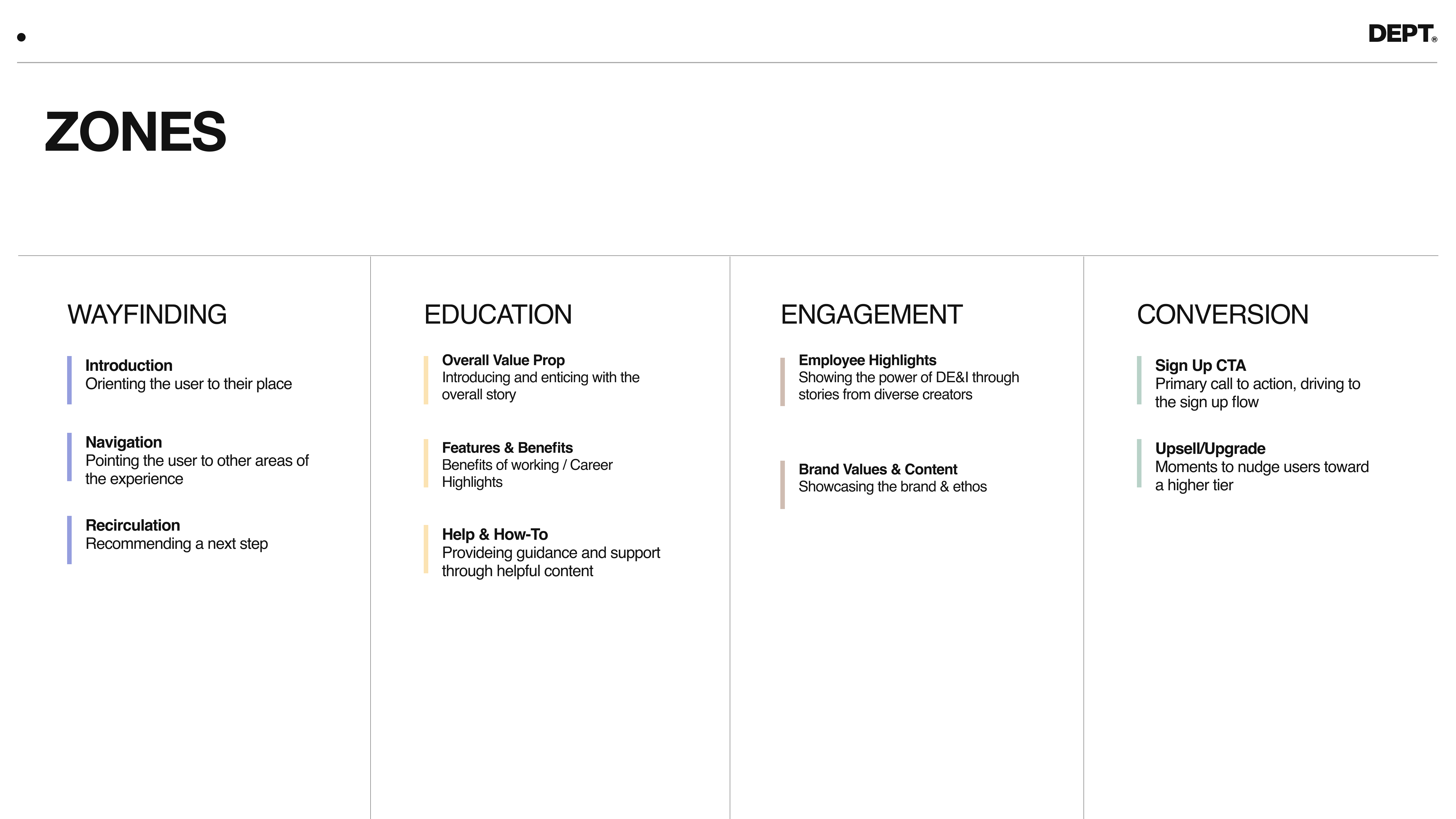
Some common zones include wayfinding, engagement, conversation, and education, but these are highly dependent on your product’s/service’s unique value.
Define all zones in an easy-to-reach list, like the one below.

Using the same product example, a question that needs answering is “How will we increase demo sign-ups using this product page?” The answer to this question might be something like:
Create some excitement with potential offers, make sure users can find the exact information they need, and showcase how our values align with theirs.
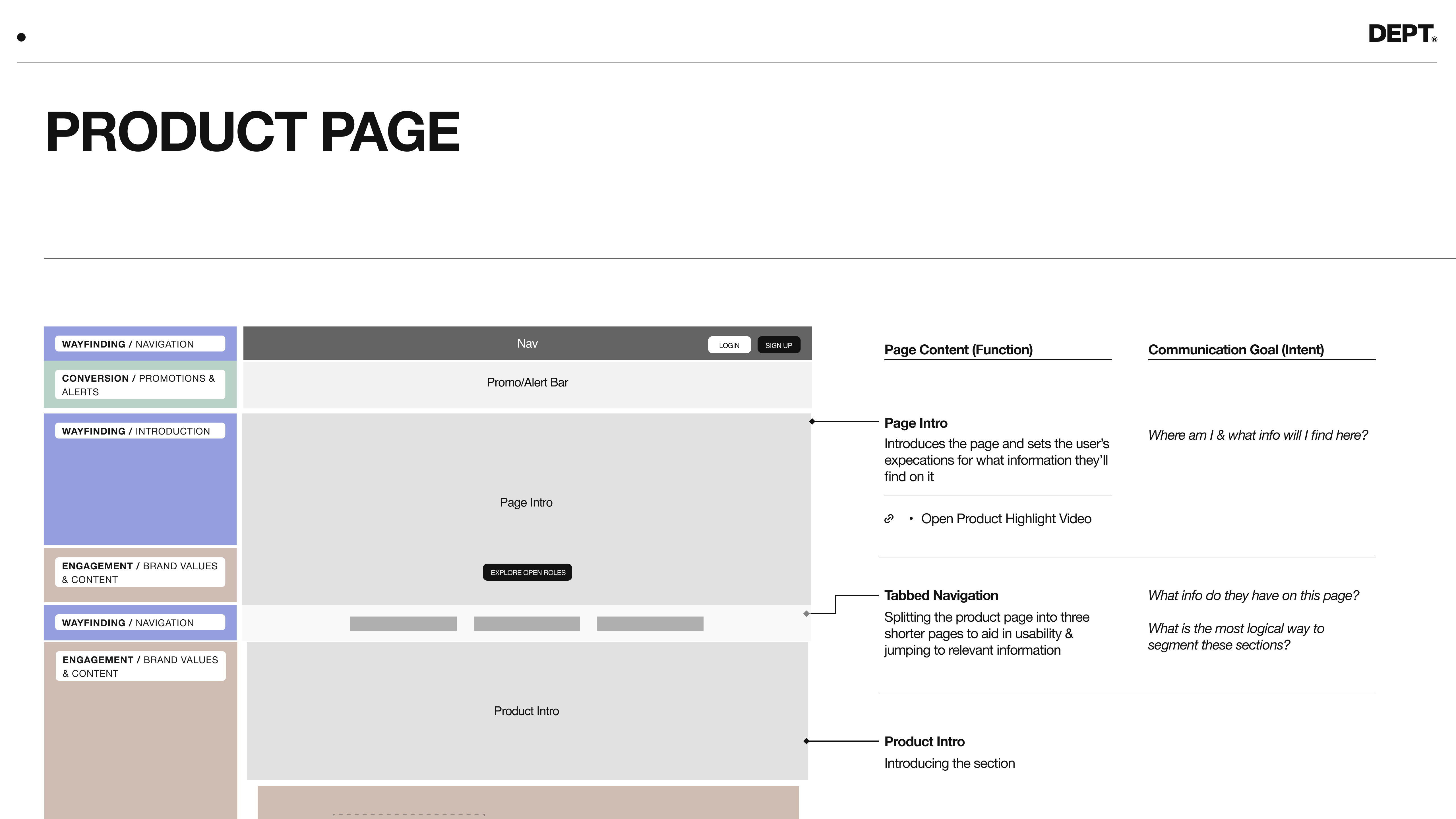
From a page view, this will look like this:
1. Conversion – limited promotion or offer
2. Wayfinding – answers the user question “where am I?”
3. Engagement – brand values and content
4. Wayfinding – specific navigation
5. Engagement – additional content
By listing out (in order) how you plan to achieve sign-up goals, you’ve naturally created zonal definitions.
You’ve also created a super-low-fidelity wireframe.

Once you’ve done this exercise for all pages, you will start to see some commonalities. Maybe on 50% of your pages, you know you need a “features and benefits” zone. And only one page on your website needs a “brand values” zone.
In this case, knowing a certain zone is important and used frequently, you might plan to design variations of the features and benefits to keep the design fresh from page to page. And since you know brand values are only featured once, you wouldn’t design more than one.
From these zones, you can start to understand how many modules, custom pages, and templates are needed.
Then you can start designing and creating your design system.
Sign up for the DEPT® product newsletter
More Insights?
View all InsightsQuestions?
Lead product designer


