Lessons learned designing UX/UI for healthcare brands

Gather diverse, relevant perspectives
Kicking off a healthcare product roadmap requires forming diverse teams and fostering clear communication with end users.
Create a large, mixed team to incorporate diverse viewpoints (a recent DEPT® project had seven designers working in tandem).
Gathering feedback from future users is invaluable in healthcare, so consider utilising a co-design process. This involves including real users throughout the design process, letting them participate and contribute their ideas and preferences.
Conduct interviews, surveys, and usability testing with your group to gather feedback. Testing medical products with real users is crucial for safety and accuracy. Your specific end-user might have unique health challenges, so prepare to approach each user test individually. Responding sensitively to the individual needs of participants is essential in providing an inclusive participation experience.
Make it incredibly accessible
For many industries, “good enough” is an acceptable bar for accessibility.
In the healthcare industry, you need more than basic Web Content Accessibility Guidelines (WCAG) standards checklist. We believe that disabilities do not lie with the person. They represent situations where they cannot participate equally due to barriers and constraints. Therefore, the level of prioritization you put into ensuring accessibility is a reflection of your commitment to inclusivity.
In this industry, your product’s designs should cater to those with the most challenging time using your technology. Generally (but not always), this is the older population who didn’t grow up in the digital age and may face some visual disabilities. Design with this population in mind first and foremost. This process differs significantly from designing other digital products, where engagement is often the top priority.

Navigating a digital product should be easy
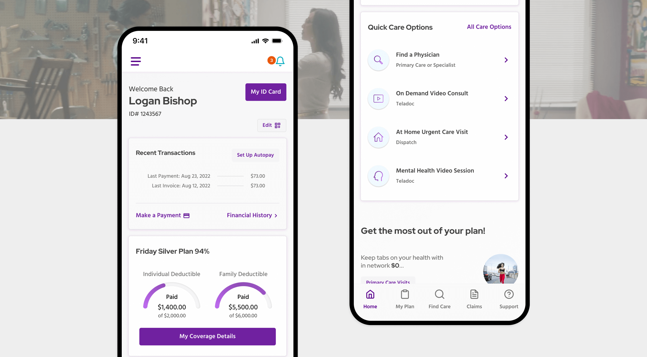
Accessibility is paramount, but users must be able to find information and functions intuitively – especially when medical information is inherently tricky to decipher and healthcare services can be complicated to navigate.
That makes an intuitive and straightforward information architecture key, alongside tone and language use.
The names of menu items or navigational buttons must resonate universally and be quickly understood. The placement of information and functionality within the website or app hierarchy should also reflect how the user will likely naturally use and navigate the product. Finally, the language on each page should be simple and easy to understand, presented in a clean and streamlined manner.
In general, don’t have too much information on a single page. Use tabs, links, and videos to communicate clearly and keep pages from feeling cluttered or overwhelming. A slow drip of information and presenting one message at a time is best.
Have the essentials readily available
While aesthetics are always a concern for product teams, your product’s key functions should always trump a decision made for looks when designing in the healthcare space. Consider these factors about your audience and how/when they will experience your product:
- Users likely won’t need to use your product all time
- When users use the product, there might be some urgency
- Your designs should be easy to understand in a high-tension scenario
With these points in mind, it’s clear why it must be easy for users to find and use your product’s essential features, even if that means forsaking visuals.

Plan for regular updates
The information in your product needs to be accurate, up-to-date, and verified by medical experts. Only healthcare professionals should give diagnoses or treatments.
Plus, many regulations worldwide are in place to protect users’ data (HIPAA, GDPR, HITECH, and CCPA). Applications, devices, and websites must follow these regulations to launch and stay in business.
That requires regular updates to digital products. While the backend and security systems are more prone to risk than designs and UX, maintaining compliance throughout your digital product’s life is essential.
Please note that regulations vary by country and are subject to change and updates. For the most current and comprehensive information on healthcare regulations around digital privacy, consult the specific laws and regulations in your jurisdiction.
And finally, bugs. Errors and bugs in custom applications and websites happen, but they can be serious, so have clear error messages to notify your users.
Featured healthcare UX/UI work
Explore DEPT®/HEALTH
Questions on UX/UI for your healthcare product?
Lead product designer


