The Italian brand Flos sells light; in the form of luxury design lamps, that is. Although it may sound exclusive and focused on a specific target group such as architects or interior designers, it is not the only audience the brand is aiming at. Flos is currently undergoing a transformation towards D2C (direct-to-consumer). For the first time, Flos is selling directly to customers rather than to resellers. Flos needed a new e-commerce platform that was thought out in the smallest detail to make this transformation successful. The brand chose DEPT® to bring a Salesforce Commerce Cloud platform and the complete Flos experience to life.
The strategy
Flos (which means ‘flower’ in Latin), arose in 1960 from the idea to create objects that would change our way of living. Bringing light to life digitally is easier said than done; it is less about products and more about the experience. Due to the uniqueness of the Flos brand, it has opted for an ambitious direction regarding D2C and e-commerce. Together, we determined the strategy, which is built around the following three pillars:
Show me authenticity
Customers want to feel that they are buying something special. Customers want to be inspired and convinced by the brand, not only by the product.
Make me feel at ease
Customers want to feel that they can buy the complex, luxury product independently. The website must therefore be accessible and recognisable.
Give me a sense of touch
The biggest challenge in purchasing online is that the customer cannot see, feel or experience the product. The platform needs to get as close to that feeling as possible so that customers can make well-thought-out decisions..
Content as a ‘bold’ starting point
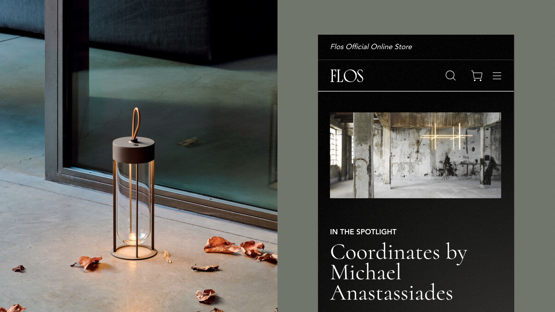
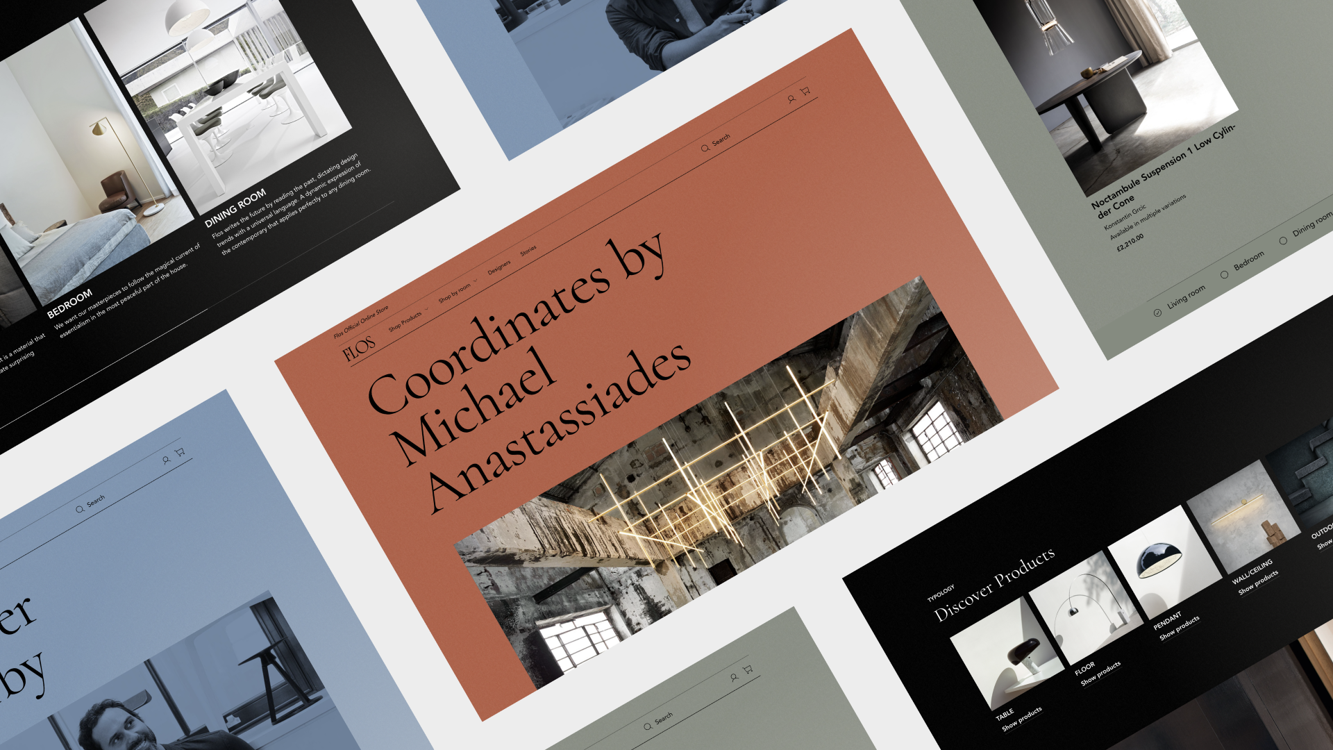
Flos had a strong foundation, ranging from a website to an Instagram account and magazines. These assets contained a mountain of valuable content, from beautiful photography to interviews with designers, videos and illustrations. It soon became apparent that content had to be the starting point, and that it had to be left in its original value as much as possible. As such, we didn’t put images in frames, but used the current ratio so that images in all shapes and sizes appear on the website. The brand is there for everyone, so imagery and expressions are bold. To radiate a certain degree of boldness, we implemented big logos in the footer which open and close as statements, and used big capital letters for page titles.
The website structure is based on different types of pages; from pages on which designers are featured, to Room pages where inspiration for every room in the house is shared, Story pages with information about new trends, and, of course, the product pages.
Bringing light to life
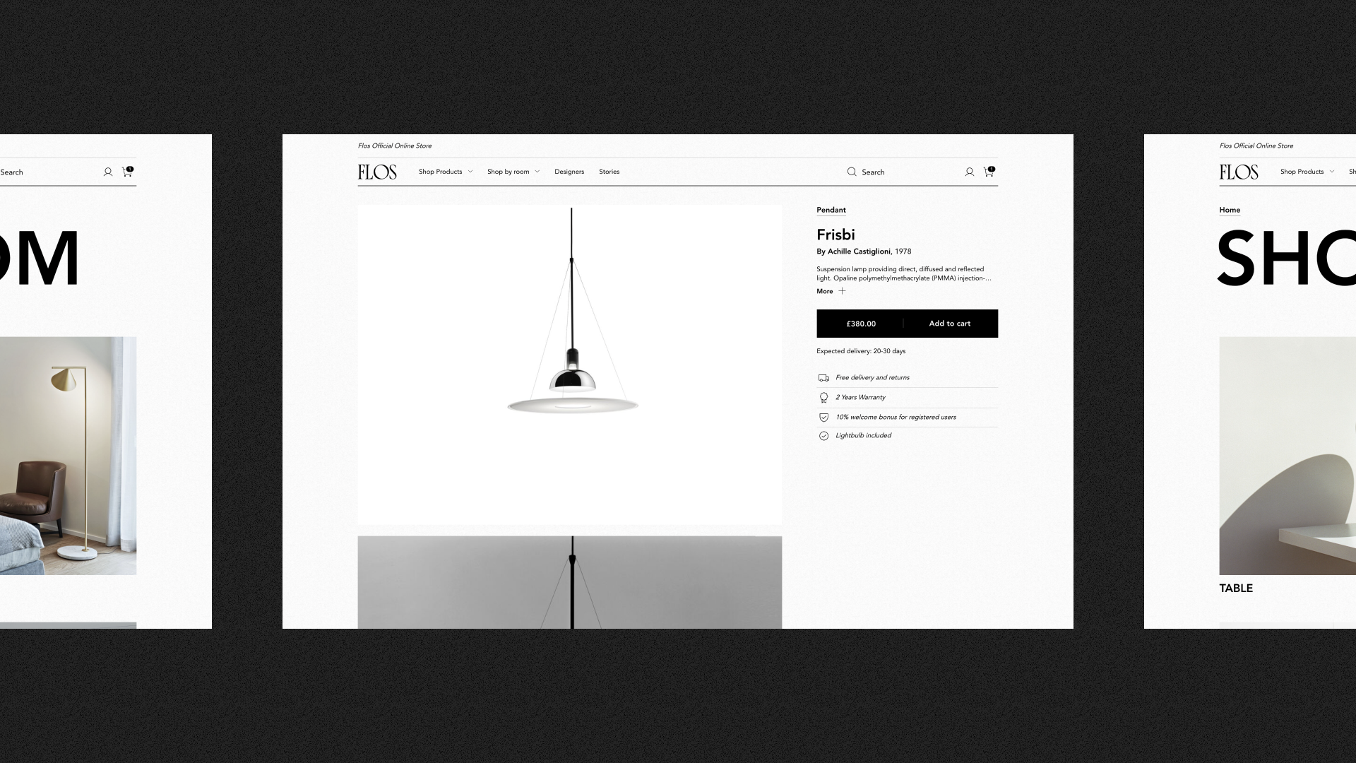
With content as a starting point, we came a long way, but hadn’t quite brought the experience of light to life. For that, we dived into physics. Light consists of three colours: red, green and blue. White light is only created when these colours coincide. We have taken this physical phenomenon as the basis for the entire colour concept of the website. What does that look like? When you land on the homepage it is dark, because you don’t have a lamp yet. Via red, green and blue pages (Stories, Rooms and Designers), you then end up at lighter pages, such as the shopping cart and checkout. Visitors actually go from dark to light when they navigate through the website. The gradient effect of light — the ‘noise’ that is always present — is also included in the design and visible in the background throughout the website. On the dark background, we implemented a light that follows the movement of the cursor. This allows visitors to illuminate parts of the website that they want to focus on. And while accessibility with such a visual style may sound challenging, the entire website adheres to AA accessibility guidelines.
Salesforce
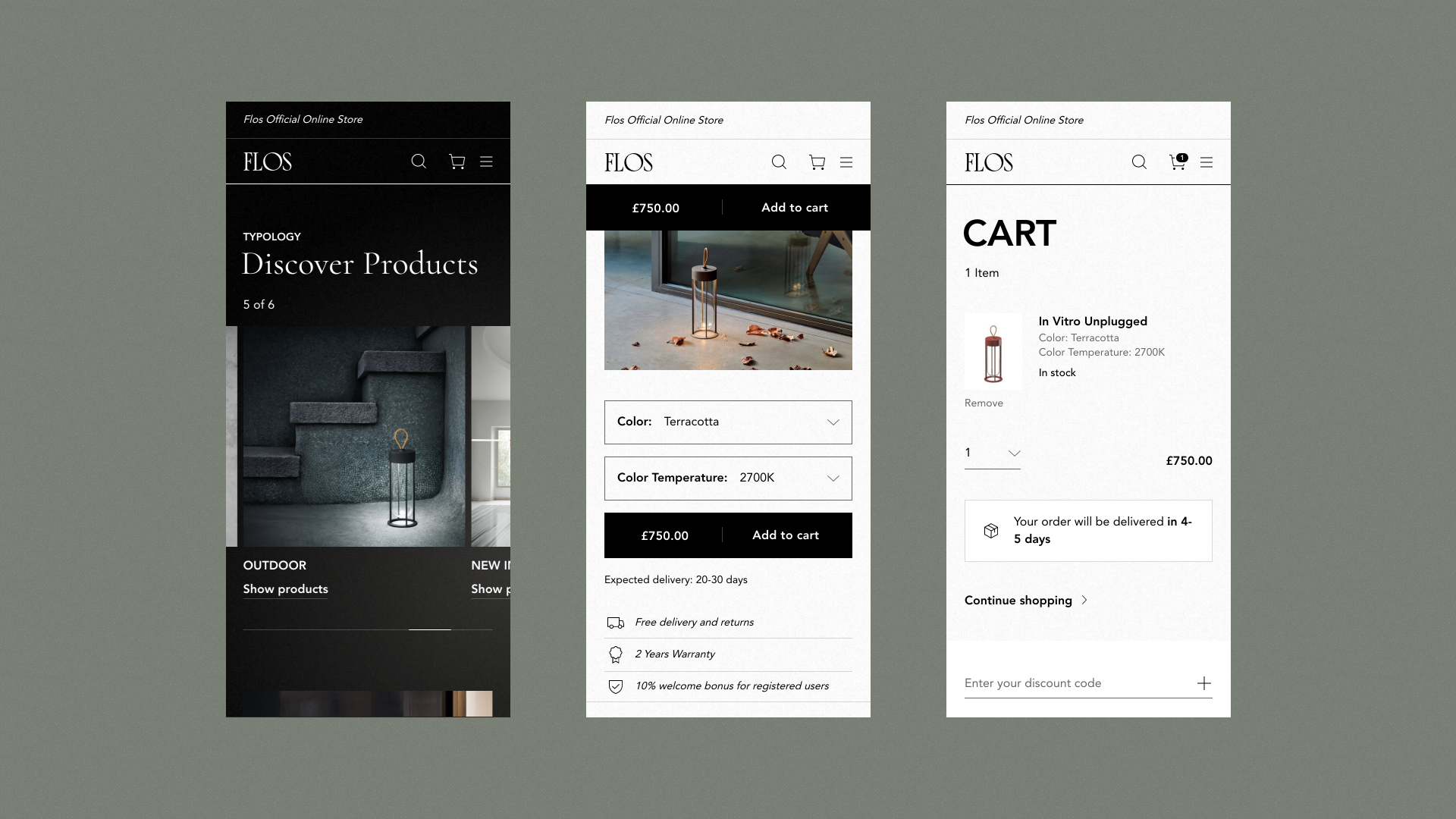
We created the perfect balance between brand, design, content and e-commerce
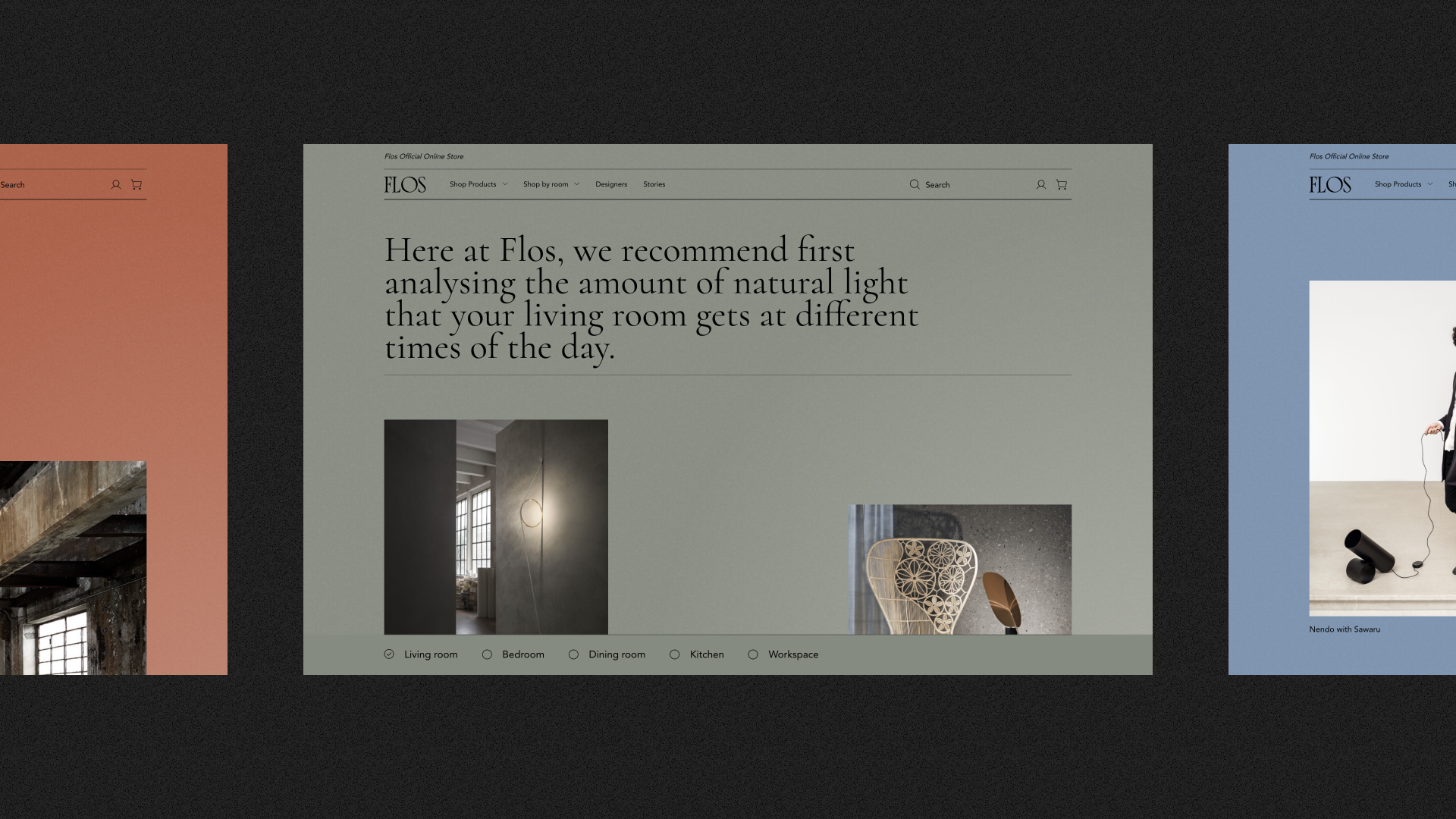
Branded commerce with a unique experience
Over seven months from discovery phase to go-live, DEPT® has built a robust platform for Flos, creating the perfect balance between brand, design, content and e-commerce. The website is now also suitable for customers who want to buy a lamp in the store or from a supplier, and desire more information. This way, commerce and brand go hand in hand for Flos.
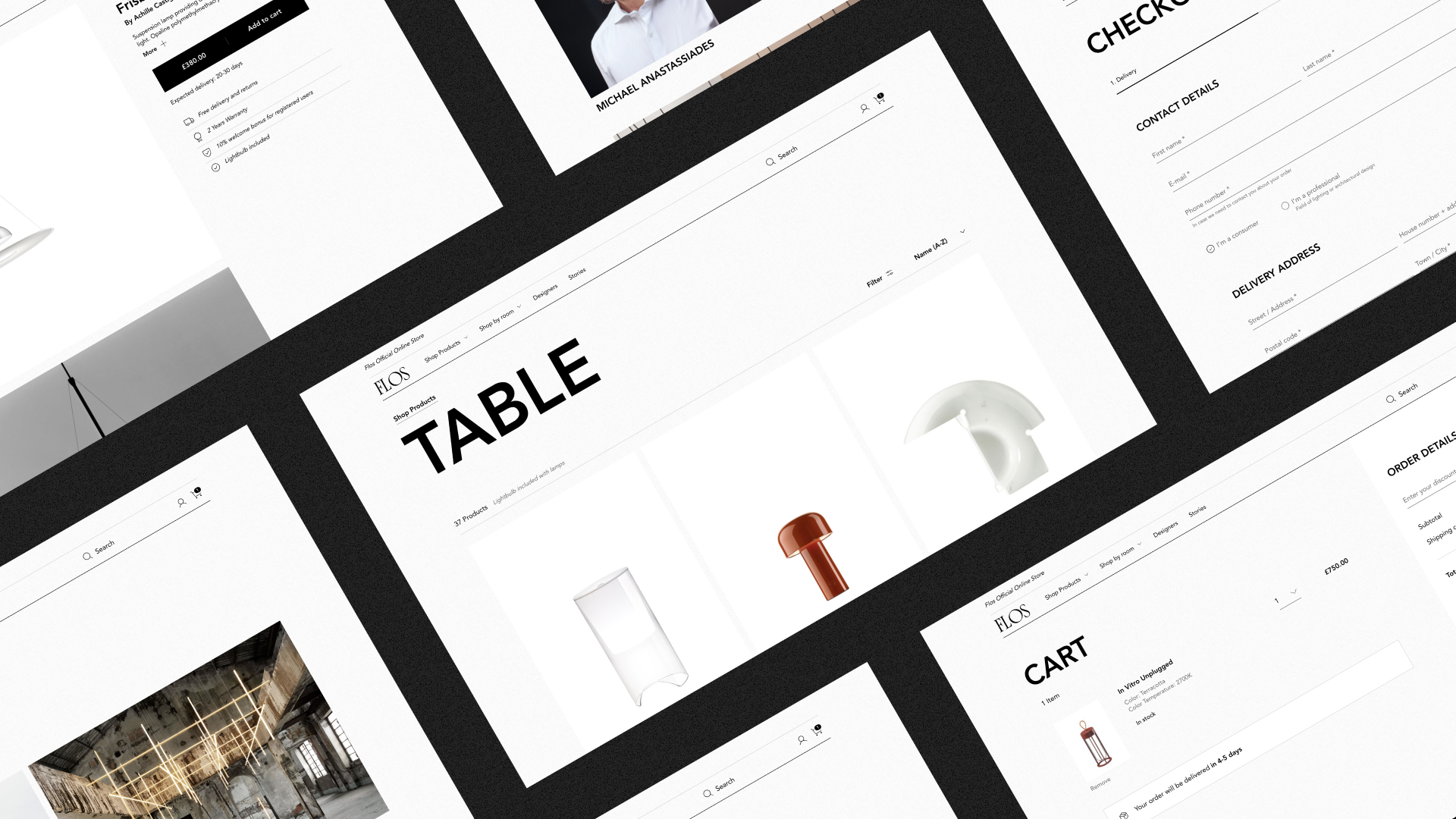
A look at the future
The D2C e-commerce platform went live in July 2021 in the United Kingdom and Spain, with other European countries following and the United States going live soon. Flos is part of Design Holding, which includes several labels; the challenge from the start of this project was to create a framework that can be implemented across these multiple brands, while enabling them maintain their unique appearance. With the underlying strategy, content as a starting point, and the role of light throughout the website, Flos has more than succeeded in creating a unique appearance. The current impressive D2C e-commerce experience shows that Flos enlightens. From dark to light. From visitor to customer.
Experience the website
Questions?
Client Development Director
Katy White
Discover more
