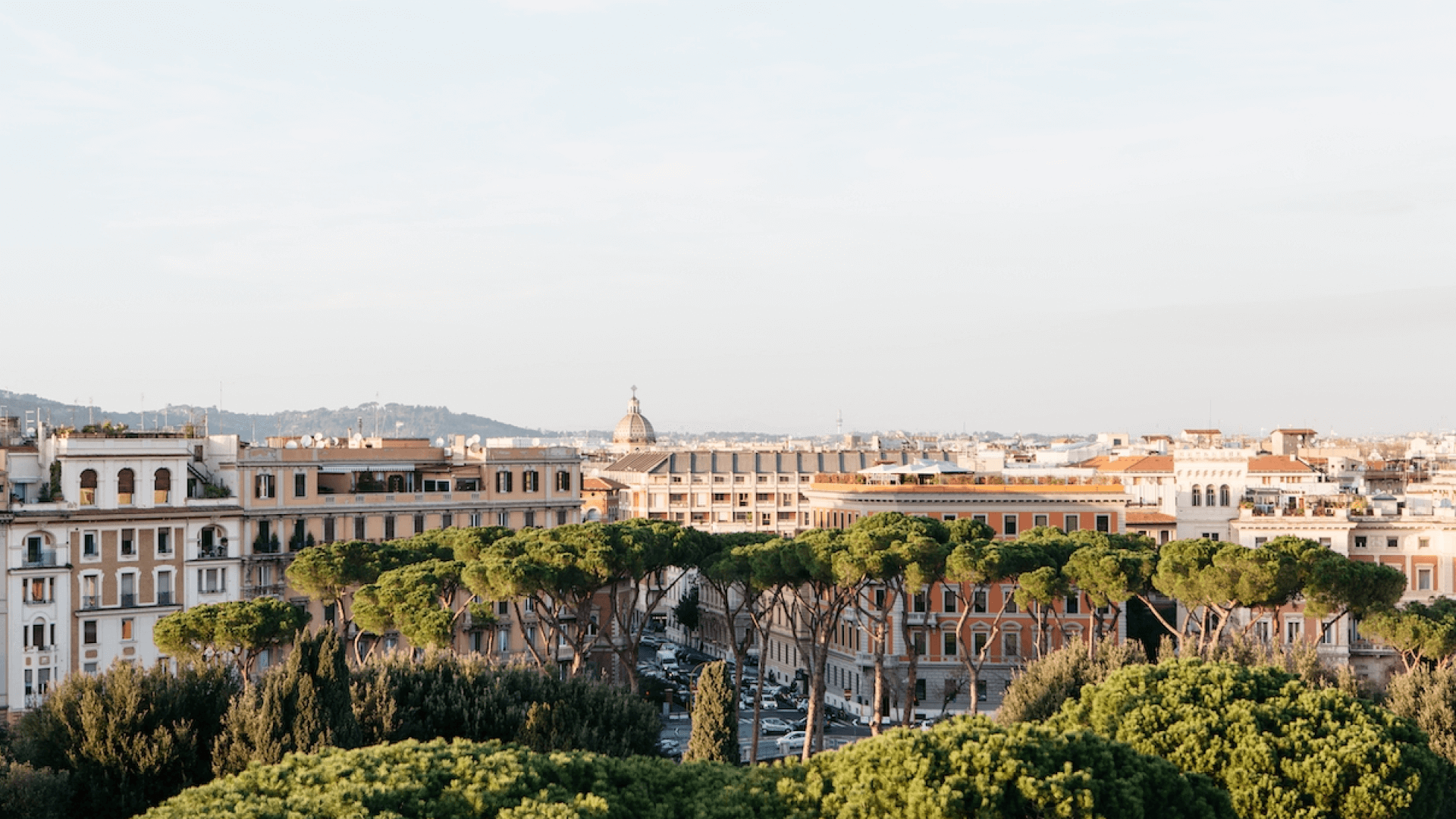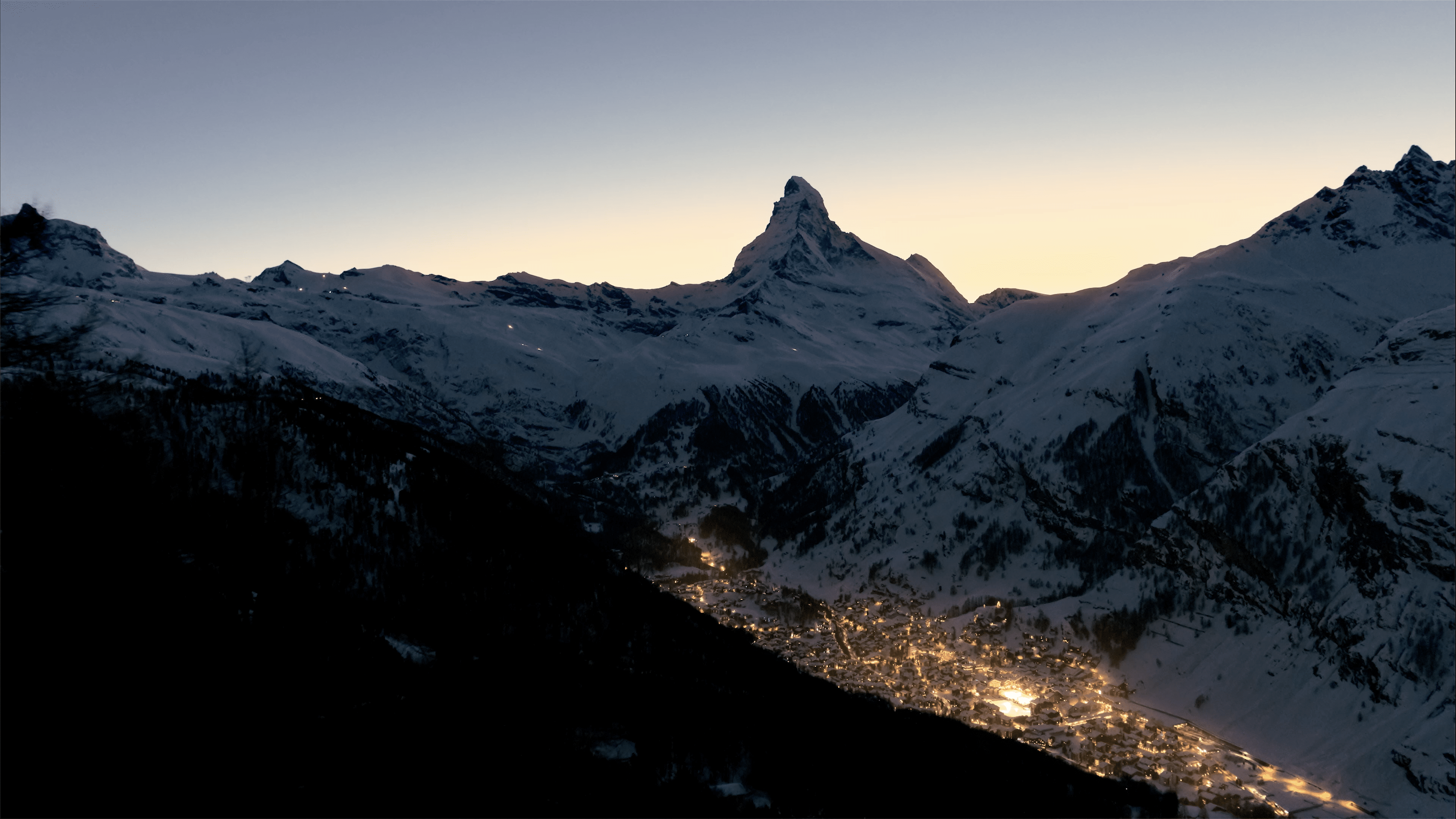
From the Matterhorn to St Peter’s Island to the Viamala Gorge, Switzerland offers thousands upon thousands of incredible destinations to experience. Perhaps the one thing Switzerland Tourism was missing, in a country with so much to offer, was a central, singular place to compile all of these experiences. That’s why the country’s national tourism marketing organisation partnered with DEPT®. Together, we created a unique platform to encourage more people to visit Switzerland and to provide that central source of information. The result takes you on a journey through the breathtaking beauties of Switzerland and enables you to find all relevant booking information right at your fingertips.
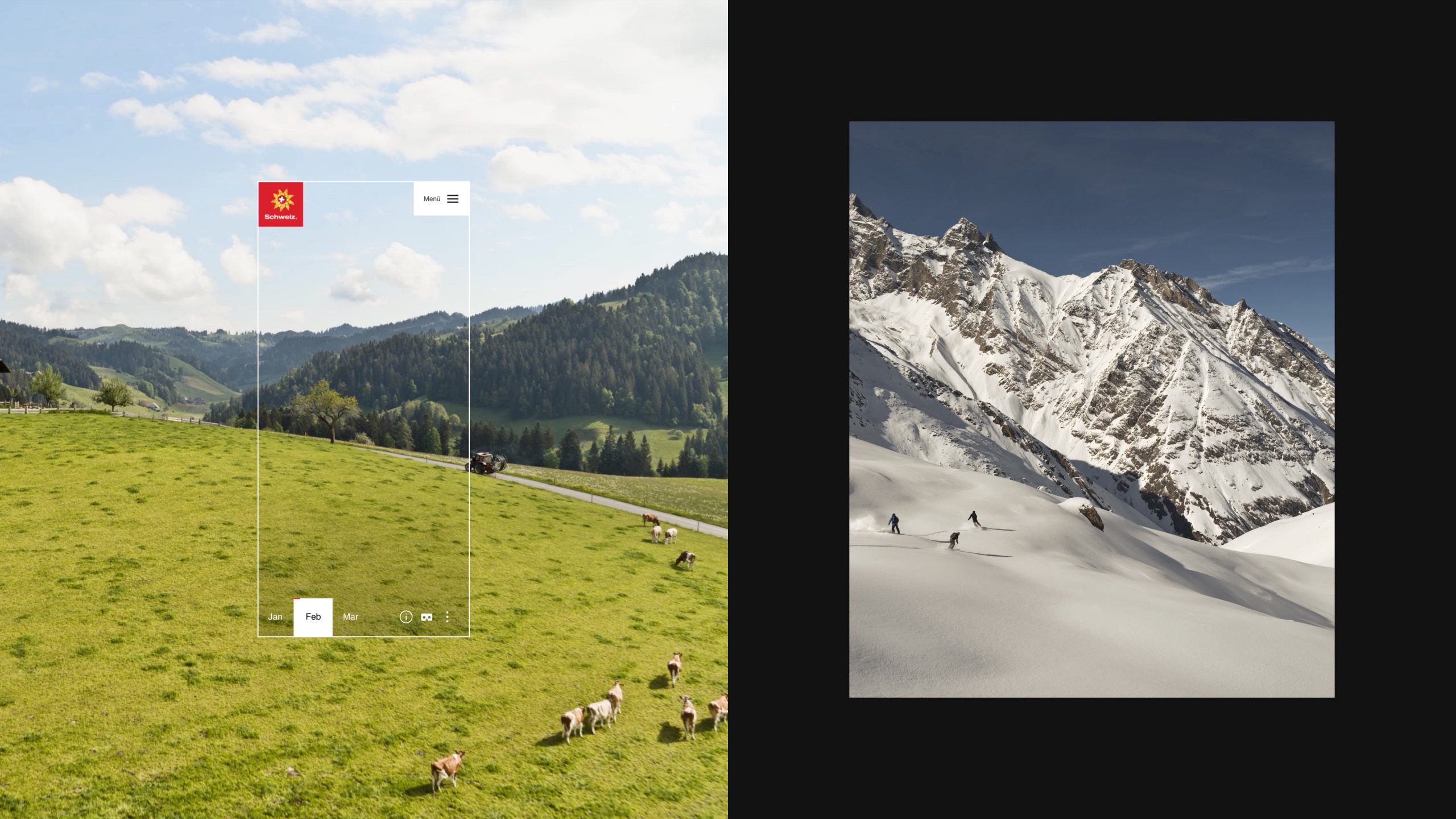
Immerse yourself in Switzerland
MySwitzerland.com is the backbone of communication between Switzerland Tourism and tourists around the world. The new platform that we built together presents over 45,000 travel destinations, routes, events, sights, experiences and accommodations in 16 different languages. All shown in detail, located on a map and directly linked to all relevant partner platforms for bookings.
Taking you on a digital journey through the breathtaking beauties of Switzerland
Creating guiding Principles to lead our design process
We didn’t just want to link to ticket windows with this new design. The aim of the new platform was to demonstrate the breathtaking and diverse world of Switzerland via inspiring stories, travel routes, holiday destinations and events. We wanted to translate the exciting and memorable experience one has when visiting Switzerland to a digital experience accessible to all, anytime and anywhere. Based on this vision, our local team established guiding principles for our visual concept:
Guaranteed modularity
Using a sophisticated grid system and the principles of atomic design, we create various content modules that had a similar structure bit that varied in placement, thus enabling adaptive rendering.
Less is better
To ensure a smooth and simple browsing process, we limited content to one column to make it easy on the eye and facilitate scanning of a page. The top-level navigation was also reduced and introductory texts were kept short which guide a user towards a more detailed page
Maximum inspiration
Users can browse through multi-layered content and thus find inspiration for their trip across the entire website. For example, via the homepage, one can access the Inspiration Calendar which provides inspiration and access to numerous topics. The “Destination Pages” and storytelling pages illustrate a digital experience of various regions.
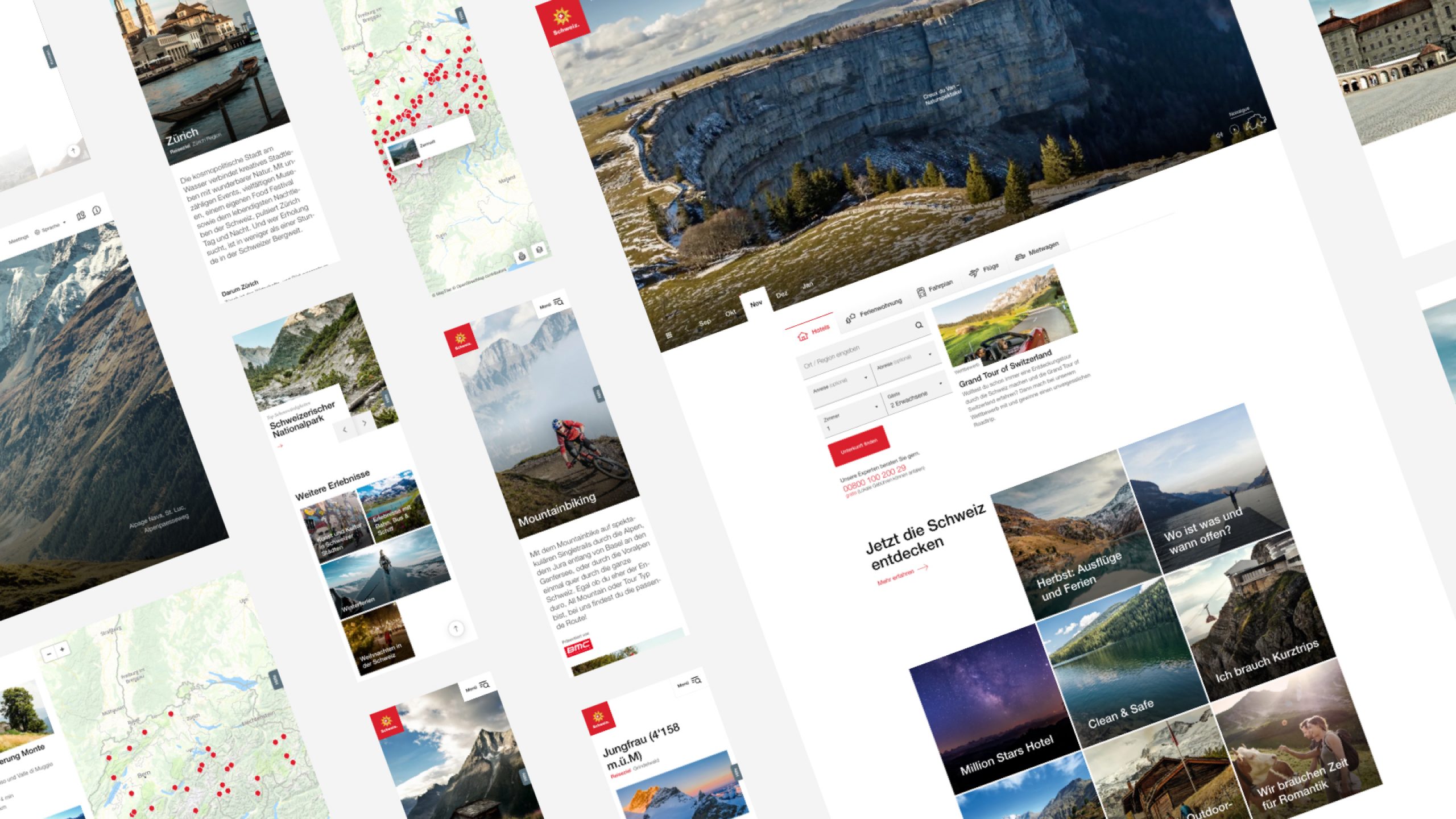
Establishing a design baseline
We started off by creating a grid system based on the brand’s logo to ensure brand representation and uniformity while also giving us a baseline to work with when creating new layouts. Based on the existing logo and our vision of the website, we built up a library of core colours, fonts and symbols which created a foundation upon which all components could be built. These design principles served as rules when creating new layouts.
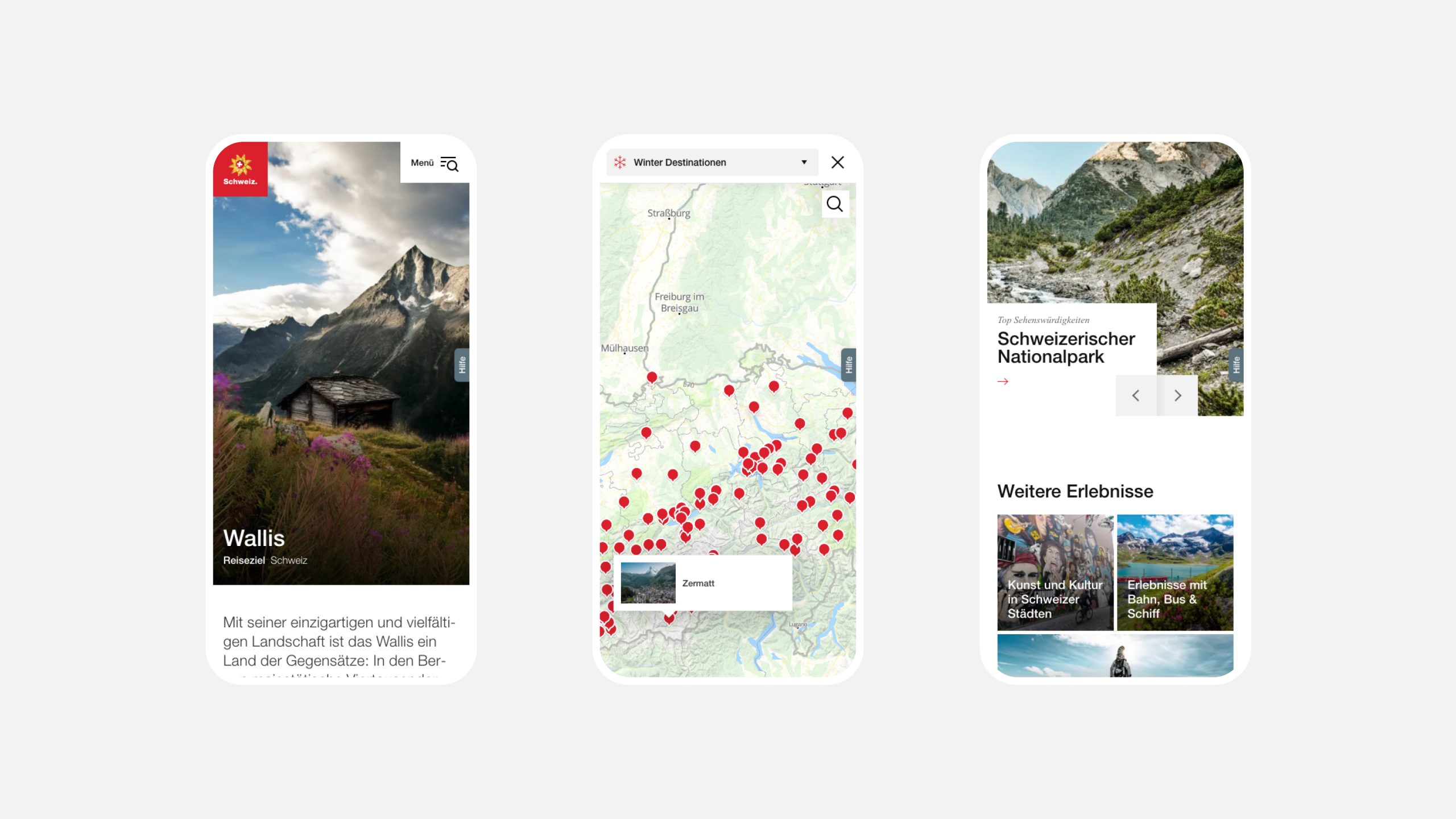
Ensuring a solid information infrastructure
The core of any solid web portal is based on a thought-out information architecture. So when coming up with the navigation concept, we adopted a hierarchical approach to the organisation of the website and fine-tuned our ideas using tree testing, a technique for evaluating the findability of topics with users.
However, we didn’t only rely on the tree test, using multiple additional user tests we ensured that the navigation was optimal by comparing different design approaches. We also conducted visual checks, via workshops and user tests, of the various navigation concepts we had created. This ensured that no one clicked away due to a poor navigation experience and that the platform had a strong information architecture.
Harnessing AI to deliver the best experience across all devices
Even though we ensured a smooth navigation process for the user, the website is content heavy. So after tagging and connecting each image to certain topics or pages, we leveraged the power of artificial intelligence and implemented an algorithm that automatically prepares over 80,000 images stored in the system in the correct formats for all output devices and connection speeds. This ensures that the right images that are tagged and matched to the content that is displayed in addition to a quicker page loading time.
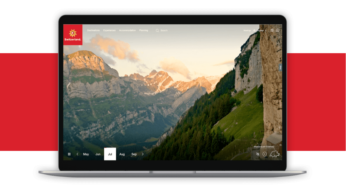
Pure inspiration during all times of the year
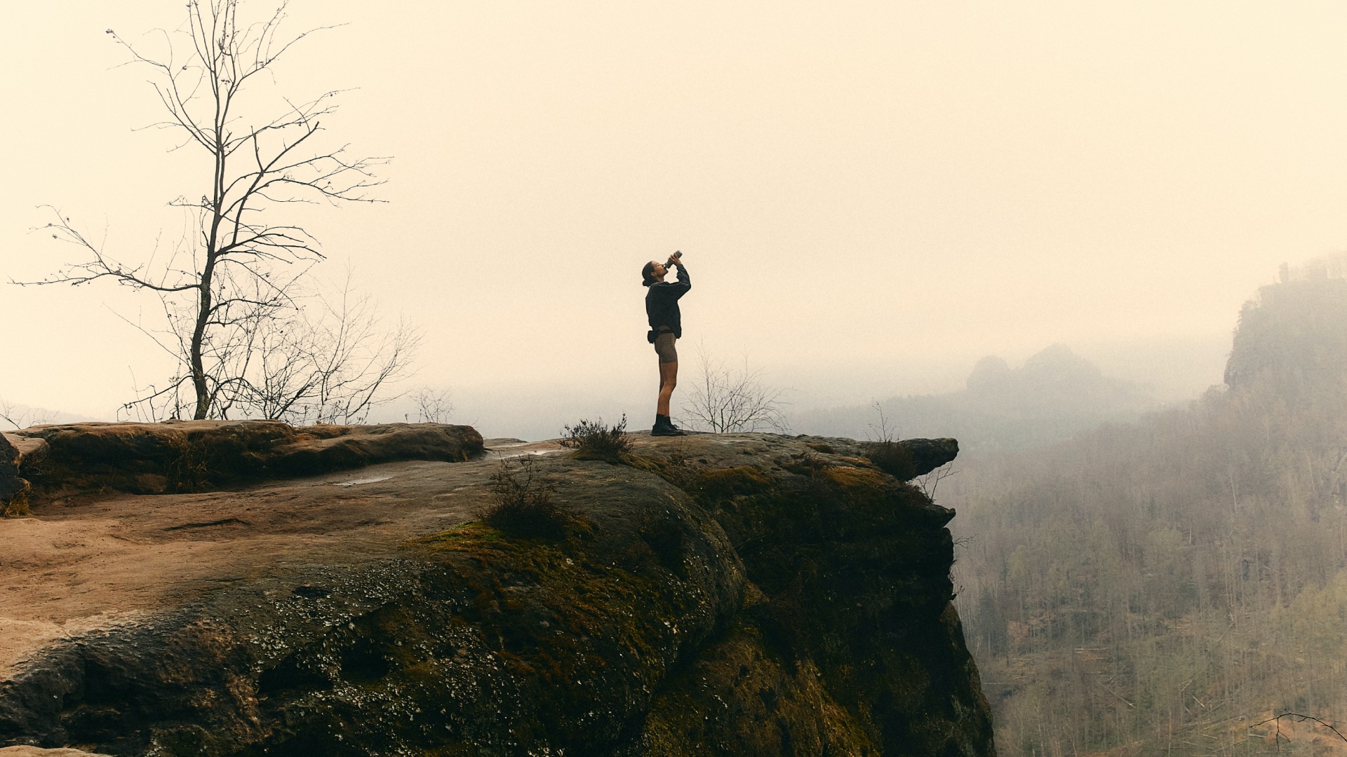
To showcase that there were numerous activities and areas to explore no matter the time of year, we created an interactive and inspirational calendar. Using 48 drone videos each lasting 15 seconds, users can browse through each month of the year or choose a region on a map and see destinations in addition to facts about each place. Users can float over gorges and city-scapes and immerse themselves in the sights and sounds of each place.
Incorporating a top-class virtual reality experience
These drone videos are featured on the homepage and are meant to entice and inspire users. However, we wanted to take it up a notch, so we transformed the footage into a virtual reality experience when browsing the website with VR glasses.
To convert flat footage into a 360-degree all-around experience, that enables the users to look around and explore the landscape, we created custom 3D geometries upon which we mapped the video. To avoid distortion, we implemented a basic spherical geometry which we gradually built upon and manually adjusted until we found a grid that met our requirements and allowed an aspect ratio of 16:9. Additionally, the position of the camera also played a decisive role. So depending on the distance of an object to the video, we adjusted the amount of overlaying information. Lastly, to ensure we captured the sweet spots, we constantly carried out tests with VR headsets during the entire process.
Immerse yourself in Switzerland
The new web portal of Switzerland Tourism sets new industry standards. Behind the spectacular presentation of unique destinations and the intuitive user journey lies a wide array of conceptual and technological innovations. From a strong information architecture to VR elements, the new site creates a world of experience for you to immerse yourself in. You can also find all the information needed for planning your next trip: from train and flight booking to the weather current current currency exchange – all the information you need is at your fingertips.
Explore DEPT®/TRAVEL
Questions?
Director Business Development
Yann Wanner
Discover more
