Leveraging the world’s largest security cloud, Zscaler anticipates, secures, and simplifies doing business for the world’s most established companies. The cloud-native Zero Trust Exchange platform protects thousands of customers from cyberattacks and data loss by securely connecting users, devices, and applications.
DEPT® worked alongside the Zscaler team to refresh its design system, creating a holistic brand identity that reflects its core pillars.
Building trust in the brand
Zscaler’s old brand elements didn’t convey the right message to its audiences. They were also difficult for internal teams to use, creating cluttered, confusing collateral that didn’t speak to the strategic direction of the business.
A new design system was needed to reflect its reputation and zero-trust technology.
Because Zscaler is in the security business, the key objective was to build trust in the brand identity and ensure that it reflected the brand pillars of anticipate, secure, and simplify.
However, we also wanted to showcase Zscaler as humble, easy, innovative, and advanced.
Creating a modular system
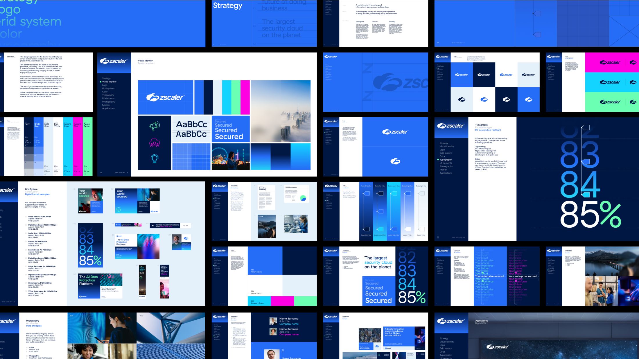
With such a simple and sophisticated brand identity, every element must work hard independently and as part of the wider design system. Zscaler needed enough scope for flexibility and variation when different toolkit parts were combined because this would ensure that communications were varied and interesting.
The foundation was built around the “secure” brand pillar, creating a flexible modular system. Blocks can increase, creating a sense of scale to generate flexible and dynamic layouts for creative expression and a clear information hierarchy.
The brand identity comes together in various ways within these modular foundations. The block grid system is complemented with assets and design expressions, including typography, image treatments, photography, colour, and motion principles.
Visual identity for zero trust architecture
Zero trust architecture controls a user’s virtual environment and traffic and assumes every connection in the network is hostile by default.
We mirrored this in the visual identity by controlling what users can and can’t see—concealing and revealing parts of imagery or typography. This helps users focus on the most relevant information and visualise zero-trust architecture in a smart, simple, and confident way.

Photography & typography in the clouds
Gradients and the ambient overlays, evoking Zscalers cloud technology, were inspired by clouds and weather maps. This humanised and softened the brand, extending the brand language to different audiences.
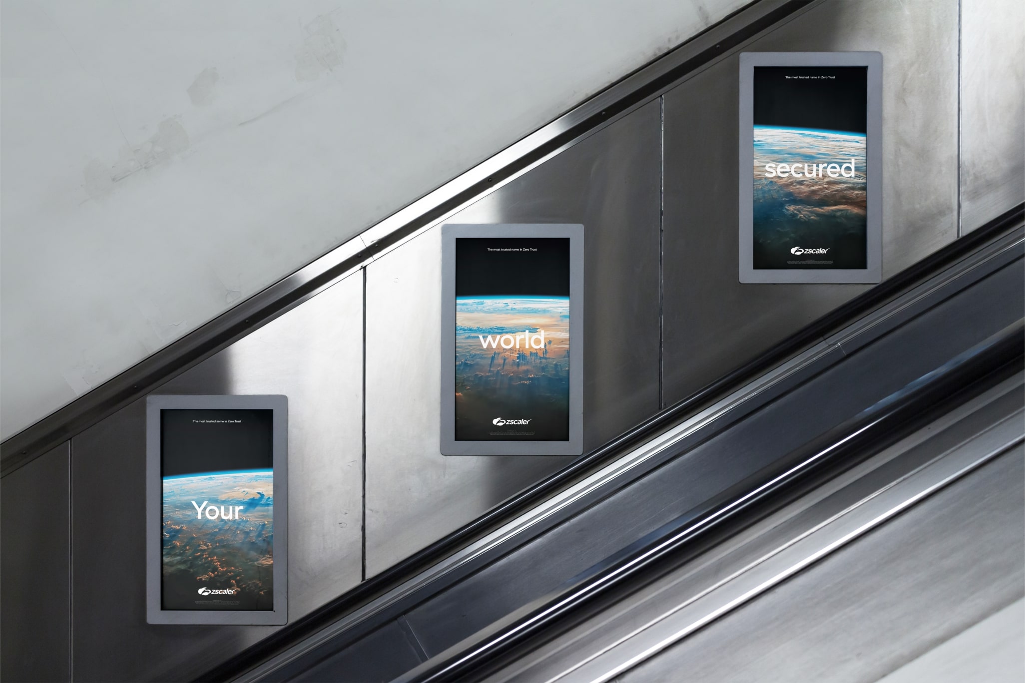
Photography uses soft-focus blur effects to continue alluding to concealing and revealing information. We have varied approaches that speak to the customers, including inspiring images of human innovation that communicate ambition and link back to their customers’ impact on the world.
For typography, we paired GT Haptik and DM mono from simple, accessible, and contemporary everyday expressions to expressive executions that provide emphasis and visual interest across assets, demonstrating Zscaler’s transformative and impactful capabilities.
The result is a smart, secure, and sophisticated aesthetic that showcases Zscaler’s work and methods.
Explore creative branding services from DEPT®.
Questions?
Creative Director
James Wood
Discover more
