Manchester homeless charity Coffee4Craig operates a daily drop-in centre supporting the most vulnerable in the community with hot meals, showers, medical aid and mental health crisis intervention. DEPT® teamed up with Coffee4Craig as part of the DEPT® Cares programme, donating the agency’s time, skills and expertise to support the charity with a complete brand refresh and new website.

The charity’s roots
Coffee4Craig was founded by Risha and Hendrix Lancaster after Risha’s brother, Craig, died of an overdose whilst living on the streets. As a reaction to his death and a desire to make the world a little better for those who find themselves homeless, Risha and Hendrix started giving out free coffee to the homeless community in Manchester. Fast forward seven years and that simple act of kindness has become a catalyst for a charity operating in his name – Coffee4Craig.

A brand inspired by its heritage
As DEPT® approached the brand project, it was clear that the charity needed to remain recognisable, so a refresh was needed as opposed to a brand new identity. The brand refresh is rooted in the charity’s heritage, whilst incorporating bright colours and clean, minimalist graphic design concepts. Here’s a behind the scenes look into the creative process:
- Mood boarding: A collection of visual assets were collated by pulling together an array of imagery, topical and industry references, inspirational quotes, patterns, font and typestyles. The theme is filled with positive emotional appeal, rather than focusing on any negative empathy.
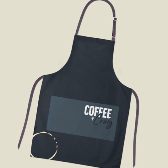
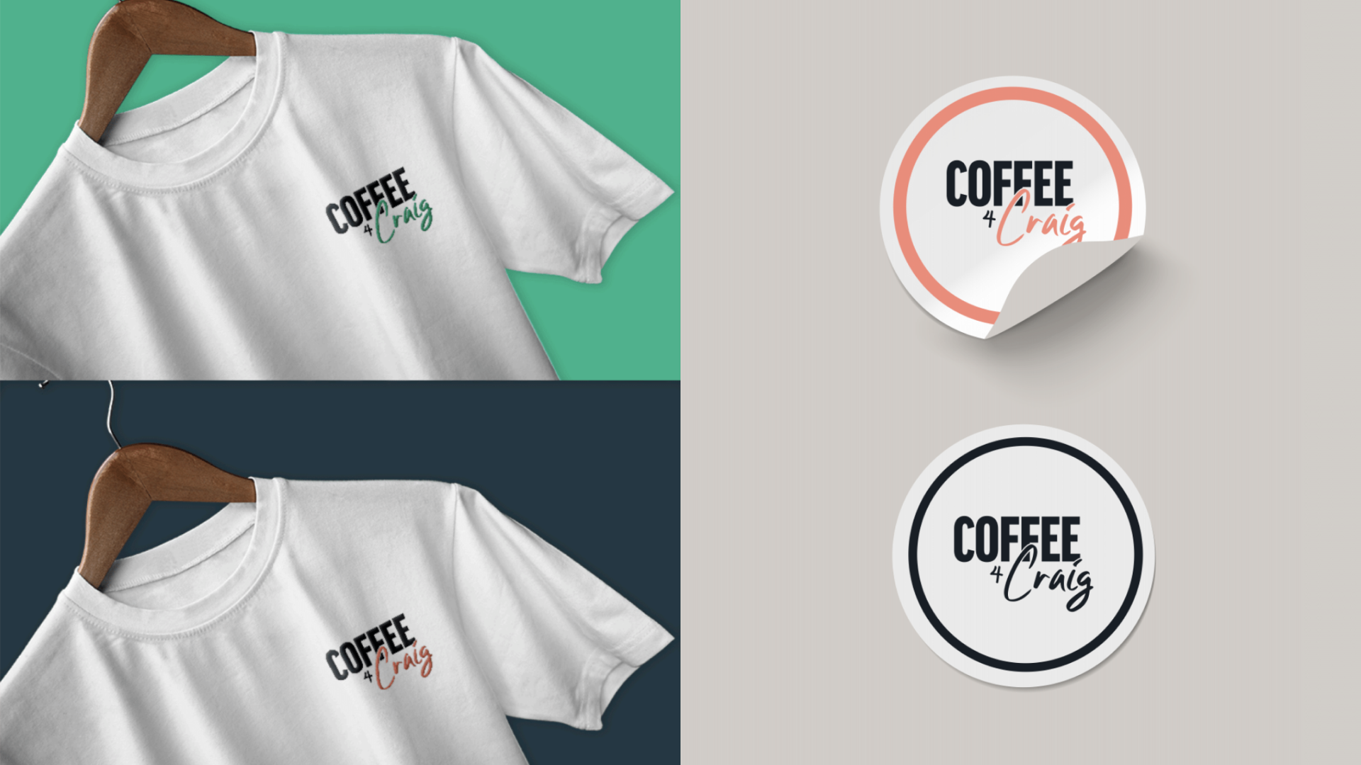
- Revealing a new logo: Coffee4Craig was initially hesitant to part with its logo so with this in mind, illustrators adopted many of the original concepts in a more modern format, such as the coffee-cup stain. The ‘Craig’ part is a handwritten font, symbolising the name a barista jots on a takeaway coffee cup. This concept was appealing to the charity, as it provides room to expand with custom logos for key volunteers (e.g. Coffee4Amanda/ Coffee4Stephen), and can also be incorporated into future campaigns.
- Pastel perfect: To encapsulate the positivity of the charity, a contemporary palette was selected with contrasting colours that can be used through all brand outputs. Fresh and clean, it lends itself well to both online and offline. The charity has already used the new colour scheme to paint the walls of its new premises.
- A new identifier: For its social media profiles, DEPT® designed an identifier to run in the logo’s place, ensuring the brand is recognised in situations where legibility of the full logo would be an issue. The identifier’s design refers to Coffee4Craig’s design heritage, adding consistency as the charity moves ahead with its new look.


Elevating a unique community charity
Simplifying the solution
When it came to the website redesign, DEPT® began by reviewing the existing site to see where improvements could be made.
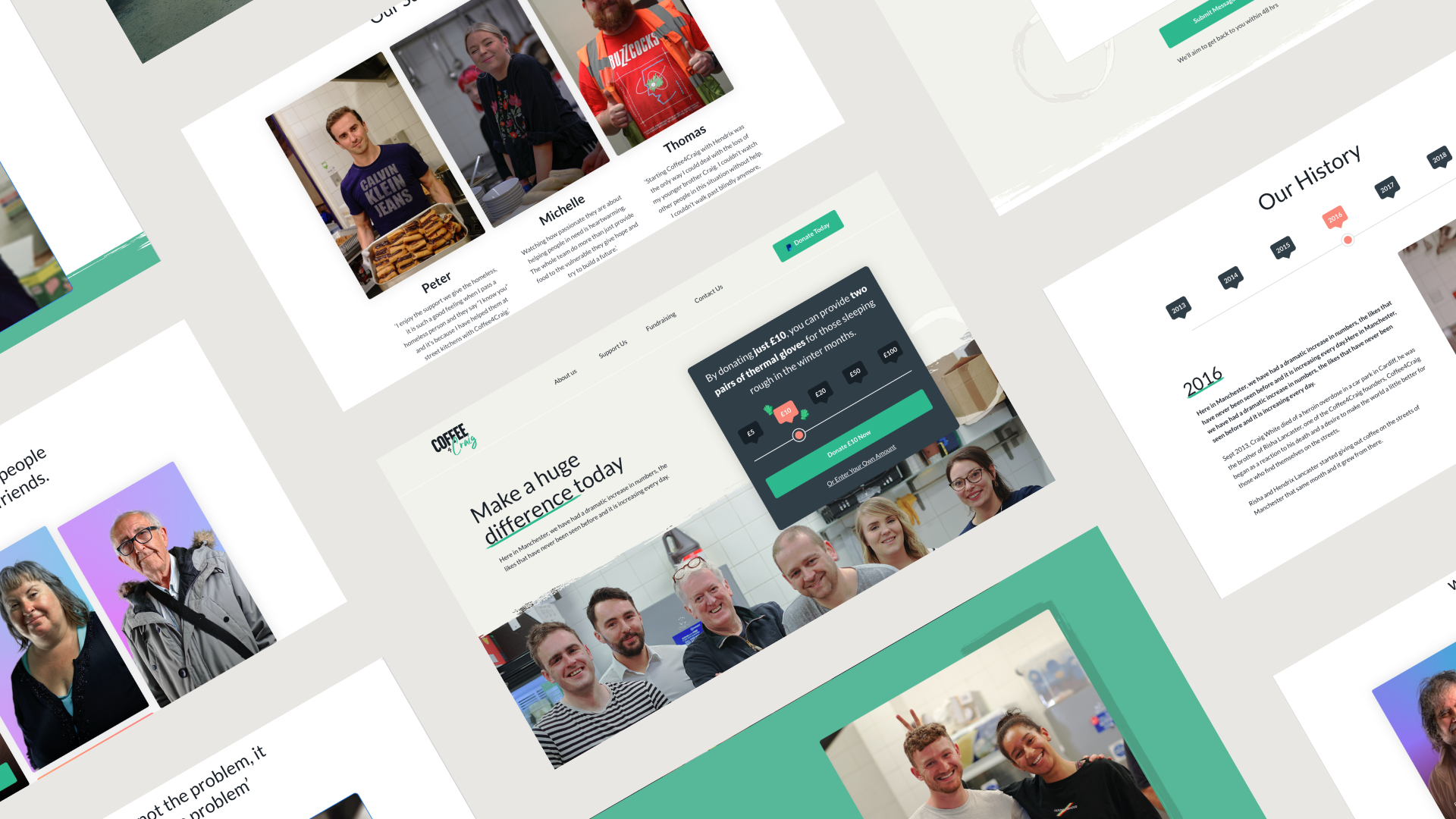
Across the site, DEPT® took a visual-first approach, replacing text-heavy sections with imagery and video content. The new design approach also shows the teamwork at the heart of Coffee4Craig; the connection that everyone involved has to the cause.
DEPT® revamped the brand look and feel to focus on the uplifting impact Coffee4Craig has had on the homeless community in Greater Manchester, showing possible donors the positive effect their money and time donations can have.
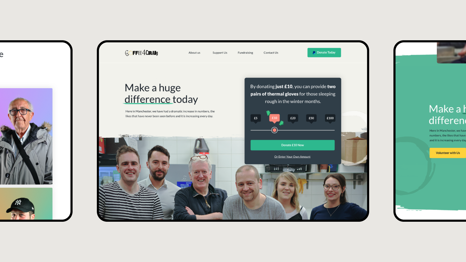
The UX team were keen to simplify the route to donation on the website. Driving donations and support were top considerations throughout the rebranding project and the new Coffee4Craig website was strategically designed and developed to achieve this. Accessibility was a key goal, to ensure visitors are always one click away from giving. A ‘donate now’ button was added to the site navigation bar, always visible when a visitor clicks on a new page or scrolls down.
The above the fold section of the homepage now prominently features a sliding donation scale, with each suggested amount showing the visitor what that donation provides for the charity. This helps donors to really visualise how their donation can help.
Driving donations
Additional donation methods
Amazon Wishlists are an important new donation channel for many charities, particularly those operating at a regional level. Certain donors prefer to control how their contribution is used; the wishlist facilitates that by allowing people to purchase selected items that Coffee4Craig need, such as disposable razors and warm clothing. By making the wishlist more prominent on-site, another barrier to donation was successfully broken.
After years of service expansion, the website needed to communicate the breadth of services to potential donors, and volunteers need to understand the scope of Coffee4Craig’s work and find out how they can get involved. Testimonials from current volunteers were added to show what it’s like to be part of the Coffee4Craig team, and contact forms were included to make it easier for volunteers to get in touch and offer their services.
Thinking of their offline donations too, DEPT® purchased two iZettle contactless payment machines to support easy donations and payment at events around the North West.

CMS selection
From a technical side, the old site was built through Wix, which the charity paid a monthly fee for. For small charities, reducing monthly online overheads can make a world of difference over the long term, so DEPT® opted to use the open-source Netlify CMS instead, which offers additional functionality and doesn’t incur any cost.

A partnership for the long term
Get involved
The DEPT® team are emotionally invested in the Coffee4Craig partnership; all services were provided pro bono and many Depsters went above and beyond, coming together in their own time to brainstorm ideas and pick up extra tasks to ensure the new branding and website are exceptional. We wanted to create a solution to match the quality of work the charity does in the community.
The project team is proud to have helped elevate and build brand recognition for Coffee4Craig. The team feels confident that the new branding and website sends a clear message about who the charity is and what they stand for, to help facilitate online donations, whilst attracting volunteers and partners.
The new website is live now, ready to take donations, find new volunteers and connect with the homeless community. Visit the site today to find out more about Coffee4Craig’s work and how you could make a difference.
Questions?
Discover more


