Transavia
A new visual design for Transavia, it’s a pleasure!
Part of the Air France-KLM group, Transavia operates from six home bases in The Netherlands and France, including its main bases at Amsterdam Airport Schiphol and Paris Orly. The ambition is for Transavia to become Europe’s leading airline in hospitality and service. The key objective hereby is to add new routes, appeal to business passengers as well as leisure, and create a dominant online brand.
Creating a dominant online brand
The re-branding was an integrated process combining company strategy, e-commerce and brand design. Transavia started to work on a new e-commerce platform to increase ancillary sales, improve the conversion of flights and reduce operational costs. Having identified the need to redefine Transavia’s positioning and visual identity in accordance with the new e-commerce strategy and concept, Studio Dumbar (part of Dept) was invited to join the team.
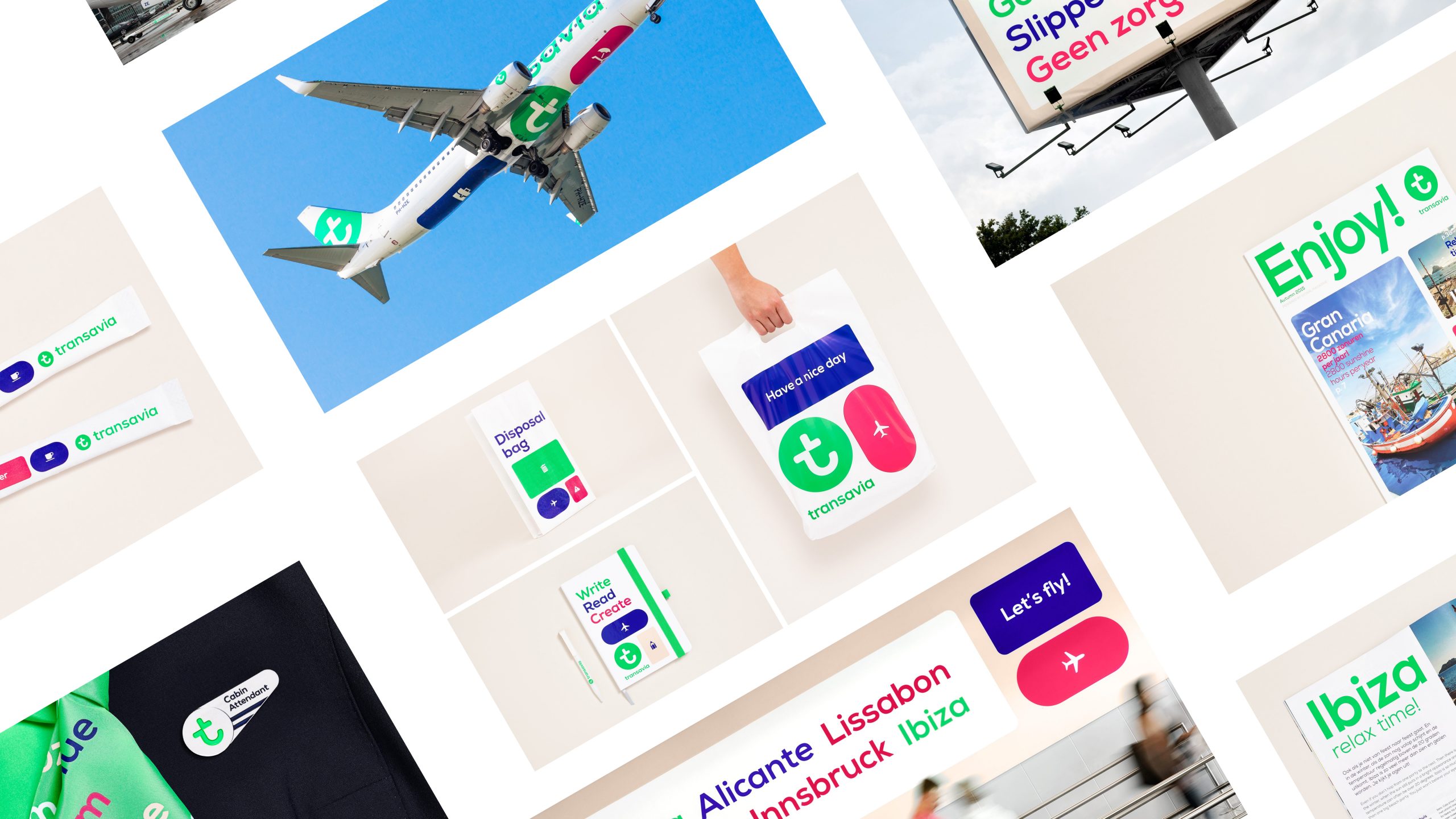
The new visual design is playful, accessible and flexible
Results
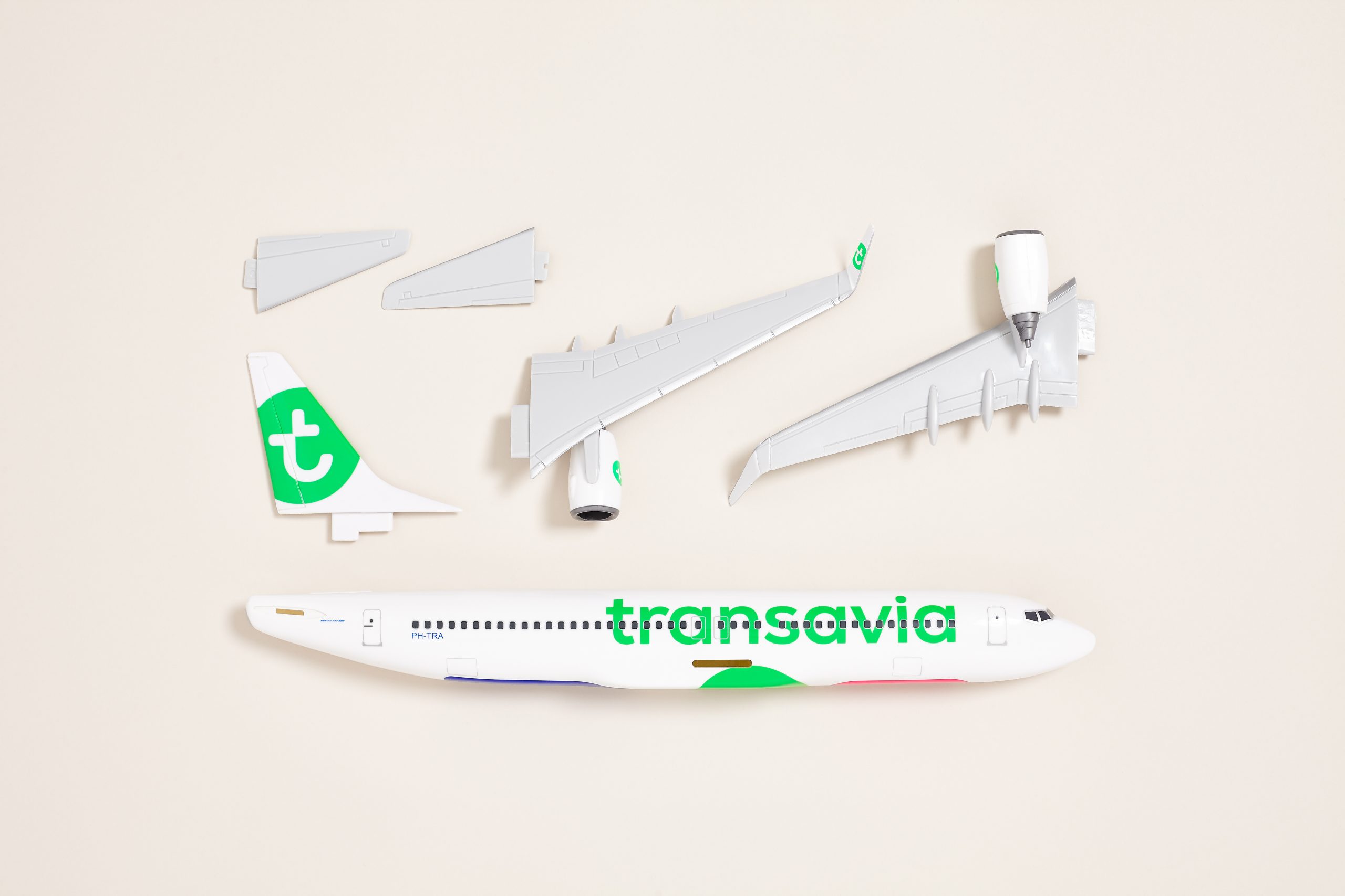
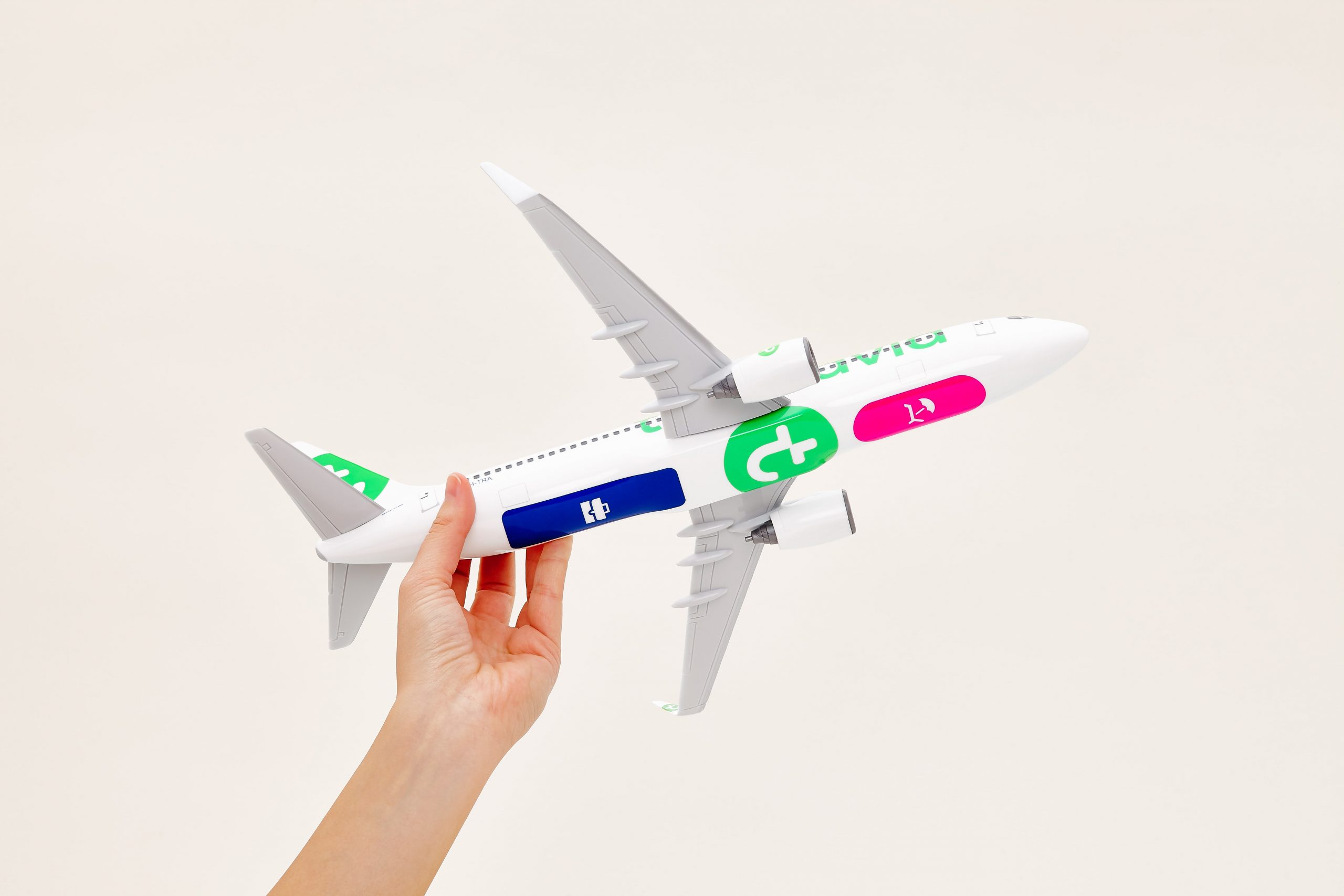
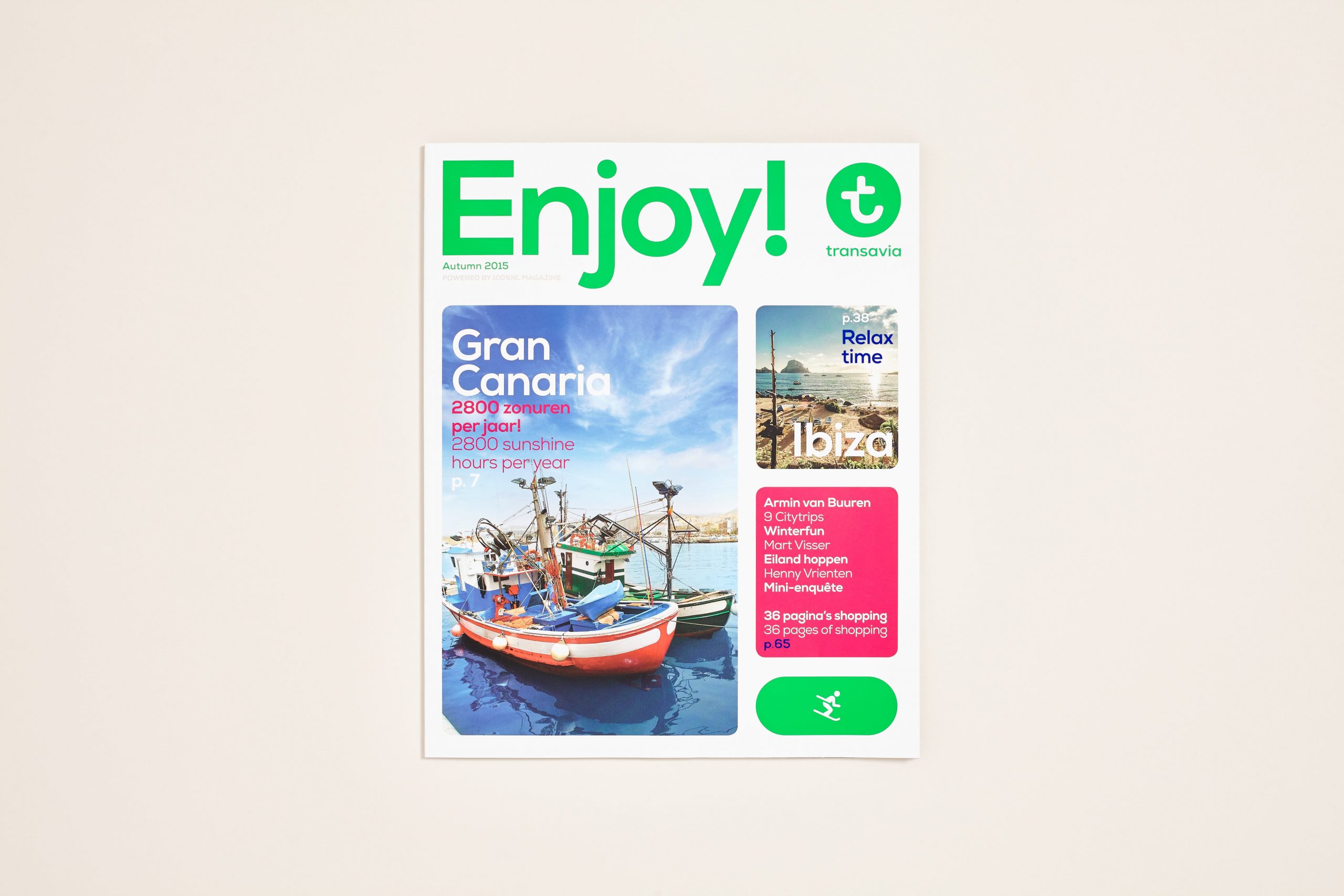
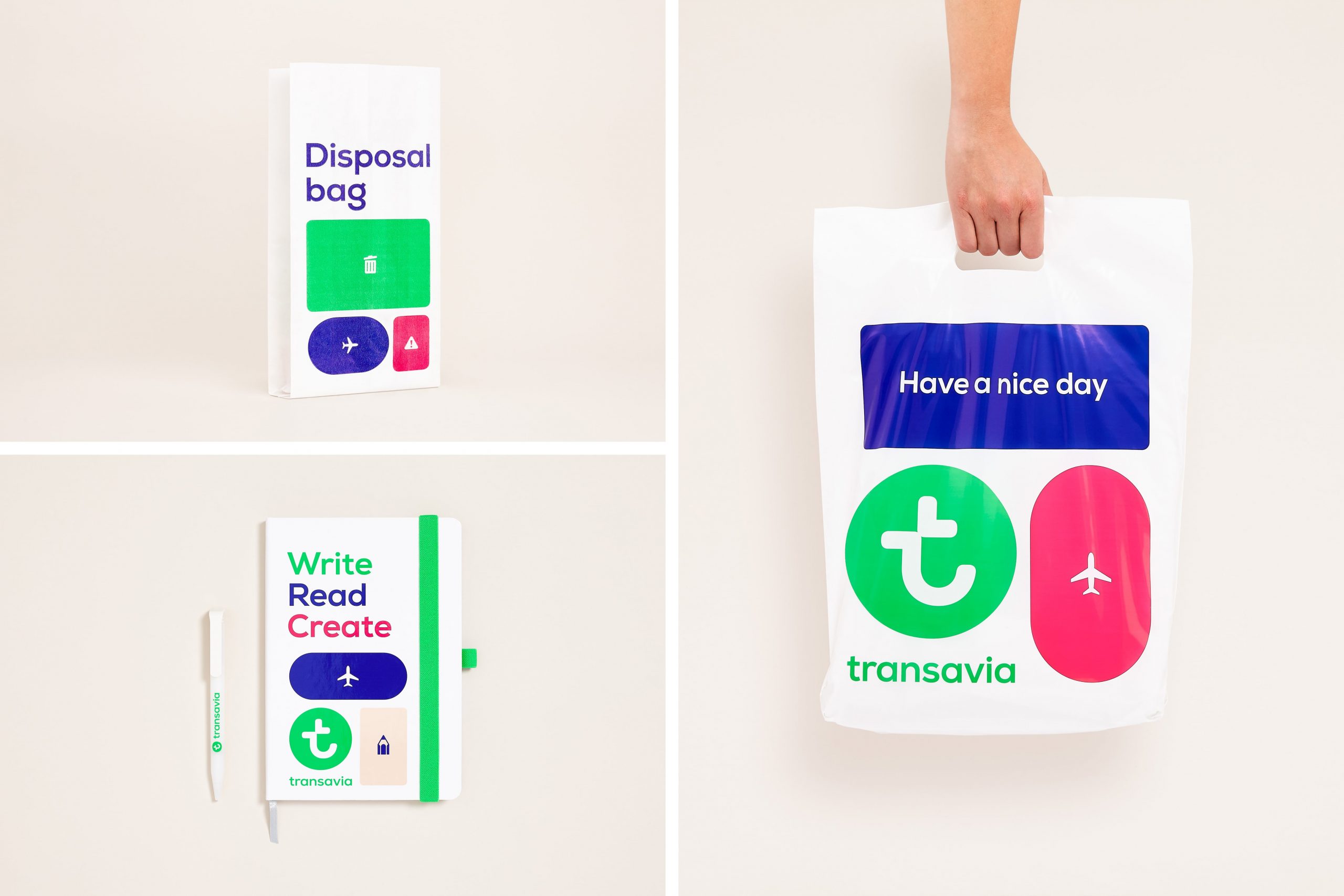
It began by developing Transavia’s new positioning. The two most important results were changing the name from Transavia.com to Transavia, and defining “It’s a pleasure” as the leading principle for the company. The design is playful, accessible and flexible. A special feature is the application of icons to the underbelly of Transavia’s planes, with a different combination of icons for each plane in the fleet. Another symbolic livery feature appears next to the entrance, where the word ‘Welcome’ is written in all the languages of the countries served by Transavia. The identity has been rolled out across the brand including uniforms, catering trolleys, in-flight amenities and more.
Questions?
Principal Digital Consultant, Design & Technology
