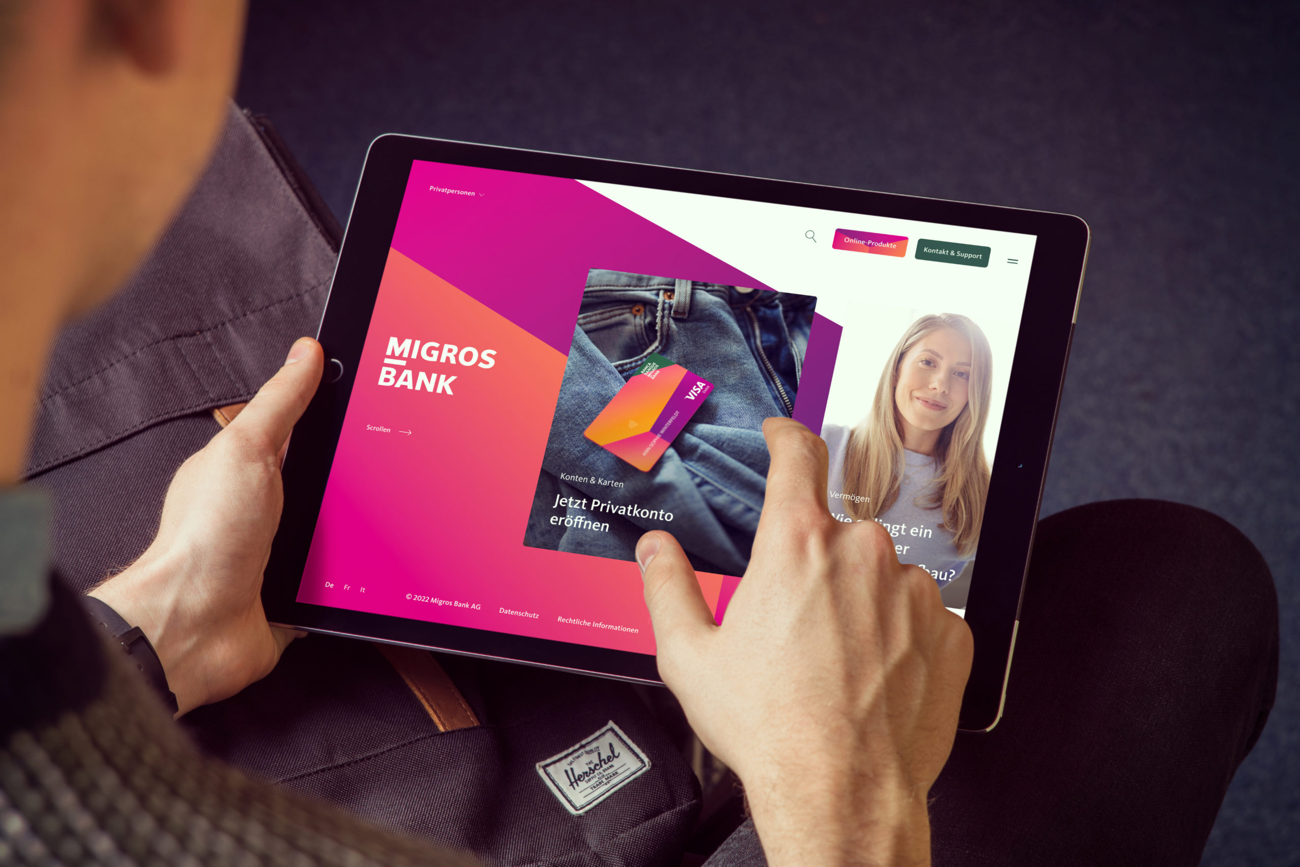
In the midst of Migros Bank’s strategic realignment, a distinctive new and unmistakable brand presence emerged—one that is accessible, committed, and tangible in both the digital and physical world.

From the bank of Migros to the bank of the people
Since its founding in 1958, Switzerland-based Migros Bank has sought out to be a different kind of financial institution compared to traditional banks.
Today, the bank continues to lead with the values it’s held from the beginning, but with a modern positioning that reflects the present-day needs of its customers. Through its updated brand identity, Migros Bank showcases its status as a contemporary universal bank with distinctive characteristics and a clear mission—both of which come to life through its online communications and personalized customer guidance. The bank’s refreshed website enables customers to naturally access the bank features and services they need, while focusing on providing practical finance and investment solutions for individuals’ specific life situations.
Sleek design, intuitive navigation, and unexpected effects
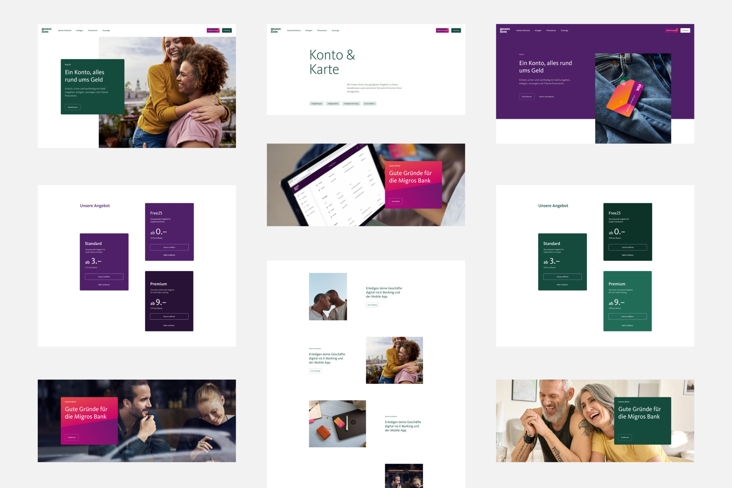
The new website utilizes a flexible design concept that showcases the brand’s future-oriented visual identity. While other traditional banks provide increasingly standardized offerings, the Migros Bank site reflects the unique needs of each customer through highly tailored user experiences. By incorporating similar design and functionality aspects of innovative fintechs and neobanks, Migros Bank aligns itself with more fresh, current, and digitally native banking institutions.
Navigating the refreshed Migros Bank website is simple and intuitive, allowing new and existing users to effortlessly find and learn about the products and services they’re looking for. Customers can easily and conveniently access their personal profiles and manage their bank accounts, banking cards, mortgages and loans, investments, and retirement plans.
Finally, the website’s updated look, feel, and functionality demonstrate to customers that they are never alone. If a question arises, users are just one click away from engaging in a personal conversation. And to symbolize that Migros Bank believes all banking customers’ wants, needs, and inquiries should be treated with equal importance, the homepage uses horizontal scrolling rather than vertical—putting everyone on equal footing.
Original values, long-term perspective
The new Migros website provides a state of the art banking experience, deliberately crafted to make people’s lives easier when it comes to all their financial matters. Since the creation of Migros Bank, this has been its social and economic mission. The website relaunch was the perfect opportunity to recommit to these values and ensure they were transparent and tangible in every detail.
Looking ahead, DEPT® and Migros Bank will continue to collaborate and dynamically evolve the bank’s digital presence to keep its vision and values at the forefront.
Questions?
Director Business Development


