As the National Governing Body for gymnastics in the UK, British Gymnastics unifies the community, celebrates the sport’s legacy, and shapes the future. British Gymnastics has played a key role in the sport’s rapid growth in participation and popularity in the UK. To continue inspiring athletes of all ages and abilities, as well as showcase the elite gymnasts’ rising on the international stage, British Gymnastics turned to DEPT® to refresh its digital brand ahead of the 2020 Tokyo Olympics.
Crafted with precision
DEPT® created new digital brand guidelines to shape how British Gymnastics is publicly perceived. The project involved refining its brand personality and tone of voice by rooting it in the principles of teamwork, challenge, encouragement and greatness.
The British Gymnastics logo, brand marks and icons were placed into a grid, where suitable spacing and colour combinations were defined to maximise visual impact. Additionally, we reviewed typography and assigned primary fonts and fallback typefaces, outlining how they should be used in a content hierarchy.
A secondary colour palette was introduced, evolving the primary colours of Candy Apple Red and British Blue with vibrant accents of Gold, Purple, and Aquamarine. Our creative team paired complementary colours, and specified when combinations work best in various digital scenarios, for example call-to-actions or statement banners. Using the Web Content Accessibility Guidelines (WCAG) 2.0, we tested several concepts with black and white fonts in a range of sizes. Based on the results, we compiled a reference library outlining which content is most widely accessible.
A brand design to celebrate the movement of gymnasts
Creating a rhythmical user flow
Drawing curved, elegant lines
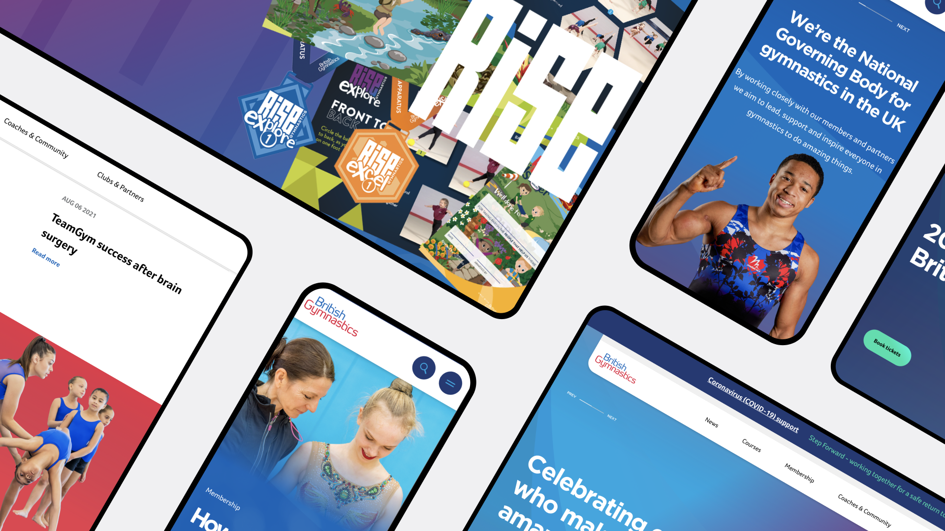
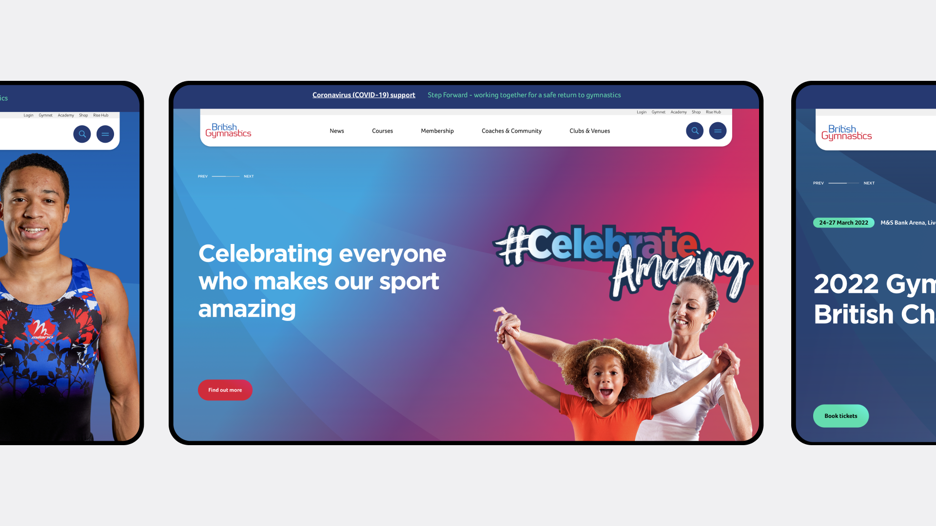
DEPT®’s designers applied the refreshed brand guidelines to create a suite of digital components and style guides which were used to design a fresh, new website for British Gymnastics.
Inspired by the elegance of gymnastics and the shapes gymnasts make when they move, all edges were softened into rounded and curved lines to represent the physicality of the sport and the equipment used. This concept was expanded when designing the website layout by adding tone-down textures that pronounce the curvature of lines and create a subtle 3-dimensional effect.
Bringing people forward
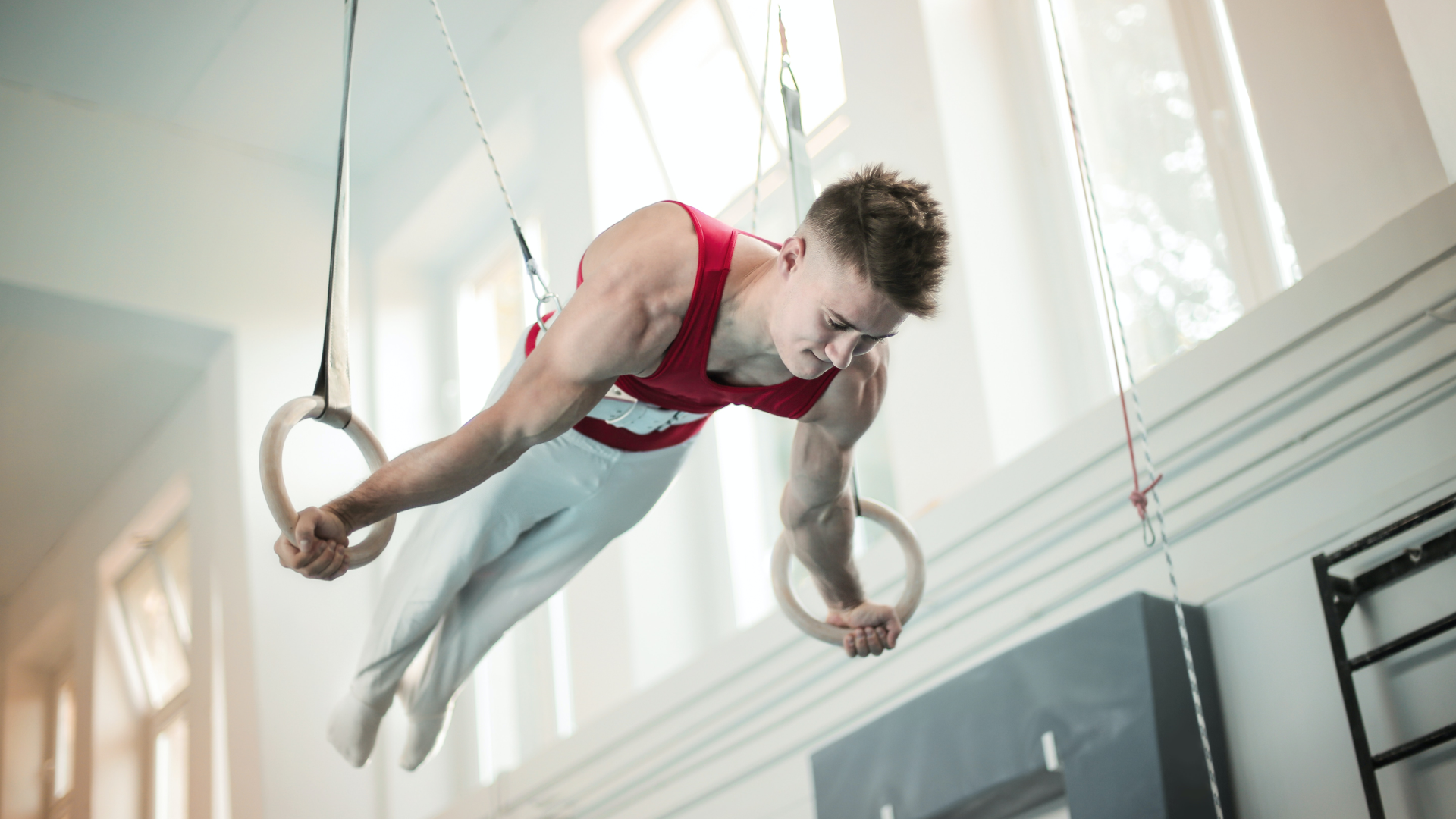
Photography played a key role in the design and was used tactically throughout the website design as a visual storytelling technique, helping to create a welcoming environment for all aspiring gymnasts. The people that make up British Gymnastics and help champion the sport were brought to the fore. Website visitors can take in the emotion from the coaches, dedication from the staff, commitment from members, and encouragement from friends and family. The identity of British Gymnastics became more about the people, and less focused on the network of training facilities and accolades. A diverse range of images are used throughout the site to ensure all users feel represented.
Matching the movement
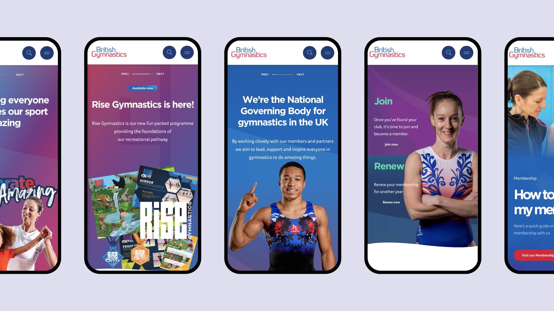
We reflected the continuous, smooth and routined movement of gymnastics when constructing the website wireframes, ensuring an easy to navigate and enjoyable online experience for all users. We drilled down on who is visiting the website and for what reasons. This insight was used to create a set of user personas, which were flushed out in a customer journey mapping exercise. By reviewing the previous website sitemap and analytics, we managed to significantly reduce the number of web pages from thousands to hundreds; minimising pain points and creating a more direct path to the information users want to access, in their preferred format. For example, the flow for coaches was streamlined into one portal, allowing them to complete courses and fill in workbooks in a central location, without facing distractions from disconnected platforms.
Launchpad for the Olympics
The events section of the British Gymnastics website is one of its most popular, highlighting non-competitive meets all the way up to international tournaments. It’s where results are broadcast and awards are announced. Leading up to the 2020 Tokyo Olympics, DEPT® created themed templates and designed a content hub around the games to profile members of Team GB, host handy guides and schedules of events, as well as communicate updates in real time. This area also acts as an information source to share news coverage, interviews, podcasts and live-action photos. Engagement was a big focus; British Gymnastics released activities and challenges to encourage clubs and Leisure Centres to join in on the excitement leading up to and during the Olympic games. All of these resources became available on-demand and gymnasts that participated the most were awarded medals.
Winning with teamwork
British Gymnastics turned to DEPT® to finesse its website ahead of the 2020 Tokyo Olympics to reflect the skill and aptitude of its world-class athletes, aiming to inspire all gymnasts and fans. We collaborated with its in-house team as a creative partner, brought in to oversee the new look and feel of its digital presence. Its new brand guidelines, user-experience maps and design modules empower British Gymnastics to maintain its refreshed identity and take it to the next level.
To bring the designs to life, we co-created the website; DEPT® took the lead on the front-end and British Gymnastics’ in-house developers created the functionality in the back-end. We used a technical approach involving Next.js React Framework and Storyblok to manage content effectively. Together, we ensured the website performs like an Olympic gymnast: reliable on all stages, maintains a continuous flow, and executes creative flair seamlessly.
Questions?
VP of Growth, Experience and Engineering
Lizzie Powell
Discover more
