Salesforce Page Designer – design engaging experiences without coding

Case study – Bugaboo
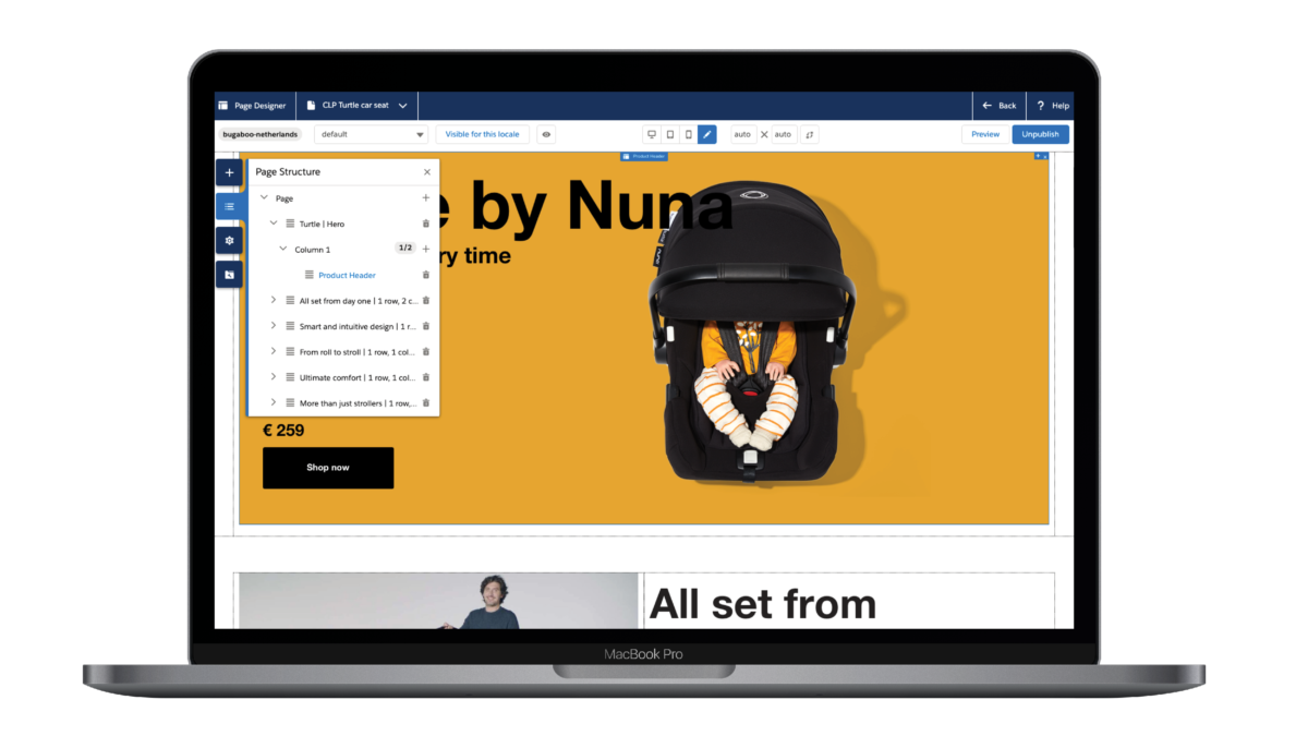
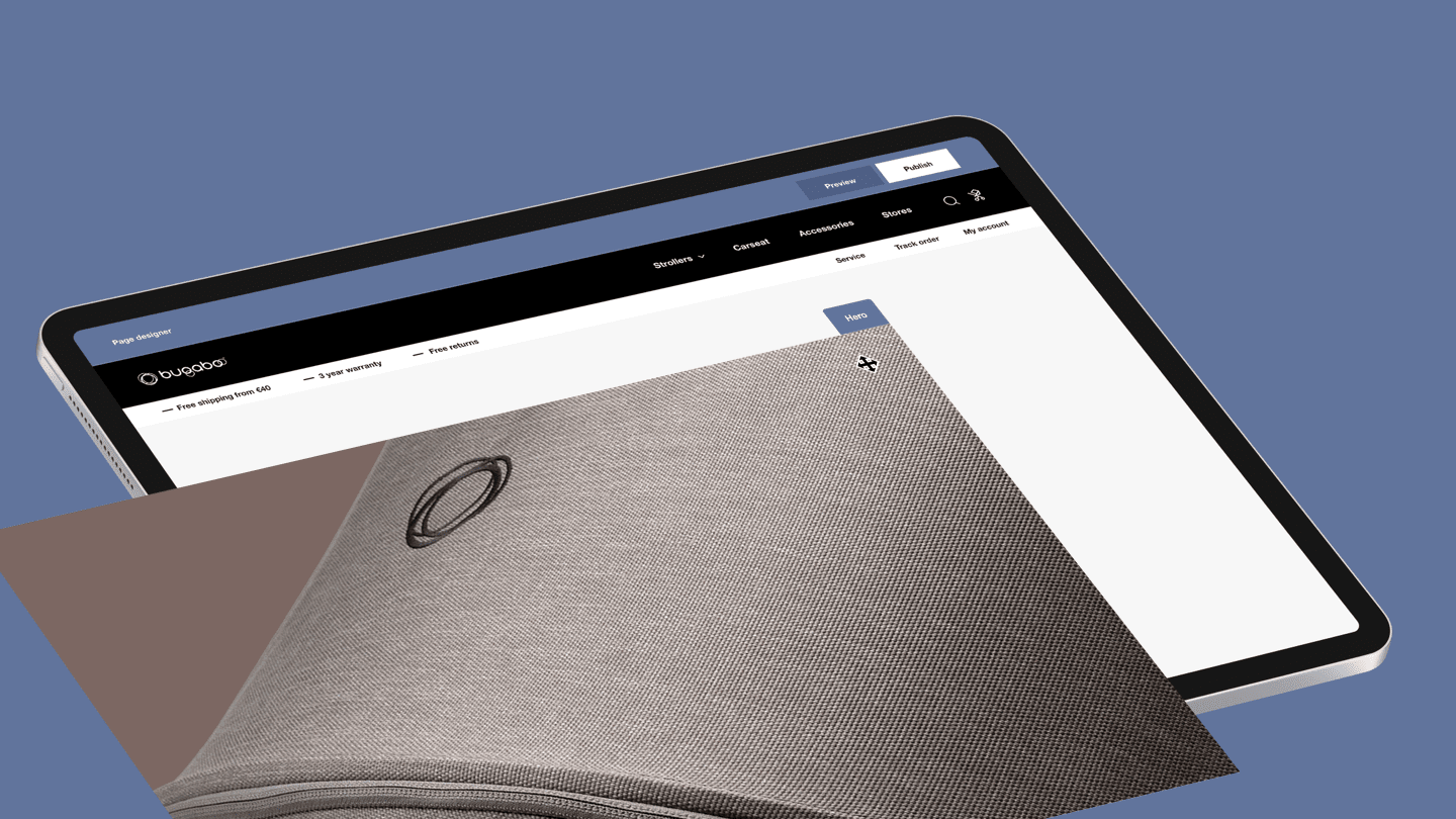
Bugaboo, the Dutch-based stroller company, wanted to reduce its website’s architectural complexity. So when we helped them migrate to Salesforce Commerce Cloud (SFCC), our team used Page Designer to create their new website since this tool is more user-friendly and makes it easier to update and edit components in the future. The new feature made building a website more straightforward thanks to its easy drag and drop components in addition to its visual nature. Our team could see exactly how a page would look and could switch at any time to different view modes to ensure all components displayed correctly as they worked on a specific page. This also made working together with the client simpler since they could see live previews of what our designers or developers were doing.
Bugaboo component
The power of Page Designer is that components can be reused in multiple layouts. Specific layouts have been built for Bugaboo varying from a row with one to four columns, carousel, FAQ and grid layouts. These layouts are ideal for components like slide, video, highlight, product tile, etc. As not all components are compatible in all layouts, Page Designer allows us to limit the options where needed.
For each component, we defined a specific set of attributes so that content managers can fill in items like titles, images, colours, headings and position themselves allowing for an enormous variety when it comes to the look and feel of a single item. This kind of variation makes Page Designer a very flexible tool to work with.
Transactional pages
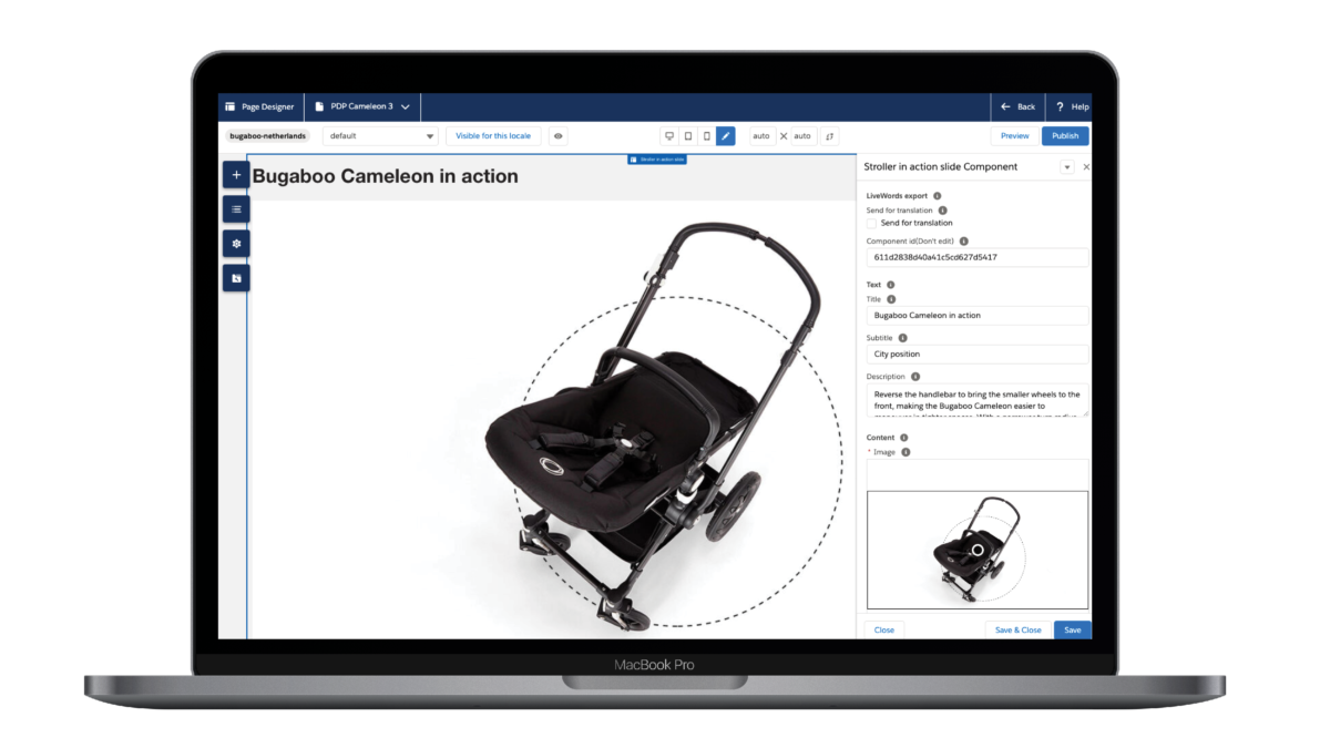
One aspect to keep in mind is that Page Designer is designed to be used for brand-oriented pages like your Homepage, Stories page or campaign landing pages. Bugaboo, being a premium brand, needed to create a rich user experience not only on content-oriented pages but also on transactional pages like Category Landing and Product Detail Pages. A good example of this is the Bugaboo Cameleon Product Detail Page which includes basic items such as visuals, price and inventory status. However, the power of this page lies in rich content components like ‘Cameleon in action’ (as shown below) and ‘What’s in the Box’. These elements are part of Page Designer but rendered on a separate page outside of the program by extending controllers and relying on a specific naming convention.

Translations
In total, we created 26 Salesforce Commerce Cloud sites for Bugaboo in various languages using Page Designer. This allows Bugaboo regional merchandising teams to have full flexibility in launching region-specific campaigns or country-specific pages (in their respective languages) and have items available in selected markets.
Just like standard content, this new feature allows for pages to be localised and/or translated. To ensure professional translations, Bugaboo partnered with an external firm. Given the number of pages and iterations being sent to the translation company, an integrated solution was needed and extended to support Page Designer translations in an automated way.
Empowering brands to change
Salesforce has created a tool which empowers brands to design, preview, schedule and publish pages across all device types. By using Page Designer marketers can personalise pages for different customer personas and various regions. Meaning brands can update content and innovate their website at the drop of a hat. The Bugaboo case showed that Page Designer can be leveraged beyond traditional content pages and played a pivotal role in implementing a branded commerce experience on Salesforce Commerce Cloud.
More Insights?
View all InsightsQuestions?
VP eCommerce, Europe


