Din Sundhedsfaglige A-Kasse (DSA) is the Danish unemployment insurance fund that provides individuals security in their work life. Today, DSA offers everything from salary insurance and unemployment benefits to discounts, social events, and more. To recruit students earlier in their careers, DSA joined forces with DEPT® to create a campaign site for their new sub-brand that resonates with this new audience.
Engaging a younger audience
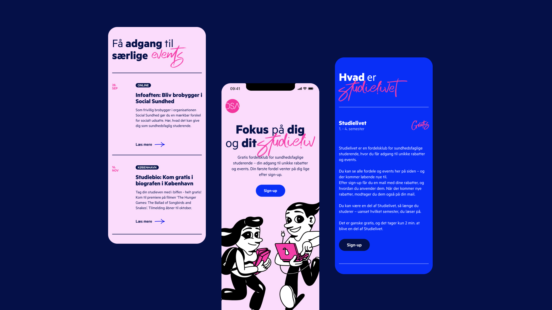
Our challenge was creating a distinctive universe to capture a younger audience. DSA proposed to team up with the Danish artist HuskMitNavn, celebrated for his humorous and political illustrations, to develop an interactive and distinct campaign site that entices students to become a member and enjoy what DSA has to offer. The playful illustrations speak to DSA’s value proposition of making everyday life easier through social events and discounts, when you become a member. Differentiating from traditional and classical cues, the illustrations set out to redefine the way we engage with a young audience, through bold colors and playful characters. We embraced DSA’s identity by sticking to its pink and blue colors. To ensure that the campaign site stood out to students, we showcased whimsical characters in combination with bold colors to communicate a youthful feeling and spark curiosity.


Reimagining DSA’s core elements
We started by exploring the brand and its identity to ensure we would stay true to the company’s basic elements. We came up with concrete suggestions for reimagining the brand’s core elements to reach their desired audience. The drawings set out to resonate with the hectic lives of students. Both static images and animations take the user through a digital universe, informing them about membership options, social events, discounts, and sign-up options.
A youthful campaign site
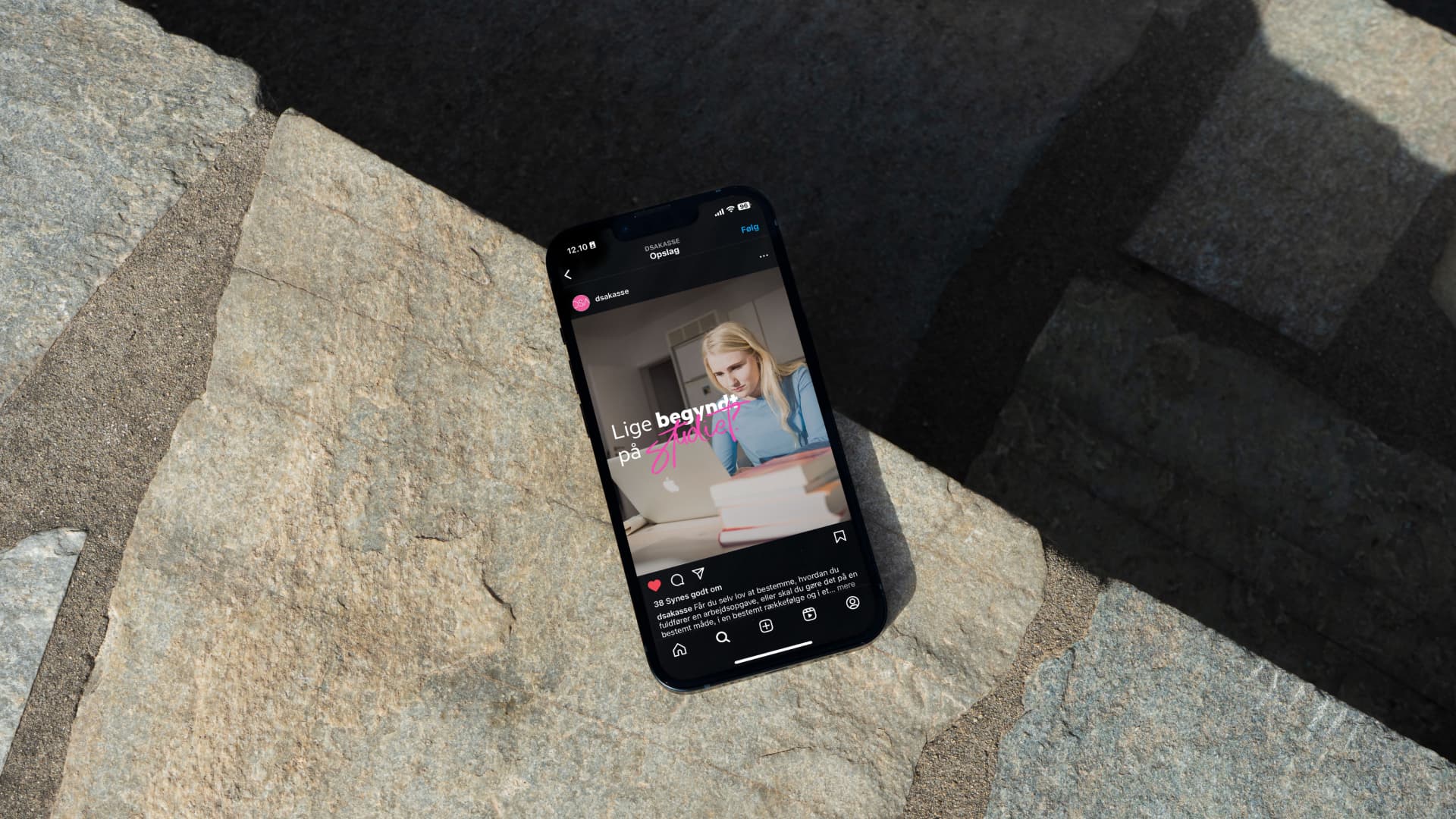
Our DEPT® team delivered a campaign site with a youthful and vibrant expression that sets the brand apart from its classic branding. However, using the same colors and typography, the sub-brand stayed true to DSA. Our collaboration with HuskMitNavn has been key in repositioning DSA and creating eye-catching graphics that speak to students. Together, we created a distinct universe in an efficient and short design process of only 3 weeks.
We met a dedicated and competent team that was ready to get started and work with our idea of collaborating with HuskMitNavn. DEPT® lifted our concept anchors, tied the knots, and almost succeeded in the first attempt to create an independent and clear identity for our new sub-brand that aligns with the parent brand. It was a brief and intense process with a tight deadline, requiring strict management over the summer vacation period. A superbly productive and constructive collaboration
Mie Bertelsen, Project Manager, Studielivet
Questions?
Senior UX Manager
Malene Møller
Discover more


