PetSafe
Unleashing a pet-centric e-commerce experience

( Services )
- Commerce
- Tech & Data
PetSafe sells fences, feeders, and training accessories to dog and cat lovers in the US, Australia, and New Zealand. After years of shifting priorities, they wanted to focus on creating an intuitive shopping experience for their online consumers.
DEPT® worked with them to rebrand, redesign, and optimise their commerce experience, resulting in a 16% increase in conversion rates.
Client-centric approach
Throughout the project, we emphasised a phased approach that balanced discovery with execution.
First, we conducted a comprehensive discovery phase with a two-day design workshop. It helped us understand the competitive landscape, site challenges, e-commerce considerations, and stakeholder needs without wasting too much project time.
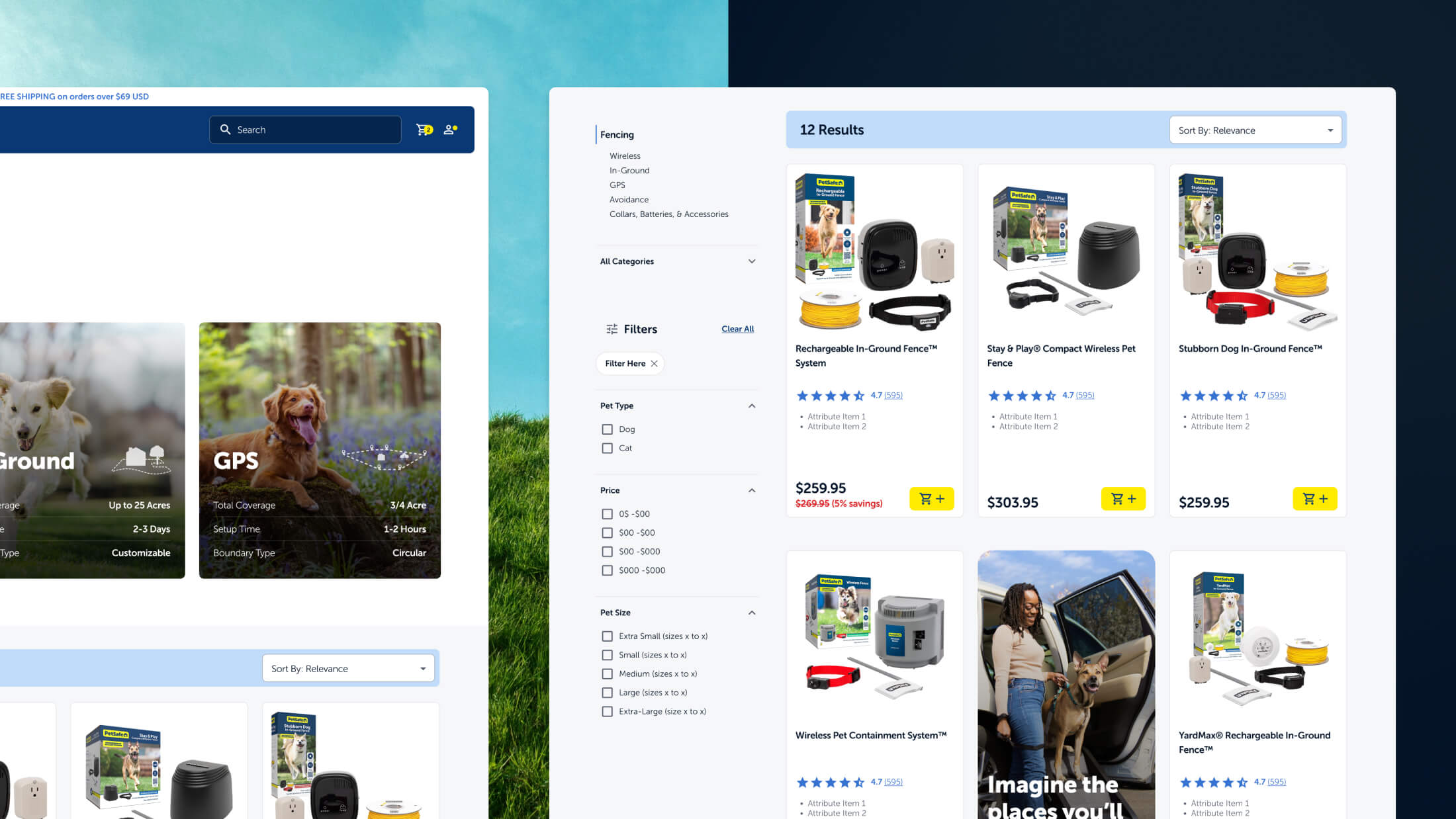
Then, we defined the brand while creating mid-fi page designs. We focused on easy navigation, product education, and a tailored e-commerce funnel while staying true to PetSafe’s brand identity.
Our project management process combined Agile principles with Scrum for timeline tracking. Closer to the launch date, it transitioned to Kanban to quickly address issues. To promote open communication with PetSafe, we favoured working sessions over formal presentations and encouraged shared Figma ownership.

Solution-focused vs. product-focused architecture
For most e-commerce experiences, information architecture leads with product categories. In PetSafe’s world, a product-focused architecture would translate into a top nav with options like Fences, Leashes, Fountains & Feeders, etc.
But after speaking with cat and dog owners and understanding how they shop online, we quickly realized there was a better approach. Pet owners wanted solutions to their problems rather than a list of products.
So we pivoted to a solution-focused architecture that funneled users into dog and cat categories. After successfully selecting their pet type, they are presented with pre-filtered products. By organizing products this way, PetSafe helps users find what they need quickly without browsing irrelevant products.

Design, development, and SEO
This comprehensive commerce project united several initiatives, including branding, web design, development, and SEO to deliver a commerce experience that guided customers through a seamless journey.
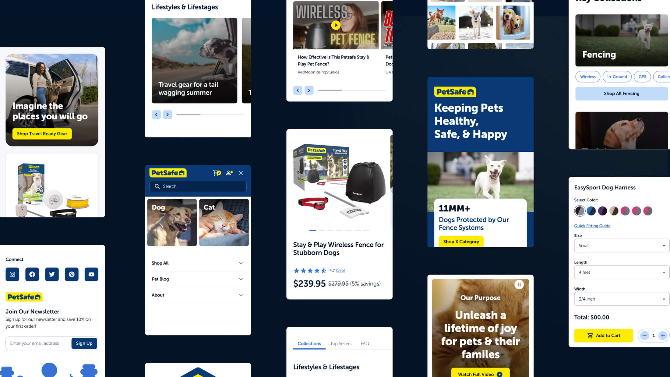
To streamline the user experience and boost sales, we prioritised a mobile-first approach, revamped the navigation, and improved the user interface. An SEO strategy from the get-go resulted in traffic performance, and new technical elements drove high conversions.
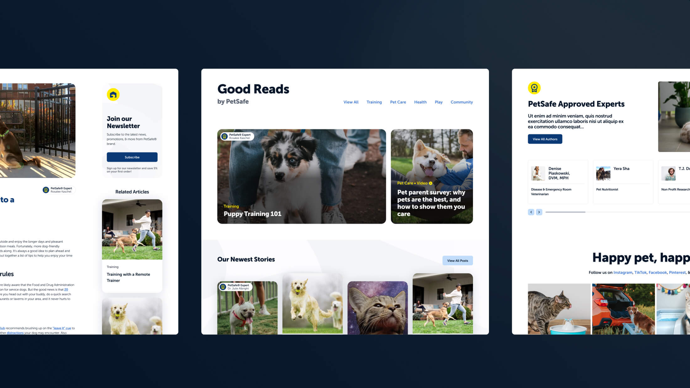
We leveraged Sanity CMS and Shopify Plus to allow content editors to easily update the site with new products, product info, categories, related or similar items, UGC, and educational articles for pet owners.
This combination of design and marketing work enabled us to launch a refined and contemporary shopping experience that revived revenue streams.
The website has already exhibited remarkable SEO, performance, and sales improvements. The transition to the new content management system has also resulted in an immediate boost in productivity for content managers.

-
+16%
conversion rate
-
+12%
average order value
-
+30%
revenue per visitor
