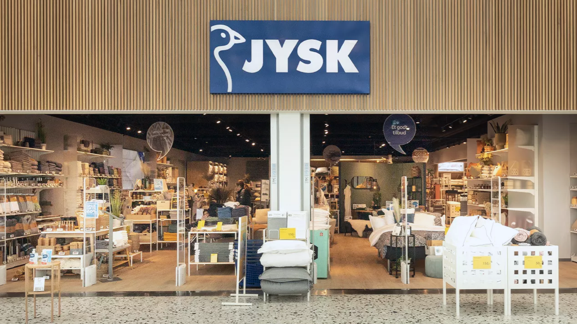
JYSK is the largest Danish retail chain, delivering Scandinavian design with an extensive offering of household goods, such as furniture, mattresses, and home furnishings. Since being founded in Aarhus in 1979, JYSK has built an overwhelming international presence, operating in 49 countries with over 3,100 stores. This project was done for JYSK Baltics, which is a franchisee of the global JYSK corporation and operates in three countries: Latvia, Lithuania and Estonia.
The challenge: increase conversions
DEPT® and JYSK Baltics have been working together for several years, mainly focusing on SEO and paid advertisement. Recently, the company approached us to discuss how to improve their conversion rates. DEPT®’s Data & Intelligence team in Copenhagen stepped in to give these markets a helping hand and the extra boost they needed.
Our aim was to identify areas of improvement and provide JYSK with comprehensive insights backed by data. An initial analysis outlined that conversion rates were suffering, primarily due to post-covid shopping behaviour, a tendency to move purchases away from the website and back to the physical shops.
DEPT®’s mission was to find the biggest hurdles and opportunities in the user experience that we would be able to A/B test within the given period and budget, to bring JYSK Baltics back up to speed.
A thorough website audit
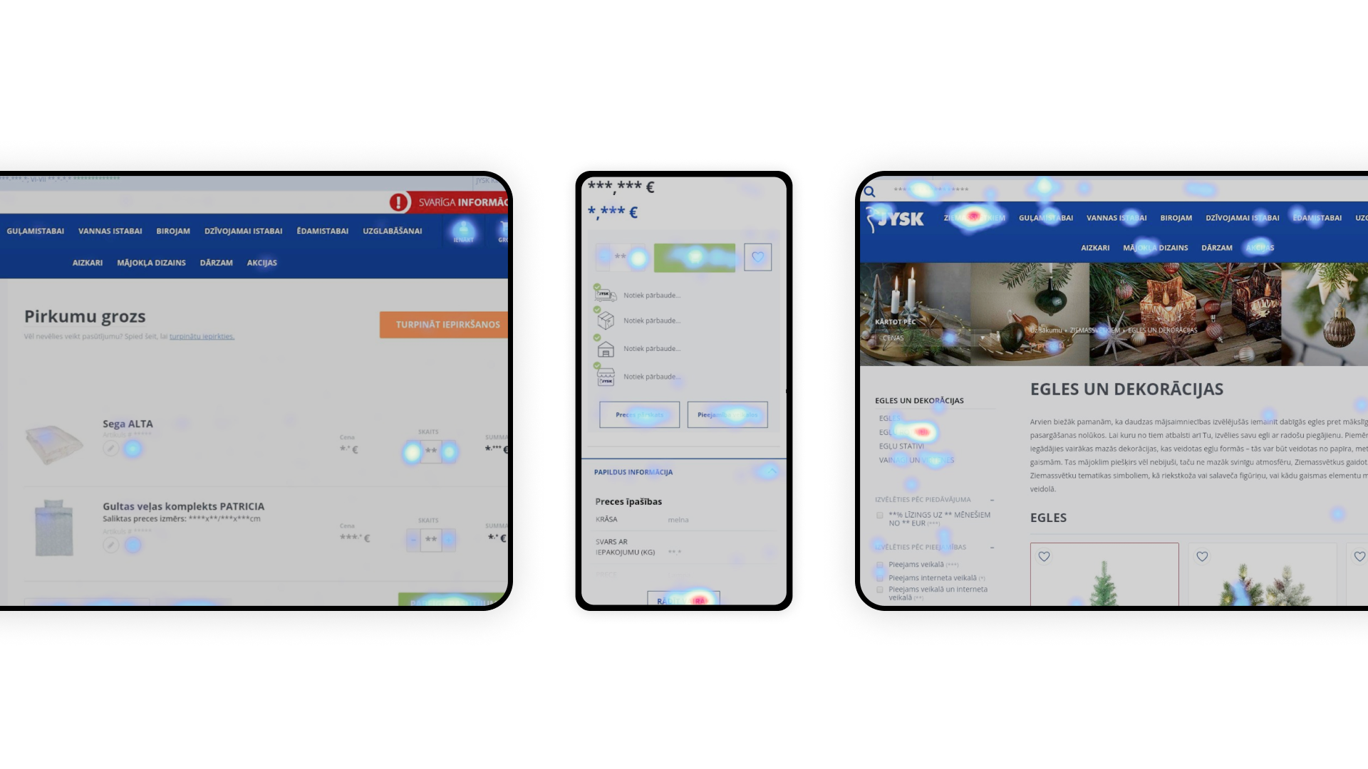
Adopting both a quantitative and qualitative perspective, we embarked on a meticulous CRO audit to pinpoint the most important areas for optimisation. Using Google Analytics for all data insights, we explored which pages revealed the highest drop-off rates and examined how users navigated the checkout. We also used Hotjar to help visualise some of the data we tracked in Google Analytics through heat maps, scroll maps and session recordings. Combining insights from both tools, we were able to identify small, but nonetheless significant bugs and uncover missed tracking opportunities.
Through a scrutinous inspection, we were able to provide JYSK with structured findings based on page types, usability issues and where the website deviated from best practices. This resulted in a backlog of dozens of ideas, helping us to identify where to start and what to test during the pilot phase. Finally, we prioritised the initiatives based on how quickly we could get the tests running and how much impact they would potentially have on the business.
The solution: learning through testing
By following the pivotal steps to highlight potential weaknesses in JYSK Baltics’ online sites, we were able to target our CRO efforts accordingly – using testing to do so.
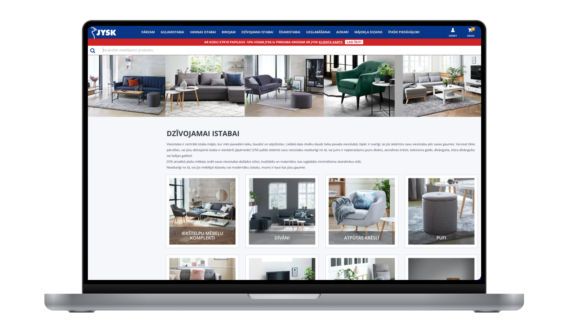
We ran several tests on different areas on the website. These included high-traffic areas, such as the homepage, sitewide tests affecting all users and the checkout page.
With the help of Google Optimize to code and run the tests and Google Analytics to analyse the results, we were able to detect significant positive effects on a specific segment, namely desktop traffic, for two of the tests. Other tests revealed strong tendencies towards improving the user experience for mobile users.
Working with different specialists at DEPT®, bringing together designers, front-end developers and data specialists, we delivered holistic CRO support, from conceptualization, design, implementation, testing, and analysis.

Promising results
The success rate of our A/B tests was above benchmark, at 50%. Even the tests that “failed” provided us with valuable data, so there is no real “loser” when it comes to testing – quite the opposite, in fact. The overall results were very promising (see below) and indicated a staggering 3000% potential return on investment to be gained from implementing the learnings.
Best practices validated
The audit phase revealed potential to adapt the site to some common UX and e-commerce best practices. While these still need to be tested, we could prove that some of these best practices work well for JYSK Baltics and that there is potential to make further adaptations in other areas of the website.
Desktop outperformed mobile in tests
The majority of tests during the pilot phase showed a stronger positive impact on desktop users. While websites often still focus on delivering the same experience across devices, analysing our tests for different segments has revealed that not one size fits all and concepts and designs need to be created with the end user’s device-specific needs in mind.
Clear USP
Tests focused on increasing transparency in communication and removing distractions were found to have the highest effects for JYSK Baltics, giving buyers a better user experience, which consequently leads to increased sales.
No distractions
Another best practice is to ensure the user has a clear direction to follow in the checkout flow. So we removed almost all available clickable items within the checkout header and footer, keeping only what supported the user’s decision making (and, of course, the legally required items). This led to another significant increase in conversion rate for desktop traffic.
Close collaboration and multidisciplinary approach
A non-technical but nevertheless essential reason for the success of this project comes down to work processes and it is twofold: first of all, we worked in close collaboration with JYSK Baltics and were given a high degree of autonomy, which made the decision making process fast and pragmatic. Second of all, we took advantage of our internal team of experts to execute on the project from multiple perspectives, so JYSK could rely on us for the full range of expertise needed.
Want to improve your website’s conversion rate? Check out our CRO services.
Questions?
Senior CRO Specialist
Ulla Wendel
Discover more


