It’s said that a picture is worth a thousand words. This is why AVINA Stiftung chose to redesign their website in a more visual manner in order to convey the importance that change must happen in our food chain by supporting forward thinking ideas and pioneering minds.
A website meant to inspire action
AVINA is a Swiss foundation established in the 1990s that funds ideas aimed at revolutionising our current food system. The foundation turned to DEPT® to provide them with a central hub through which pioneers could find out more about the foundation and apply for grants. Based on the foundation’s manifesto, we redesigned the entire website and produced two videos that project AVINA’s message to the world.
Transforming the brand identity into digital elements
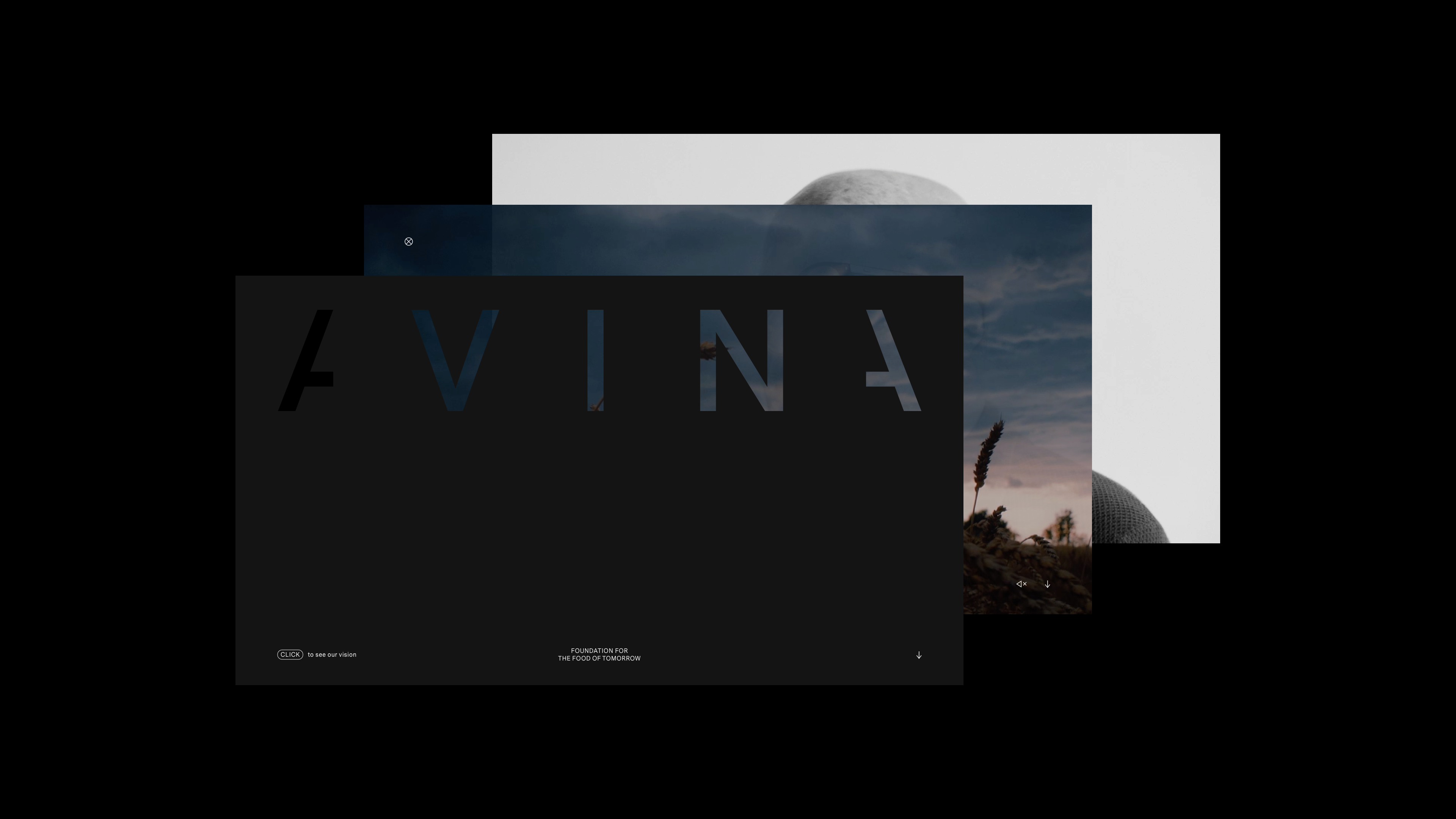
Our source of inspiration for this project was the foundation’s logo and brand identity. Some of their core values are transparency and openness. These were the two themes which guided our design choices moving forward. We also purposefully chose to keep our design minimalistic which is why it consists of only a handful of pages. This way, a user can quickly understand what AVINA stands for and then apply for a grant with little fuss or obstacles.
A design that goes against the norm
A user may be surprised as to the darker colour palette, however, this was done on purpose to go against the norm. Rather than a white minimalistic site with a lot of text, the black background is a bold move that highlights all of the typography while also ensuring that the video content pops and entices website visitors to click on it. In addition, the cursor is a circle to symbolise the circularity which AVINA is aiming for.
The core of the website
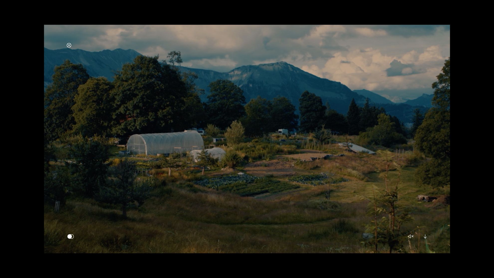
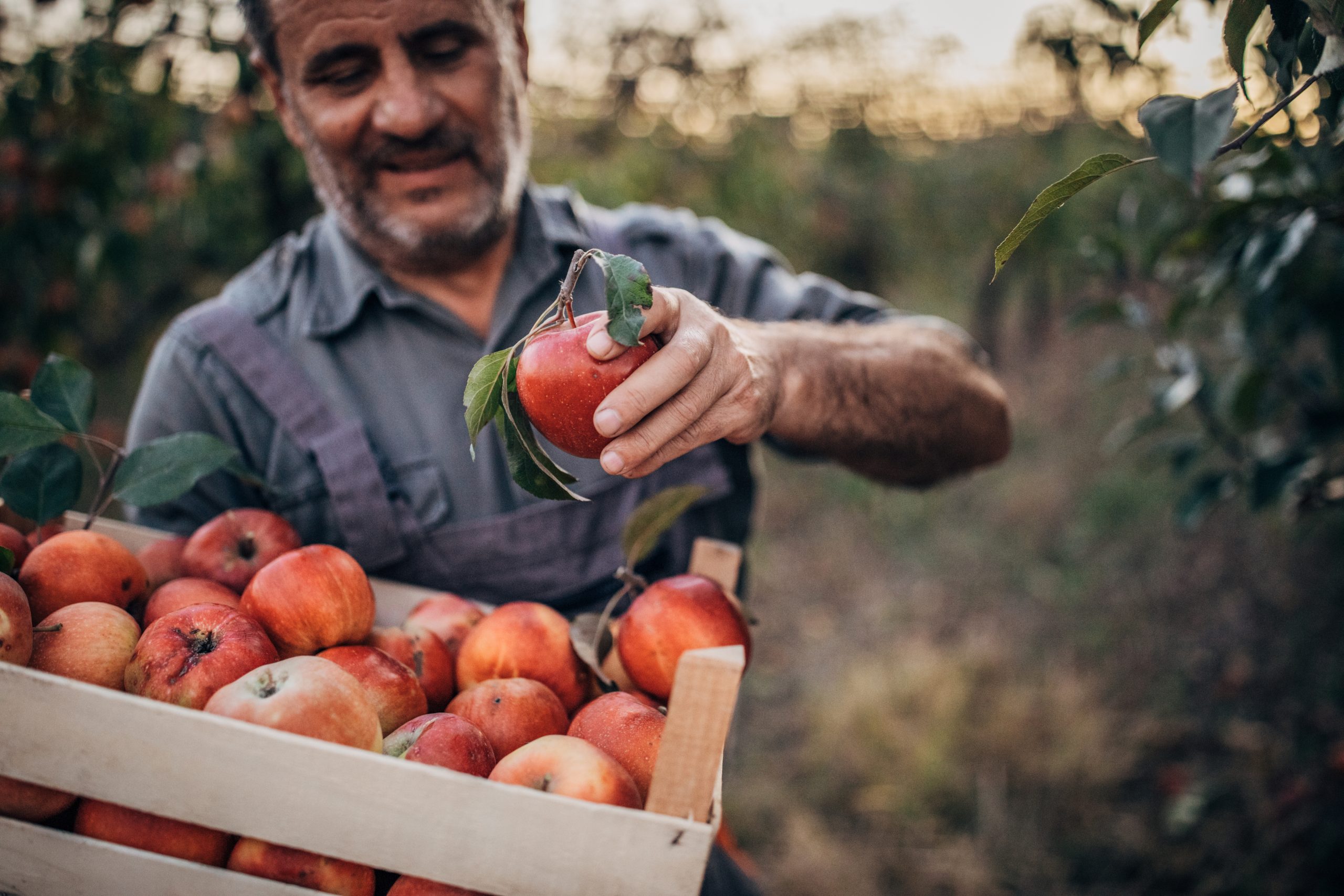
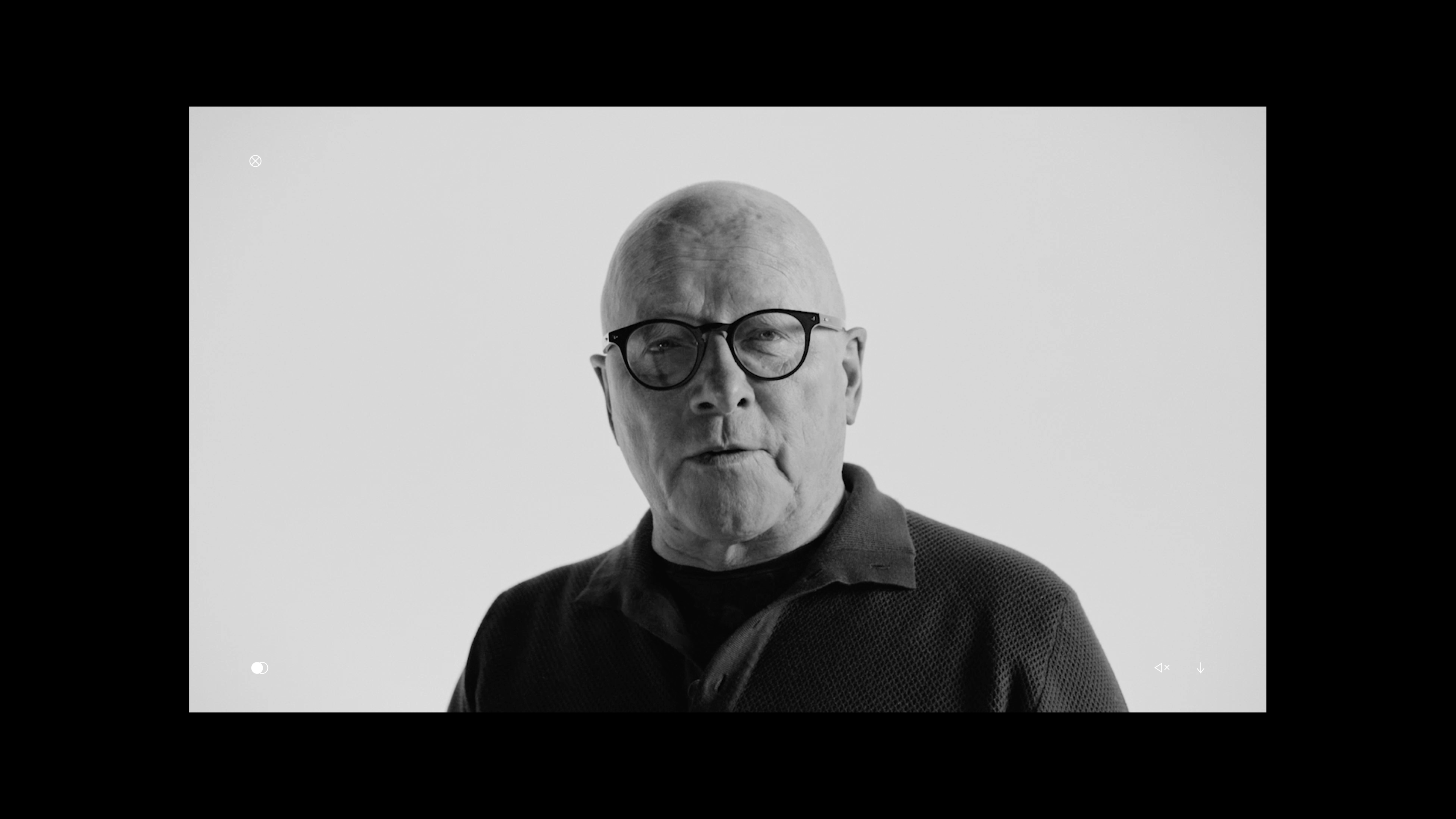
The heart of the new website is the AVINA manifesto. This is what guided our production choices when filming the videos. We travelled around Switzerland to get footage from some of the leading research institutions, capture breathtaking nature shots as well as scenes from everyday life. The video plays simultaneously to a recording of the founder Stephan Schmidheiny reading AVINA’s manifesto.
When a user lands on the AVINA homepage, both videos will play and depending on how the user navigates either one or the other will be displayed to the user. The two clickable and changeable video layers showcase AVINA’s openness and transparency and invites the user to look behind the scenes.
Inspiring and guiding users towards a better world
AVINA Stiftung wanted a new platform that inspired change. Therefore, we delivered a new website which captures this desire and makes it tangible. We created a simple website whose appearance makes a bold statement yet remains simple to navigate so as to not overwhelm the user with information. Crafting a website worthy of food for thought doesn’t have to be difficult, in fact, sometimes simplicity is the answer.
Questions?
Creative
Valentin Baumann
Discover more
