C&A is one of the leading fashion companies in Europe, with over 1,300 stores and 25,000 employees across 18 countries. Every day, over 2 million customers flock to its physical stores, or visit its online site looking for high-quality fashion at low prices. C&A turned to DEPT® to review and refresh its technical architecture in line with its extensive rebrand.

Flexibility and scalability – key factors in a digital world
The collaboration between C&A and DEPT® began in mid-2020. Initially, we were tasked with maintaining and further developing the front-end of the previous online store. However, the monolithic e-commerce platform it was built upon was unfortunately restricting the retailer’s digital growth. In today’s digital world where user expectations, trends, technology, and broader market factors change so quickly, a flexible and scalable system is key for companies who want to act instead of react.

From a monolithic platform to a headless microservice architecture
C&A needed a customer experience platform to act as its central digital touchpoint and support omnichannel consumer journeys to ensure a seamless shopping experience. The retailer had already developed an innovative architecture concept, and planned to replace its legacy platform with an edge-based, headless microservice architecture with SPA front end. Together with C&A’s in house teams, DEPT®:
- developed an agile product strategy and roadmap;
- set up a cross-product design system;
- developed new front- and backend components;
- implemented a new, modern technical architecture.
Product strategy and roadmap
To effectively pursue the goals of C&A’s digital strategy, as well as the overarching business and brand strategy, DEPT® worked with C&A’s Product and UX team to develop a medium-term, agile product strategy for the new online store.
We first developed data-based customer value propositions for the target groups of the online store. We mapped out an ambitious Webshop Vision Statement 2024 as a landmark for the product team. Together with C&A, we set strategic milestones and defined associated key results, to ensure the online store’s success is continuously measured and can be made visible to key stakeholders at any time.
To bring the online store strategy to life, we set up an agile workflow that leads directly to a dynamic, strategic product discovery and roadmap. Since expectations and impulses around digital products change at lightning speed, the online store will be strategically reviewed in regular alignments in the future.


Collaboration and process
From the very beginning, DEPT® established a broad collaboration with various stakeholders at C&A – from brand and marketing teams to IT and research units. This was an important basis for the success of the project, as it enabled a common understanding of how brand purpose and brand value propositions could be translated into the digital realm. Possible solutions based on consumer insights were developed with the help of collaborative ideation and co-creation sessions, and the results were tested using interactive prototypes. In order to routinely generate ideas for new functions and services in the future, the collaboration between the C&A user research team and the product managers was integrated and intensified – a new power force that will not only further develop the online store in a user-centric manner but also make it more innovative.

Architecture and technology
The technical solution conceived by C&A was further elaborated and implemented together with DEPT® to create a microservice approach. This scalable and flexible infrastructure enables optimal time-to-market performance, and enables personalised offers, content, and services to be delivered to the users. At the same time, the solution can grow seamlessly with future requirements.
Due to the complexity of the project and the associated complete renewal of the architecture, the development of the new online store was divided into several stages. Stage 1 included the redevelopment of the store frontend for the customer journey up to the shopping cart, as well as the introduction of a new backend. Both components are hosted “on the edge” on a high-performance and scalable serverless infrastructure from Cloudflare. The generation and delivery of content to users is done via a worldwide CDN (Content Delivery Network), with thousands of nodes.
A new, modern headless CMS became the central tool for content maintenance across multiple channels such as the online store and the C&A app. Because the backend and commerce engine remained unchanged in Stage 1, interfaces to the legacy system based on GraphQL were developed in collaboration with software company novomind. This enables the parallel operation of old and new technology, and conducts ongoing A/B tests for 10% of the users. The connection of these APIs and all other third party systems like Reco-Engine, PIM, etc, takes place via a newly developed gateway, which provides the data in a consolidated form to the frontend; a modern and server-side rendered single page application based on React.

Product design, user experience and content
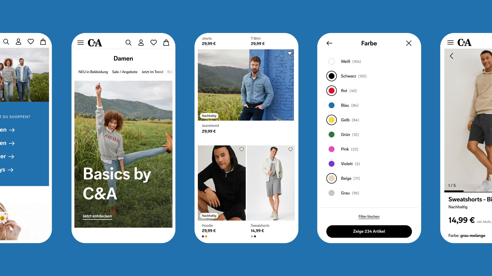
The entire user journey through to checkout was redesigned. A comprehensive set of content modules provides space for engaging, inspiring content that embodies freshness and modernity. Large-scale images and strong portraits combined with close-ups create an emotional connection, while striking typography succinctly brings user-relevant content to the point.
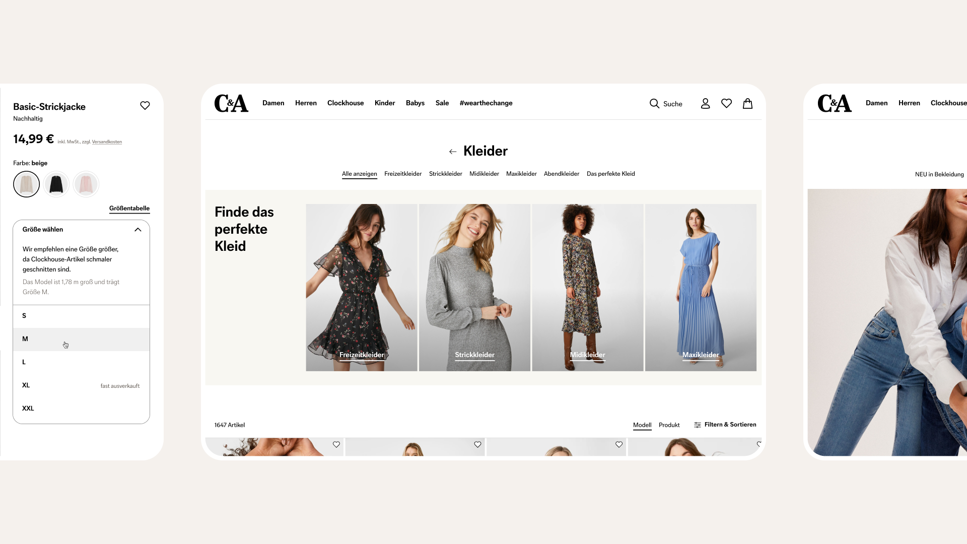
The header is now cleaner and clearer; there is a new navigation concept for the mobile and the desktop versions. New and more balanced product listings provide a better overview and support the user to make an informed buying decision.
Easy-to-understand labels and a focus on sustainability communicate the brand promise and good value for money. A user-friendly filter gives customers the most important options directly at their fingertips. The products on the details page now have a new arrangement, with a clearer buy box and integrated size advice, helping to underline the modern look and feel of the new platform.

The design system as the single source of truth
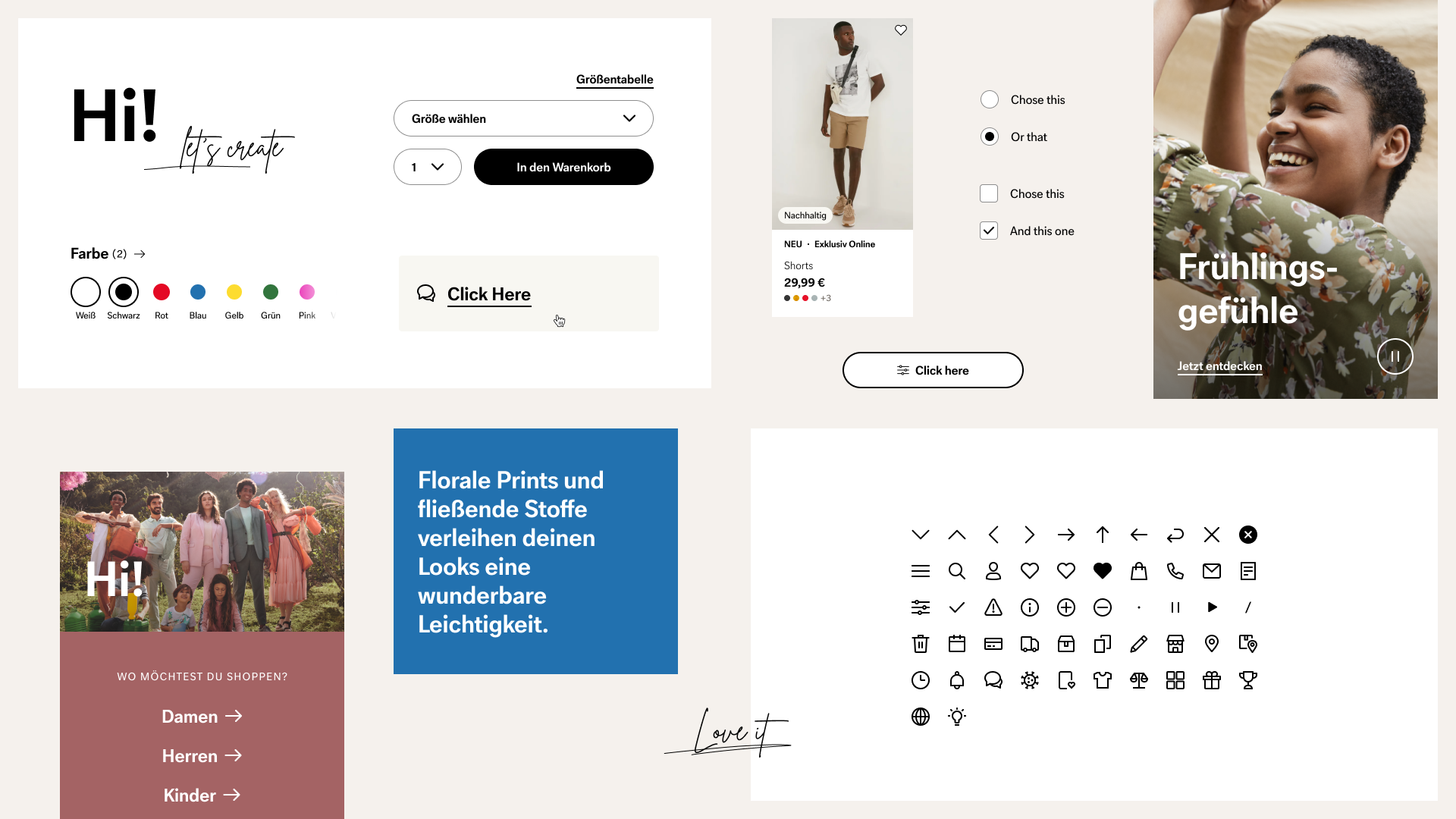
Built from scratch, the new C&A design system is a living digital ecosystem that grows and changes in symbiosis with the e-com products. It enables teams to develop a consistent experience for users as the new single source of truth for a common digital language. This increases efficiency and strengthens cross-functional collaboration, even for external partners. In a collaborative approach, our product design team worked closely with the client to develop and define the overarching guidelines such as digital branding basics and content principles. Shop-specific foundations, components and UX patterns are provided with guidelines and numerous best practices to offer the best possible orientation and guidance for a consistent experience.
Together with DEPT®, the strong partner at our side, we have built a state-of-the-art webshop. The new platform fulfils the wishes of our customers, reflects the modernity of our brand and forms the basis for our ambitious growth targets.
Ulrike Otto, Head of Digital Experience, C&A
Questions?
Managing Director


