The power of good friction: Two brands pioneering brand recognition & loyalty through e-commerce

In marketing and UX, friction might as well be a curse word. Slow-loading pages, obnoxious form pop-ups, or a seven-step checkout process? Forget about it.
But, sometimes, there is such a thing as “good friction.”
Friction, when used strategically, can be a powerful tool to slow down visitors, create meaningful interactions, and reinforce a customer’s decision to buy from your brand.
Deprioritising friction on your DTC site
Sure, your DTC site needs a relatively frictionless user experience. Easy navigation, a simple checkout process, a clear customer journey, connected channels, and responsive customer service. Who hasn’t heard that any friction in the customer journey will send consumers running?
But here’s the thing. Regardless of how seamless your site’s technology is, you can’t compete with platforms like Amazon when it comes to cost, speed, and convenience.
So, the goal shouldn’t be to replace Amazon as a sales engine, but to embrace the role of your e-commerce site as a brand-building platform. By focusing on building brand recognition, loyalty, and love, you can ultimately drive more sales in the long term through personalised experiences and customer engagement.
Let’s explore two examples of brands whose e-commerce sites utilise good friction and storytelling to engage visitors in a positive way.
Patagonia
Patagonia, a beloved outdoor apparel and gear brand, is known for its commitment to sustainability. Its values are a major part of the brand identity, but if a shopper is buying a Patagonia sweater from REI or hat from Amazon, for example, those values don’t always necessarily come across.
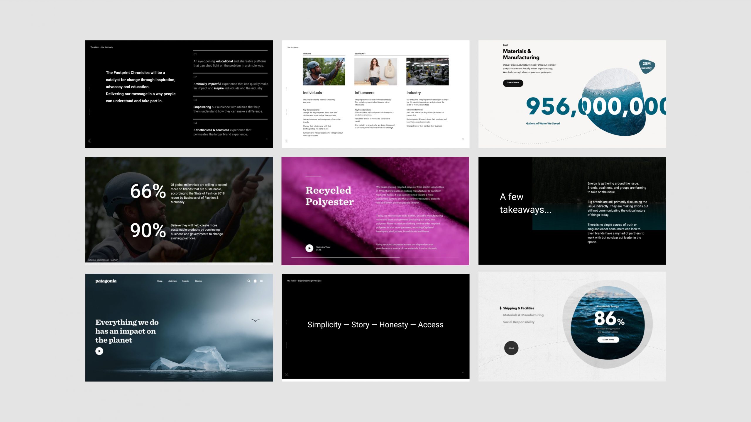
By collaborating with Patagonia to reimagine its e-commerce platform, BASIC/DEPT® created an easy-to-navigate, personalised, and purpose-led user experience. As part of the partnership, we also brought the brand’s Footprint Chronicles initiative to the site, implementing cards on product detail pages that educate shoppers on how products are made and their impact on the planet.
While it may seem counterintuitive to make consumers pause and reconsider their shopping habits just before potentially making a purchase, this element of friction has a much longer-term value. Although shoppers may have a more “out of sight, out of mind” experience shopping the brand’s products through other sellers, this thoughtful use of content-based friction utilises the brand’s owned platform to showcase its values—prioritising sustainability over sales—highlights their commitment to transparency, and builds trust with shoppers who increasingly want to see brands practice what they preach.

Bicycle
For the average consumer, playing cards are a spur-of-the-moment purchase. Grabbing a deck from 7/11 on the way to a game night. Throwing a set in your Amazon shopping cart as you prep for family vacation.
While most people probably aren’t going to a card brand’s website to buy a simple deck from, that doesn’t mean nobody is, or that site doesn’t serve other purposes.
That’s why DEPT® and Bicycle Cards built the brand’s site to not just promote products but to celebrate its history and establish itself as a leader in playing cards. The site appeals to its most loyal and interested customers, including collectors, magicians, and design lovers.

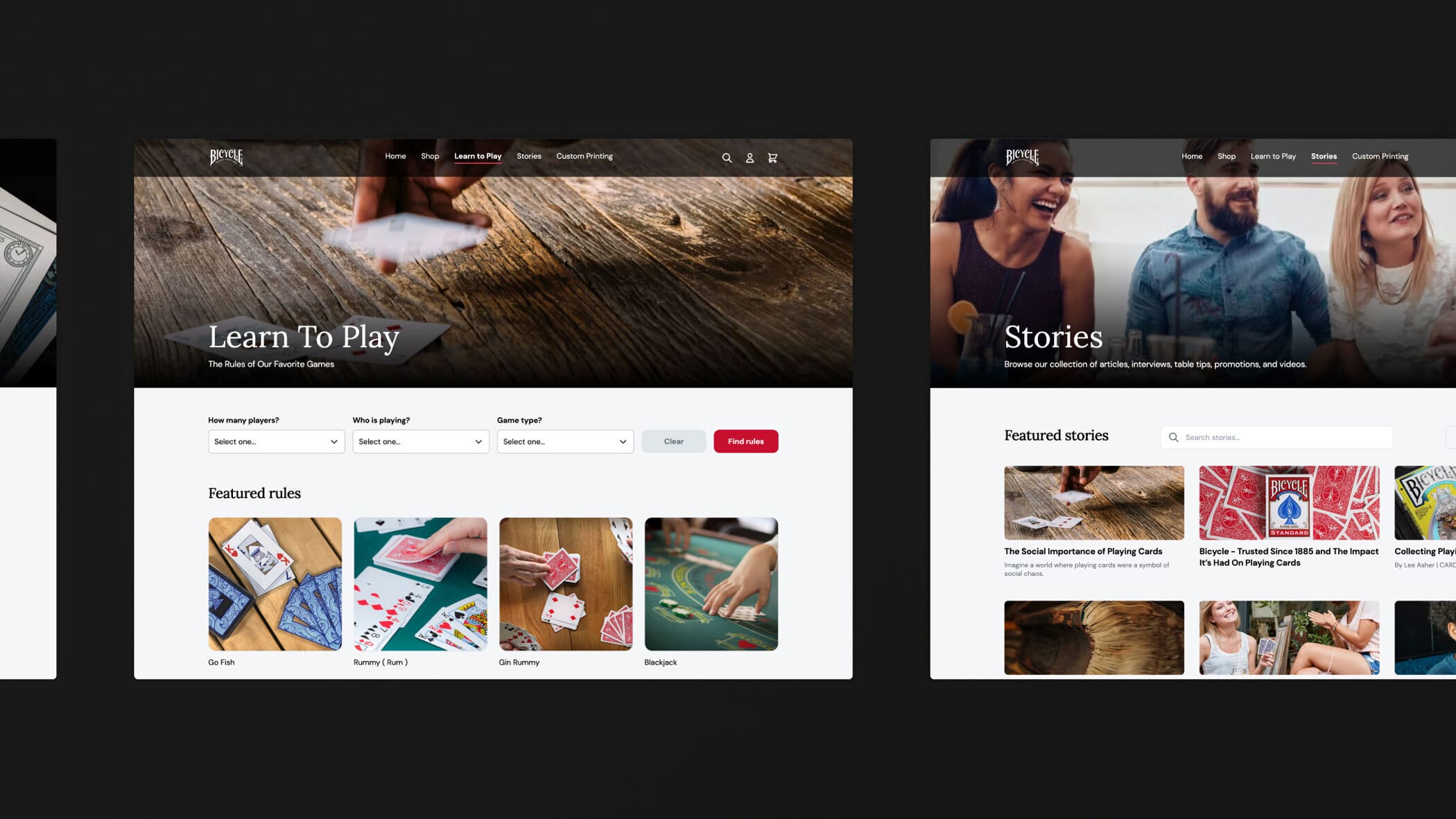
Rather than display its most traditional (and likely most popular) decks front and center, the site highlights its limited edition decks, bundles, and new releases. It also features a vast library of content including articles and interviews, as well as gaming rules that users can search for by number of players, who is playing, and game type.
While the site may not be the brand’s number one sales channel, it allows the brand to gather highly valuable data from those who do make purchases or simply browse its content. Even if visitors don’t make a purchase on the site, the platform’s focus on providing a helpful and entertaining experience to users helps ensure that when someone does need to buy cards—whether from a retail store or a third-party seller—they’ll think of the brand.
Memorable experiences over immediate conversion
Both Bicycle and Patagonia are examples of owned sites where conversion and sales are not always the primary metrics of success. Instead, delivering a unique and memorable experience takes precedence. By slowing down visitors with personalised content, storytelling, unique visuals, and purpose-driven initiatives, brands can gather deeper insights about their audience and use that information to drive sales through personalised communications, targeted ads, and retail media.
In the world of DTC e-commerce, building brand recognition and loyalty is just as important as driving immediate sales. By embracing good friction and focusing on delivering unique experiences that users can’t get from other platforms, brands can create lasting connections with their audience.
