Louisiana
Bringing art to life in a digital manner
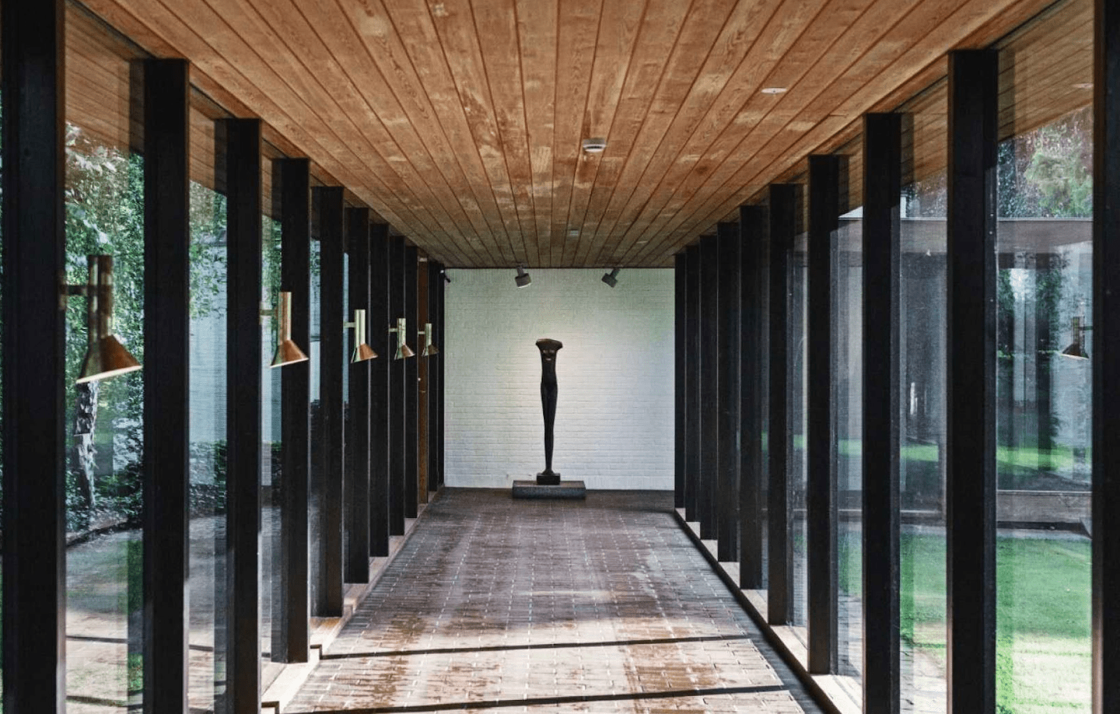
The Louisiana Museum of Modern Art is a leading international modern art museum and a top attraction in Denmark. Art, nature and architecture are combined to create a unique experience that attracts visitors from all over the world. However, the art museum didn’t feel like its website captured and reflected this experience so they asked DEPT® to redesign it in order to provide users with an elevated digital experience.
A website that reflects the uniqueness of the Louisiana
Louisiana’s collection of Modern Art dates from 1945 to the present day and contains more than 4,000 works of art, both paintings and sculptures. However, the museum is famous for more than simply stunning artwork, from the building’s location and architecture to its playful children’s wing, its the 360-degree experience which makes one’s visit memorable. But the museum’s current website did not echo this unique physical experience. So we created a clean and minimalistic new site which showcases that the museum is full of life and allows important information to stand out, much like colours on a blank canvas.
A new website which communicates the holistic experience of visiting the Louisiana museum
Conducting consumer research to decipher priorities
The museum’s website had been around for quite some time and the client had lost track of it. The interface had become cluttered, by trying to communicate everything all at once, the website ended up sharing little with a user that often felt bombarded with information. So, to kick off the process, we started with an analysis which would enable us to make concrete recommendations for the museum’s future website. We researched user needs via surveys, interviews and by looking at Google Analytics. Based on this information, we helped the Louisiana define business goals and clear objectives for the website which were inline with the museum’s overarching strategy.
Our consumer research illustrated that the new website needed to convey the uniqueness of the Louisiana experience, excite the visitor while also supporting and improving the actual visit by providing tailored content for various users. It also highlighted ten user persona’s which enabled us to create different user journeys and prioritise some user interactions over others.
A website which entices users to visit
Once we understood the various user journeys and pain points, we began working in an agile manner to redesign the front-end of the website section by section.
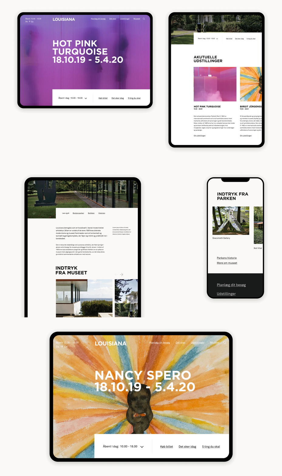
We started by decluttered the interface and organising the information into various tabs to ensure the navigation was simple and that each page had a clear purpose. Next, we prioritised communicating practical information and current exhibitions in addition to events and activities hosted by the museum. So all of this information can now be found on the homepage of the museum’s website. But we opted to keep the museum’s webshop as a separate subsite to preserve the main site’s message of conveying useful information and encouraging individuals to visit.
However, we didn’t simply want to communicate with a user, we wanted to entice them to visit the museum. So we incorporated video content to bring the museum to life and awaken a user’s curiosity.
Don’t try to outdo picasso
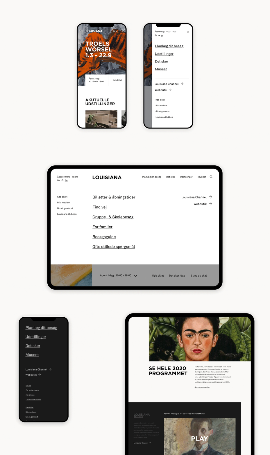
The Louisiana museum’s architecture is sleek, modern and functional. So we channelled those same characteristics when creating a visual identity for the museum’s website. However, we did not want the website to become a piece of art, as the staff at the museum have a saying which goes “Don’t try to outdo Picasso”. So, instead, opted for a clean, timeless and minimalistic look which enables content to stand out against the white background and stimulates the interest and curiosity of the viewer.
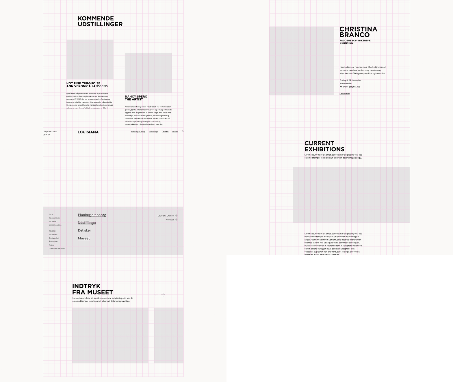
However, the website should not look like a basic template either. So using a 24 grid system, we created a modern yet non-symmetrical layout to make the design more unique. The aim was to convey that despite being an art museum, the Louisiana is full of life. So we added interactive elements which activate when a user hovers over them in addition to using video clips to illustrate the museum experience.
Bringing the Louisiana museum to life
By understanding the user’s pain points, we transformed the Louisiana Museum’s website into a timeless and contemporary mobile-friendly platform which does not compete with the art but instead allows it to shine and entices the user. By using a similar colour palette and typography as the museum itself, our local team translated the museum’s DNA in a digital manner and brought the art to life.
Questions?
Strategy Director
