Fritz Hansen
Curated content that connects inspiration and information
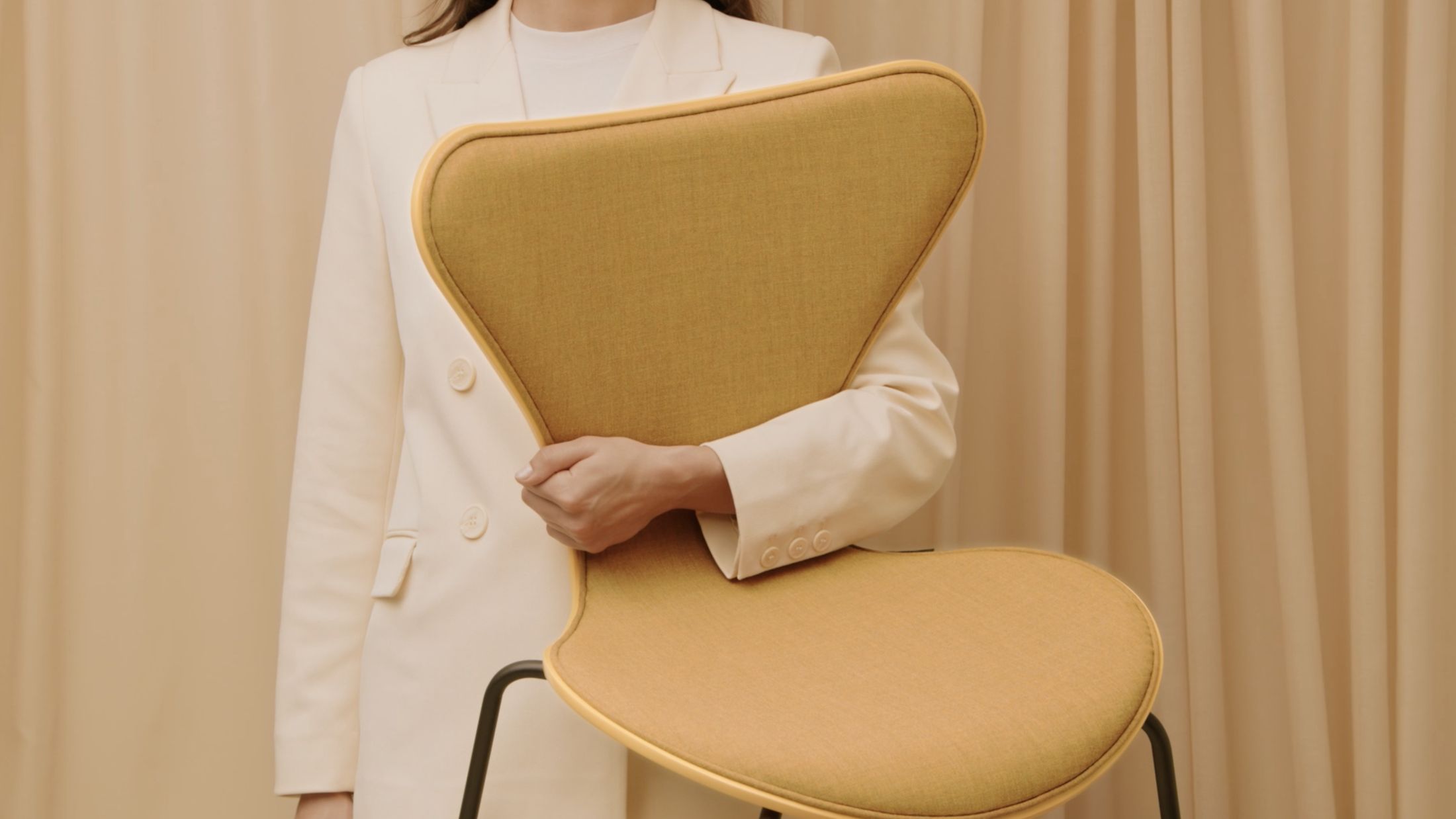
The furniture company Fritz Hansen is synonymous with Danish design and proud craftsmanship. Their pieces are an investment that can be passed down for generations, and their impressive range of thousands of exclusive items includes some of Denmark’s most iconic classics. At the same time, a huge range of fabrics and finishes allows customers to put together just the look they’re after.
When Fritz Hansen approached DEPT®, the original aim was to create a configurator to give customers an easy overview of the many options available for each design series but this quickly developed into a larger ambition: to create a modern digital platform that was inspiring, aesthetic and intuitive – just like Fritz Hansen’s design classics.
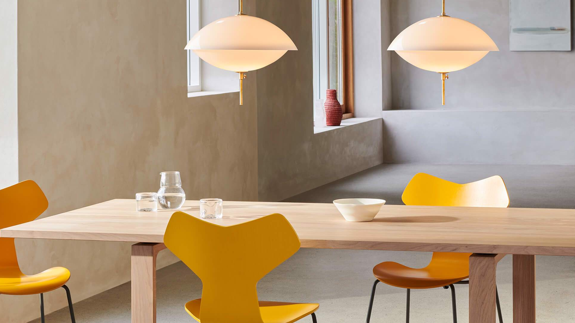
Mapping the customer journey was the starting point
Fritz Hansen’s customer groups include private customers and retailers as well as architects, designers and other professionals working with the interior design of larger premises and buildings. In order to uncover the user journey for the relevant target groups, we started the project with a thorough customer journey mapping based on precisely these two target groups – private and professional customers. While private customers typically make few, but carefully considered purchases, the professional customers often buy furniture for larger projects. The result is – not surprisingly – two very different user journeys.
Based on the two customer groups and journeys, we prepared a small concept catalogue of the highest priority options. This was the starting point for building a brand new site that could support the relatively long buying journey that typically precedes investment in premium design furniture.
A two-part platform
Although the vast majority of Fritz Hansen’s revenue can be attributed to professional customers, it was important not to lower the site’s priority for the private customers. As one of Denmark’s largest design companies, it was crucial for Fritz Hansen to deliver a digital experience that lived up to their place in Scandinavian design history.
Danes know Fritz Hansen as a flag bearer for Danish design and craftsmanship. And that is an obligation. In order to maintain its proud place in the hearts of the Danes, it was clear that Fritz Hansen had to meet their customers with a digital showroom that reflects their design spirit. It had to be intuitively functional and aesthetically recognizable, but at the same time also deliver the level of innovation one would expect from a company known for iconic design.
In addition, professional customers, who often operate with huge projects and tight deadlines, had to have the best framework to quickly navigate the site and assemble portfolios of files, inspiration images, technical specifications and budgets.
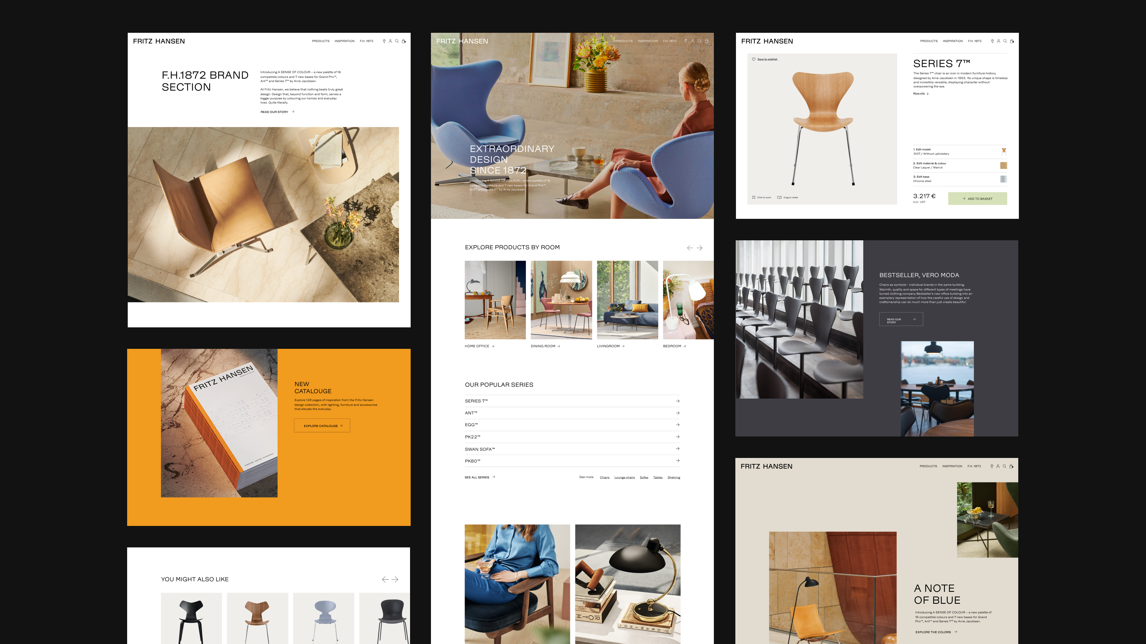
It therefore made sense to create two versions of the site: one for professional customers and one for private customers and resellers.This way we could ensure that all content was contextual, inspiring and relevant to the target group and quickly solved their needs. On each site, menus and categories are therefore illustrated with furnishings relevant to the target group: for example offices, canteens and lobbies for professionals, but bedrooms, dining rooms and entrance halls for private individuals.
A close link between inspiration and information
From the beginning, our ambition was to build a site that supports users in the relatively long purchase process behind luxury furniture. The thorough customer journey mapping made it clear that the key to this was to offer plenty of relevant inspiration.
We therefore prioritised showing the furniture in several different settings before customers reach the page where they can configure the chair and either add it to their basket or find it in a physical store.
At the same time, it has been important for us to integrate information such as technical specifications and measurements directly into the inspiration pages. By linking inspiration and information closely together, we avoided sending customers on detours to more fact-driven sub-pages and can instead keep the user on a creative journey of discovery through the range.
The design: simple frames and innovative details
From a design perspective, it was crucial to give Fritz Hansen’s digital presence a calibre that lives up to their status as part of Danish design culture. And with a slogan that reads “Extraordinary design since 1872”, the framework is set.
The new platform had to be inspiring and have a strong visual expression that stood out from traditional ecommerce solutions and spoke to the design-conscious users. But with a core target group working to tight deadlines, ease of use was also a key factor. This created a central challenge, as the easiest user journey is rarely the most ground-breaking. Finding the balance between innovation and ease of use was therefore crucial, and the solution was a simple design with subtle, innovative elements.
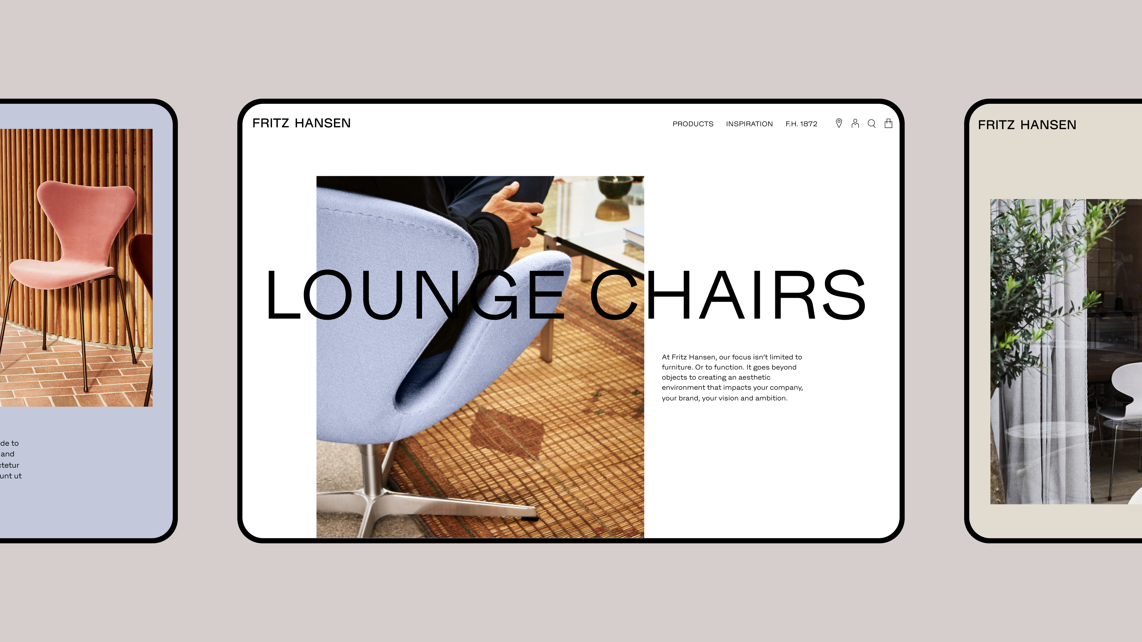
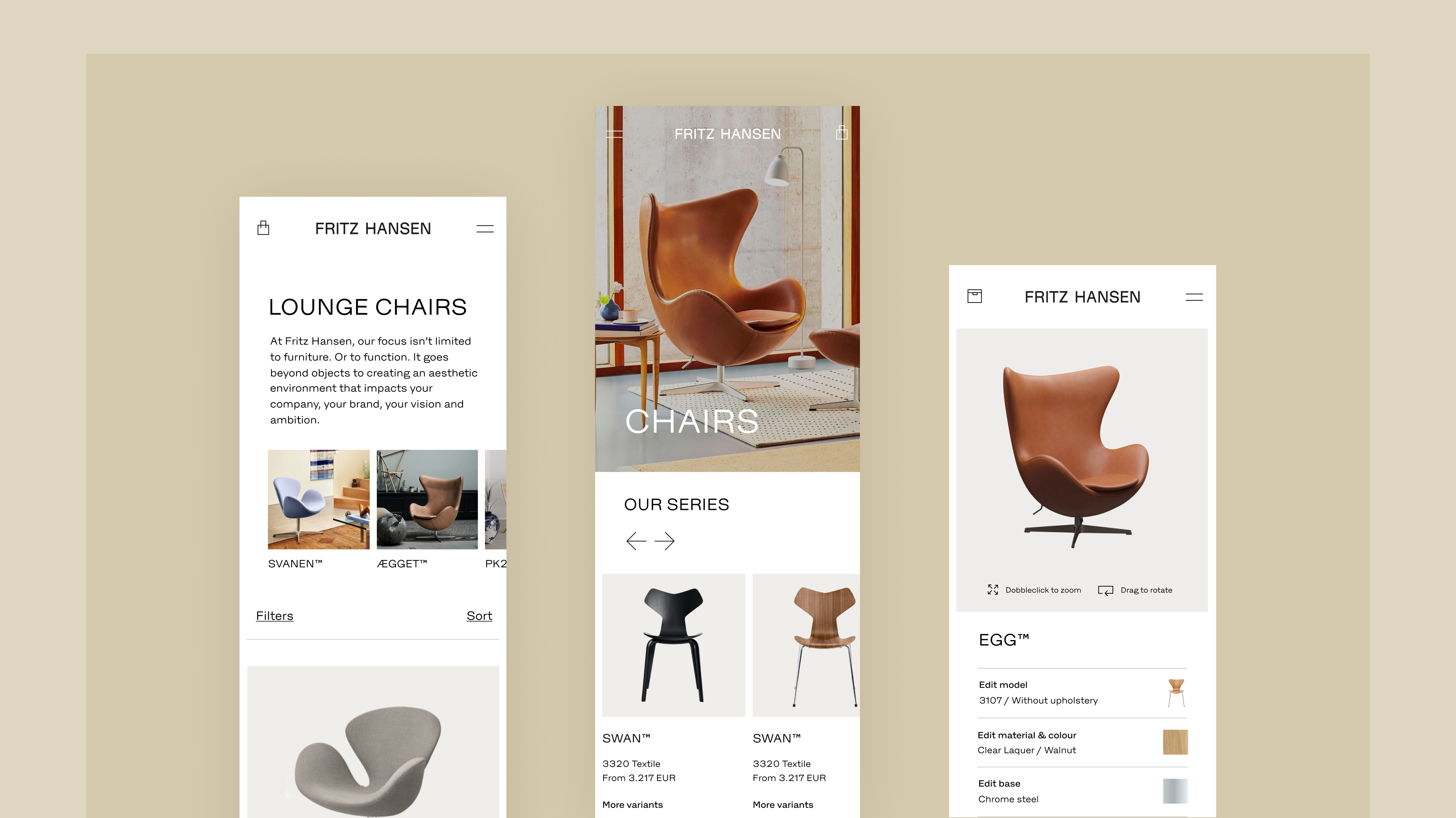
Like Fritz Hansen’s products, the site had to exude exclusivity. We therefore chose to create a simple framework that gave space to the products and Fritz Hansen’s strong visual identity. By combining classic, clean elements with more modern use of whitespace, grids and typography, the layout achieves a simple but distinctive look, where small details give the minimalism an edge.
To create an overview, the iconic type chairs are highlighted as gateways to the various design series, and from here the comprehensive product configurator allows the customer to easily switch between design variants, upholsteries and colours without leaving the product detail page.
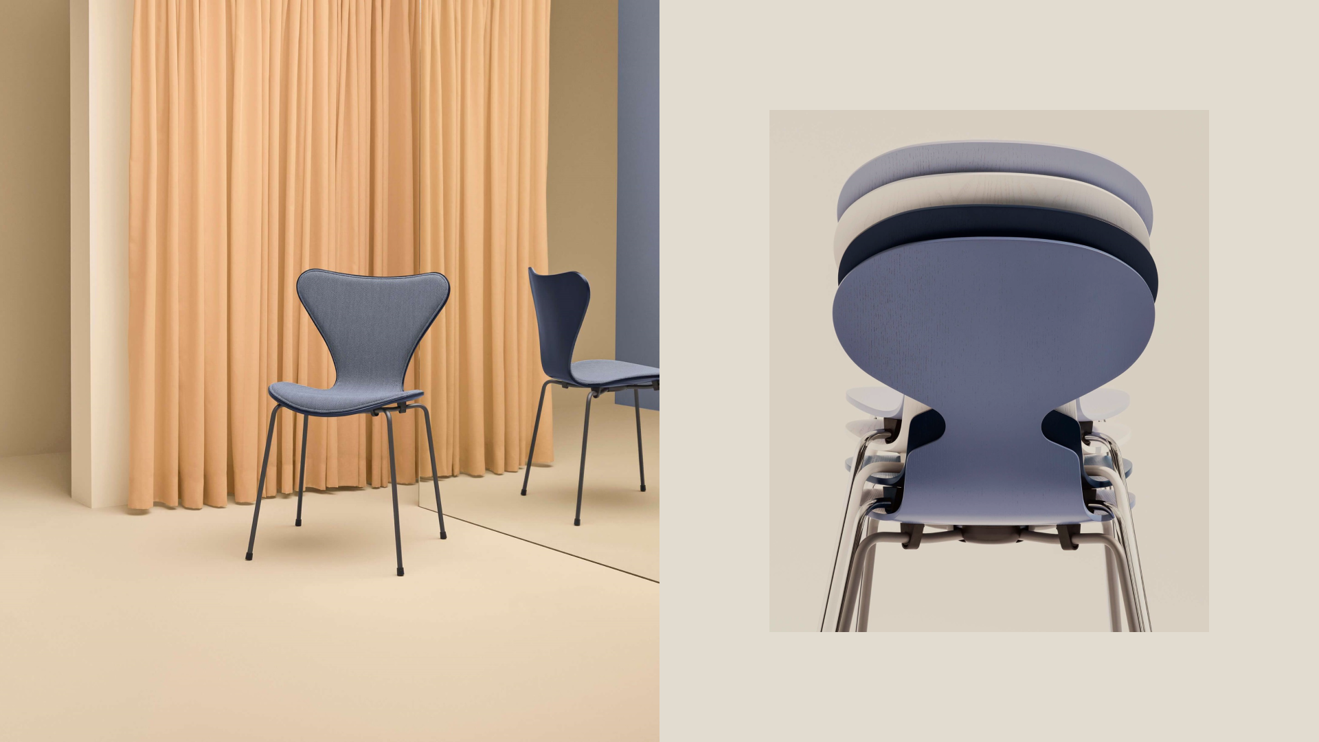
As colours play a central role in Fritz Hansen’s visual identity, we have built a flexible system where the individual modules match the imagery used.
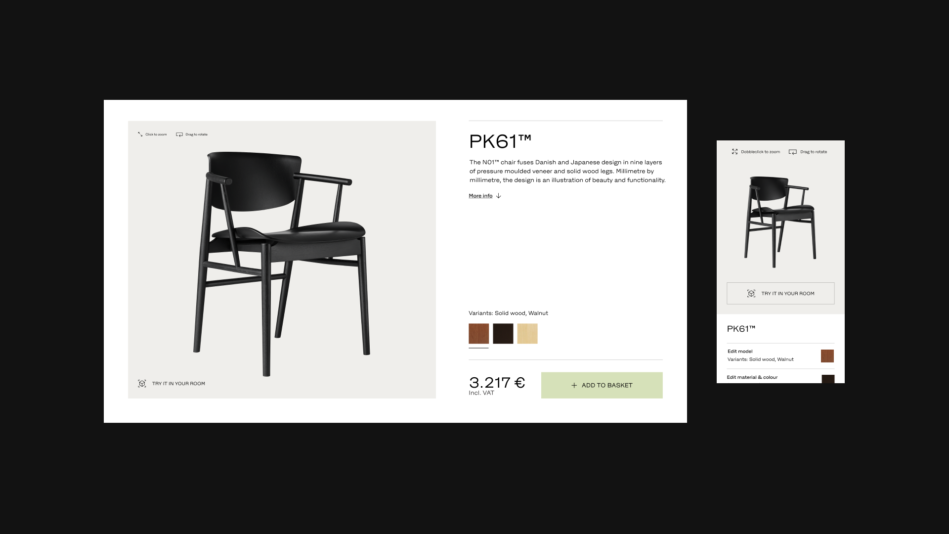
The configurator
Fritz Hansen wanted to create a configurator where their different user groups could easily experience all the different solutions. It had to be intuitive and easy to use, but to meet the needs of professional customers it had to be comprehensive at the same time.
The solution was a configurator that takes full advantage of the technology that smart devices offer: millions of configurations, 360-degree rotation and the ability to see a piece of furniture in your own home with AR – right at your fingertips. The configurator is so integrated into the user experience that it appears as part of the product detail page, providing a user-friendly overview of the millions of renderings that Fritz Hansen’s range offers. And that creates both value for customers and increased sales.
A makerspace for users
It was crucial to create a site that catered to the busy professional segment, who often work under great time pressure preparing pitches and planning projects. To make it easy to create and keep track of multiple projects, we added the option to create project folders directly on the site.
The project tool allows users to quickly save images and materials so they can easily build a portfolio to present to their clients. And going forward, the products will also be stored on individual images to create even better integration between the technical information and the visuals.
The new platform does not just create a general overview of Fritz Hansen’s complete range; it also gives each customer the opportunity to create their own curated overview by building a portfolio of ideas and favourite products. In this way, the site is not just an aesthetic showroom but an engaging and functional makerspace that all Fritz Hansen customers can actively use in their creative interior design projects. And this increases the likelihood that the customer’s search will eventually lead to a project collaboration.
Conclusion
A thorough customer journey mapping was the starting point for an intuitive and aesthetic e-commerce solution, which presents Fritz Hansen’s range through inspiring and informative content, tailored to professionals and private customers respectively.
Fritz Hansen and DEPT® have succeeded in creating an intuitive and aesthetic e-commerce platform that provides an easy overview of a range that includes millions of unique products. The main elements are an advanced product configurator that is integrated into each product detail page, and tailored content.
The close link between inspiration and information creates a simple introduction to the products and a smooth transition between the phases of the purchase process. And by integrating an advanced configurator into the product pages, we have created an easy overview of each furniture series, while at the same time engaging the user by inviting them to try out different looks.
The result is a digital platform that stages Fritz Hansen’s furniture in a context that is relevant and relatable for the different target groups, and supports their long buying journey through inspiring, intuitive and functional design. In other words, a site that exudes Danish design tradition.
Experience the website
Questions?
Head of User Experience
