Schwartau
Raising the bar: Multiple flavours under one branding

For over 100 years, Schwartau has been adding sweetness to consumers’ lives, with its taste that many have remembered since childhood. Schwartau is the market leader in jams and muesli bars in Germany. Constantly maintaining quality at the highest level and ensuring maximum product satisfaction are the main drivers of the brand’s success.
As part of the development of its standalone brand of Corny muesli bars, Schwartau wanted to extend the existing brand design framework to meet Amazon specific content requirements. With this purpose, they came to us and entrusted us with the full cycle of work, including content creation, design, and branding itself.

Building the product storefront
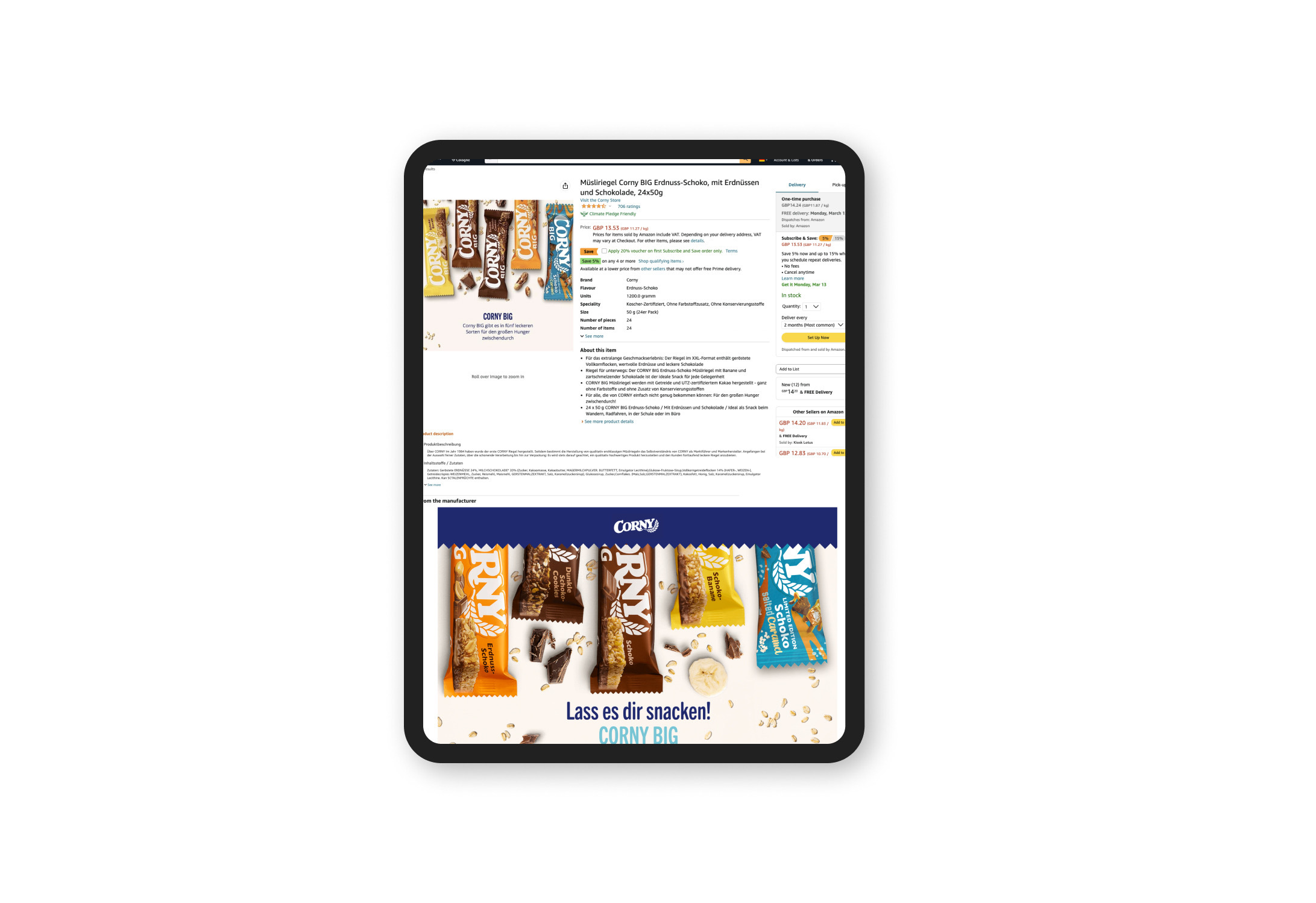
The key to successful branding on Amazon is a high-quality Product Detail Page (PDP). It may sound too simple, but in fact, the anatomy of the page is quite complex and plays a crucial role in brand awareness and its place in the marketplace. Taking this into account, we provided Schwartau with a whole PDP for Corny Big: product images, SEO-based bullet points, SEO-based title and A+ content. All of these elements directly influence the decision to buy a product and interact with the chosen brand.
“From the content strategy to the design strategy, every element of the page should work together seamlessly to showcase the value and benefits of your product, and ultimately drive sales.”
Content that tastes the same
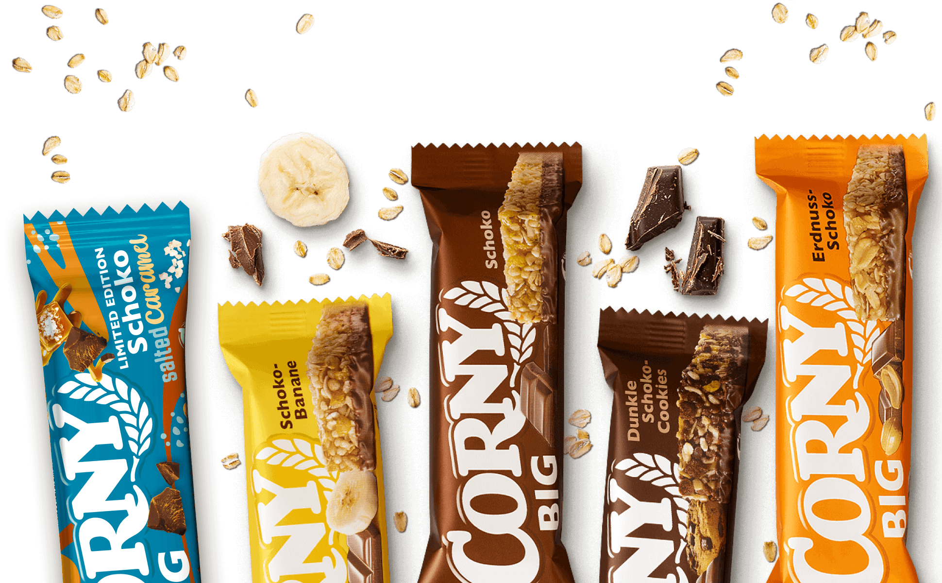
Corny Big muesli bars are currently available in five different flavours. Accordingly, they all have different packaging, associations and demands among customers. Our main challenge was to unite all these flavours under a single common branding that keeps a clear focus on the nutritions and benefits of the product, while not losing the unique presentation of each flavour.
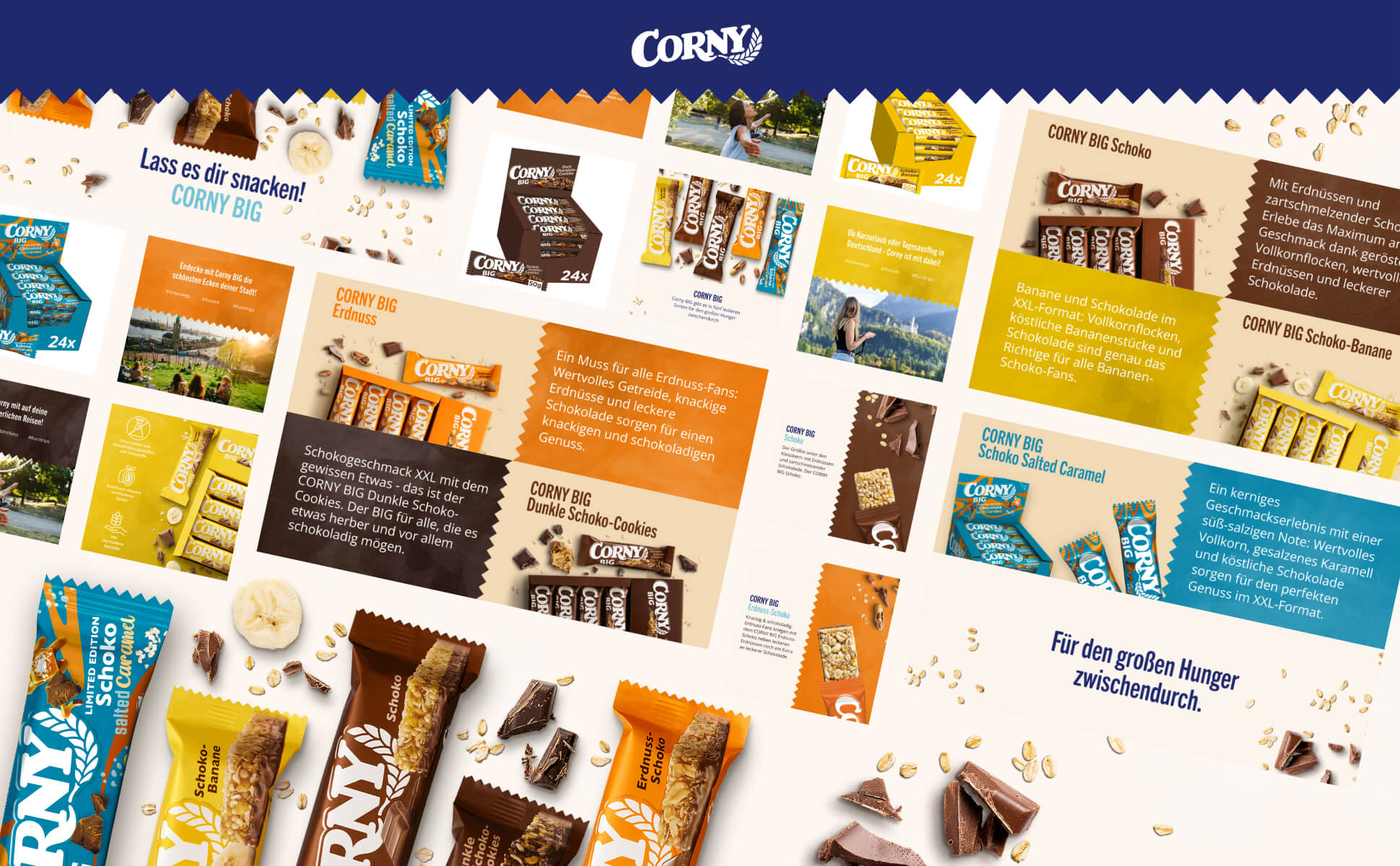
The solution came across using the product’s unique elements such as different packaging designs, respective brand colours, mood and texture to ensure each flavour’s visual representation. We designed high-quality product images, showcasing the product in use or in its intended environment, along with its features, benefits, and packaging design. This helped us combine differentiating elements of all the flavours with the unifying leitmotif that communicates the brand’s unique value proposition and messaging.
A+ content taking the lead
In addition to creating a custom product image design, we also used A+ content as one of the main methods to represent all bars’ flavours without breaking the overall brand look.
With the help of an Enhanced Product Description, we provided detailed information about each of the products, which covers the most obvious questions of customers. In addition, we created A+ Content that visually introduces what the brand has to offer, along with all the products and their stories.
In this way, we were able to cover the entire spectrum of the brand’s request – from its overall value for the customer to the detailed benefits of each individual product in the Corny Big line.
Leveraging mobile shopping and cross-selling tables
Mobile shopping is another essential component of a successful e-commerce strategy on Amazon.
To cater for this trend, we adapted the layout with a design that adjusts to both mobile and desktop screens. This makes it easy to read and navigate and overall improves search rankings. It also attracts and retains not only desktop shoppers but also mobile ones which can help drive sales and build a strong brand reputation.
We are also aware of the power of a cross-selling table as a part of A+Content.
These tables showcase related products to the one being viewed making shopping more convenient and saving customers’ time. This helps increase the average order value and improve customer satisfaction and loyalty. Taking this into account, we decided to add a cross-selling table and demonstrate different tastes at the end of the Corny A+ Content.
Increasing conversions by adding motion
To consolidate the effect, we created a Sponsored Brand video. It was initially designed to increase brand awareness and drive product consideration and sales. Sponsored Brand video can capture the user’s attention, which is a great tactic for increasing click-through rates and conversions. We also saw this as a perfect match for our client’s request, as Sponsored Brand videos can present a brand’s products in a dynamic and engaging way, while also highlighting their unique features and benefits.
Brand identity as an outcome
Brick by brick, with the help of various content and design solutions, we managed not only to build an effective Product Detail Page that engages customers, but also help the client make their brand stand out with an effective Amazon brand design strategy based on the given brand design framework.
The Enhanced Content and SEO strategy creation made us sure we reach the target group: health-conscious individuals looking for a quick and convenient snack option.
High-quality, colourful images and short easy-to-read descriptions helped the brand to effectively communicate its selling points, such as natural, healthy ingredients and a range of tastes.
Product Images, B+ Content and A+ Content that showcases the quality and benefits of the product allowed us to differentiate the brand from its competitors and help it stand out in the crowded marketplace.
Our efforts have resulted in distinguishing each product from the Corny Big line while staying true to the Corny overall brand look and values. We developed a whole brand identity that mimics the brand in a way that it remains easily recognizable, engaging and storytelling.
Looking ahead, the emerged brand identity will help the client not to disrupt the established associations among customers even when adding new products.

Questions?
Visual Designer
Natacha Elanor Steyn
Discover more

