Friday Health Plans
Allowing users to navigate their health plan benefits & care via mobile

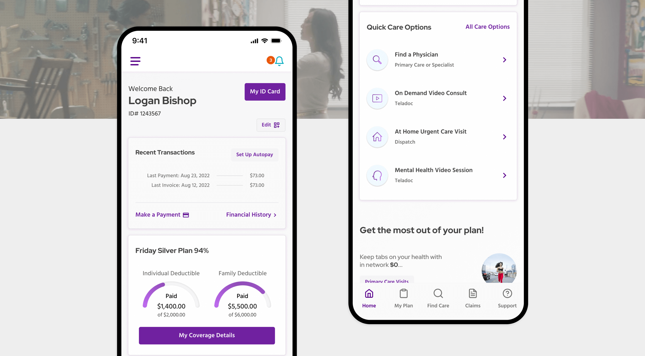
Looking to reimagine its mobile experience, Friday Health Plans engaged DEPT® to strategize and design a new UI/UX prototype of a future-state mobile app.
About Friday Health Plans
Friday Health Plans is built for people who buy their own health insurance. People like independent consultants, freelance pros, tradespeople, service workers, part-time workers, or anyone who doesn’t get health insurance through their job.
Friday is in the business of delivering affordable health insurance with benefits that work for independent individuals and families. And because Friday’s plans are all offered on the Health Insurance Marketplace as part of the Affordable Care Act, it’s real insurance you can trust to cover you regardless of any pre-existing conditions.
The need for consistency and functionality
As more people turned to mobile devices to buy and manage their health insurance, Friday Health Plans knew they needed to refresh their mobile app.
They came to us with a few complex problems, including
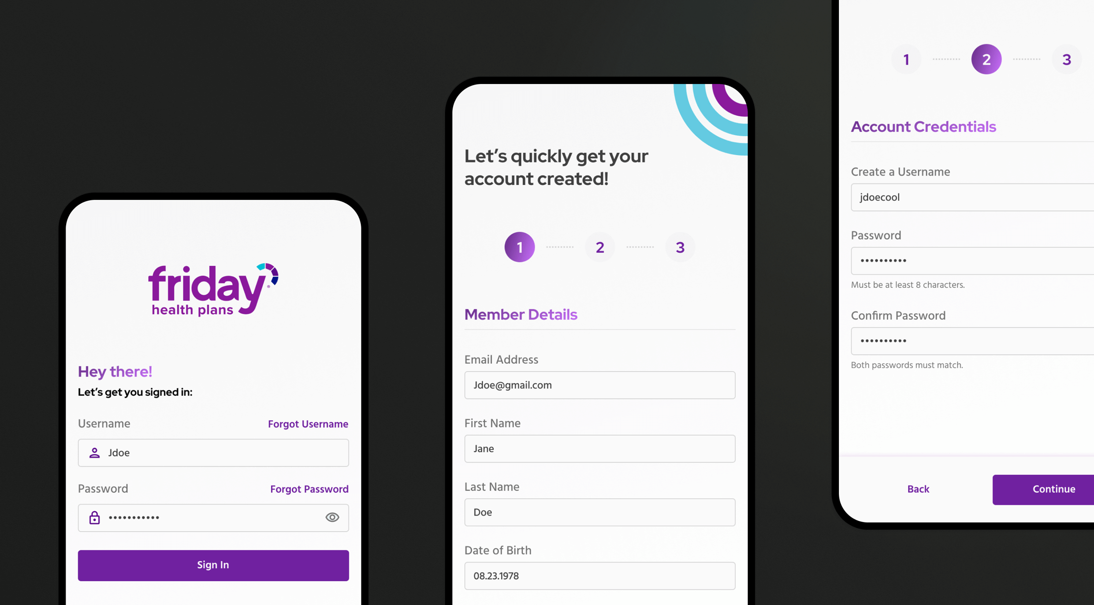
- Navigation: Overall, the navigation needed to be more thoughtful e.g., the onboarding, plan/coverage details, and transaction information wasn’t clearly laid out.
- Functionality: There were a few functions missing. For example, adding a digital ID card to a member’s mobile wallet was not available.
- Simplicity: When members need to find care, quick and easy access to the right information is necessary. The focus was to create a simple experience that had a consistent feel with the mobile devices’ native functionality.
On top of this, the app needed to meet a variety of compliance regulations including HIPAA, WCAG 2.0, and URAC.
Helping users find the right information
In a world where healthcare plans are already hard to navigate, our main goal was simplicity and ease. From the start of the project, there was a focus on creating a seamless experience for their users, while also being compliant with all industry regulations.
We started crafting their app strategy by diving into their audience. We needed to cater to the main user group’s needs, while also standing out in the healthcare space. This work consisted of user interviews, competitor analysis, stakeholder interviews, and a lengthy discovery session.
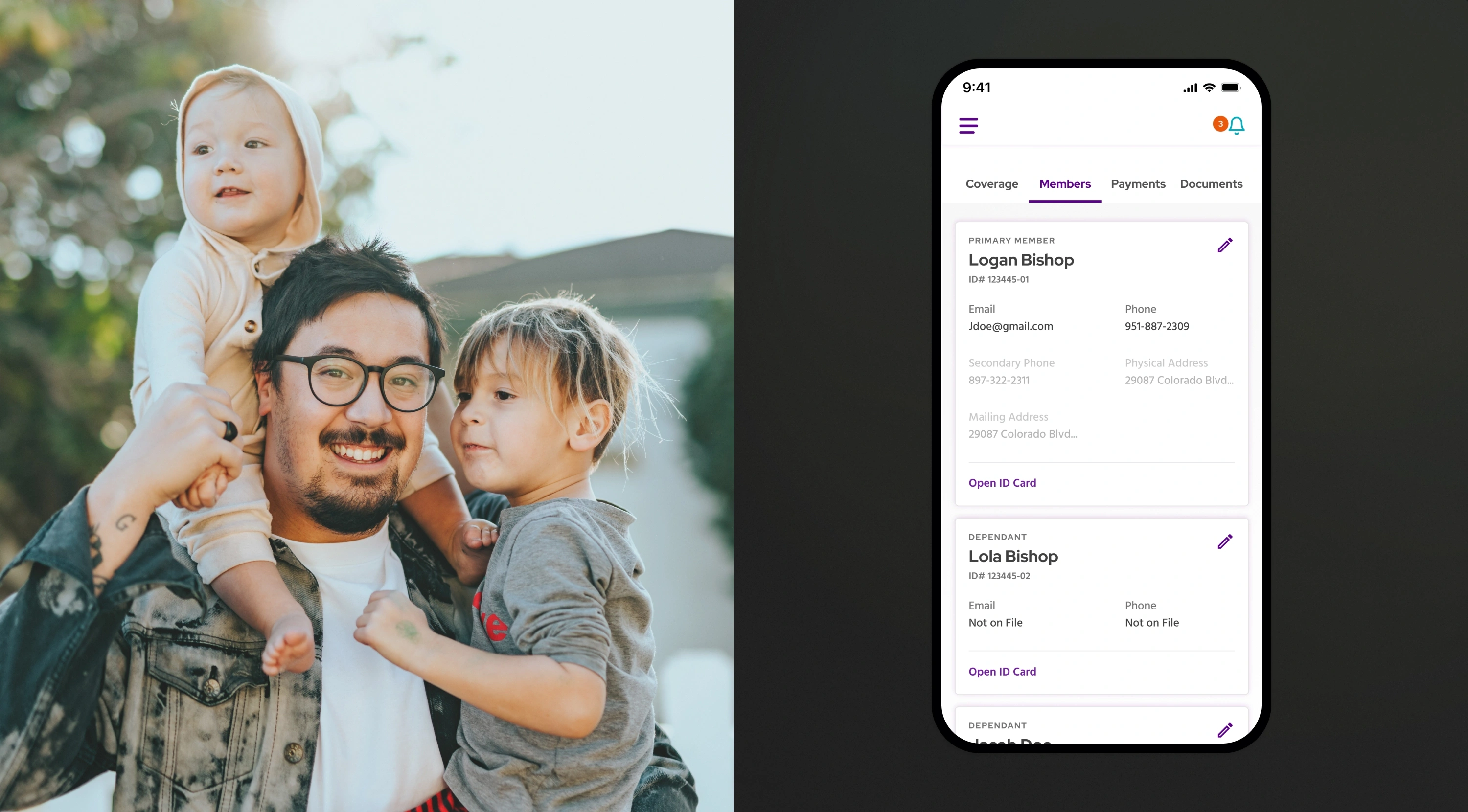
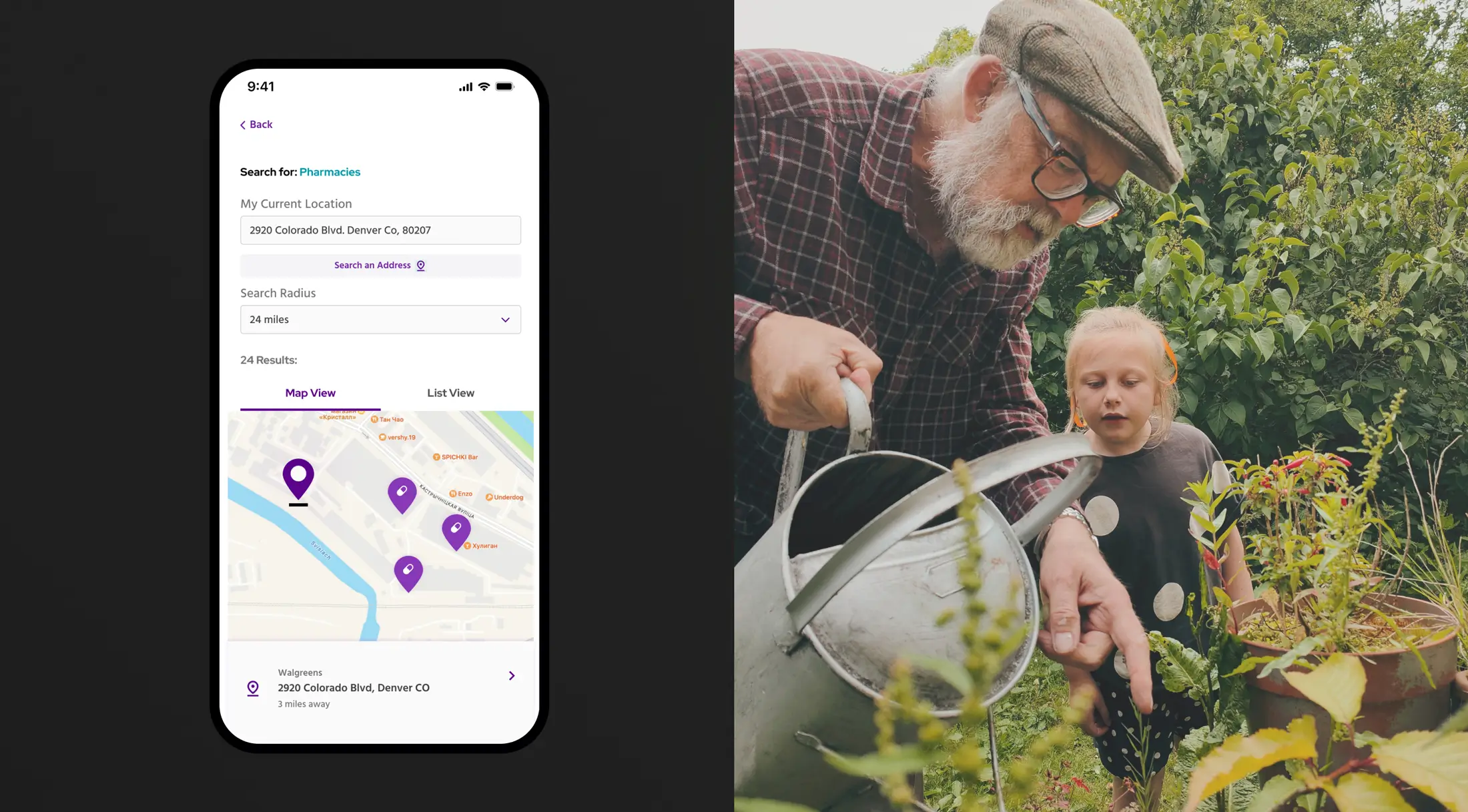
From this insight, we created a functional navigation to highlight the most important parts of the app, which helped users Understand their plan benefits, find care quickly, see their accumulators, view recent transactions, and pay monthly premiums.
We also updated branding and extended their existing system into a new modular, mobile-first design system. A modular design system will allow their internal team to iterate, edit, and expand mobile app features without starting from scratch.
Some quick design wins included adding a FAQ section and key contact methods. Plus, a dashboard view to highlight recent transactions, payment options, ID cards, and provider searches. These additions are positioned to help users find what they were looking for and access care with the right providers quickly and easily.
Please note, this product has not been developed or started in production as of 2023.
Questions?
Lead product designer
Logan Bishop
Discover more
