BigTime Software approached us with a pressing issue: its time and expense tracking apps were outdated and buggy.
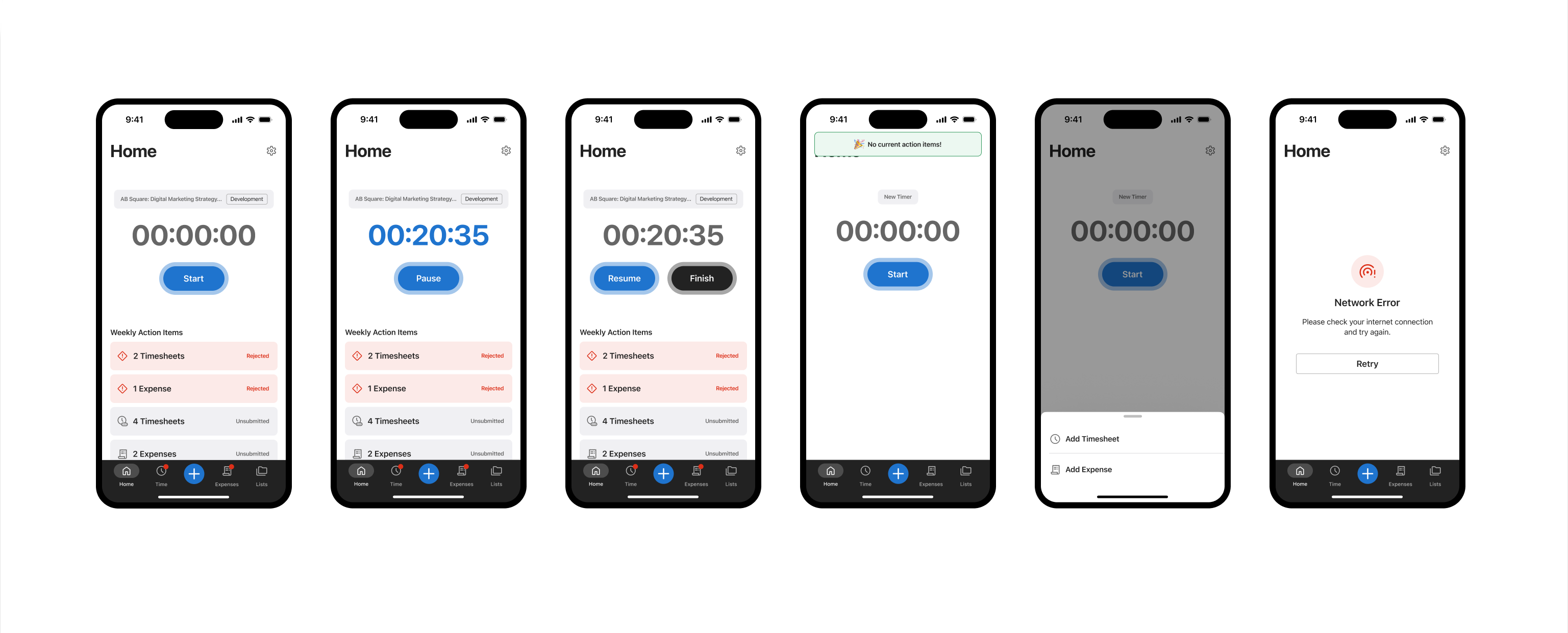
Our digital products team dove right in, working alongside BigTime to overhaul the app’s interface and rebuild the iOS and Android apps.
A multi-step request
The BigTime app was built to help project teams track and bill for their most important asset – time.
However, because the app was unsupported for years on iOS and Android, it faced problems like crashes, security vulnerabilities, performance issues, and feature-breaking bugs. On top of the functional issues, BigTime’s UX/UI was outdated, frustrating customers and stakeholders.
They knew they had a great product that needed some attention, so we built a strategy focused on improving user experience, modernising the app, and ensuring interim support for the existing versions.

An architecture sprint to start
To kick off the project, we performed a two-week architecture sprint, which is a fast and furious way of looking “under the hood” of a product. This upfront work allowed us to make recommendations and prioritise work based on technical limitations, timelines, and resources.
After a careful appraisal, we recommended that some immediate work be done to stabilise their current apps before starting on a new native rebuild.
The technical recommendations included:
- Interim support sprint to improve the stability and reliability of the current applications
- Application rebuild using native technologies (Swift for iOS and Kotlin for Android)
- Optional post-launch support

Engineering teams for maintenance & new development
Recognising the immediate need for a functional app, we provided temporary engineering support for the existing versions.
During this period, we addressed various Apple and Google Play Store policy violations, major bugs, and performance issues to make the existing apps functional until the new versions were ready for launch. This ensured their availability on the App Store and Google Play during the entire rebuild.
Immediately after the current app was restored, we rebuilt the mobile app for both iOS and Android. We leveraged SwiftUI for iOS for improved UI/UX and compatibility with the latest devices. To save time and reduce revisions, we replicated the iOS app design to Android with very few modifications.
Through an updated stack and scalable and flexible architecture, we ensured the app was ready for new features and updates.

Enhanced user experience
Recognising that the current app wasn’t working for users, we had to completely rethink and revamp the user flow.
First, we conducted a UX audit of the old app, understanding what was salvageable vs. what needed a complete overhaul.
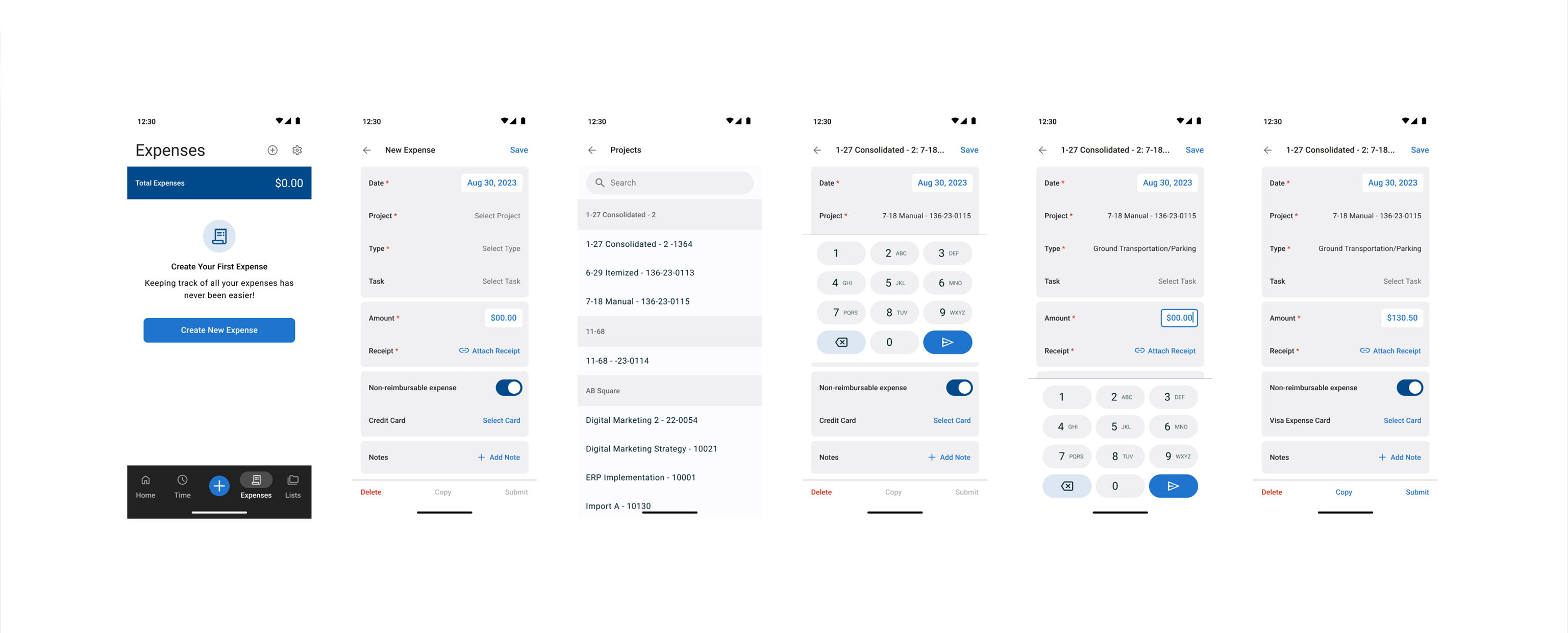
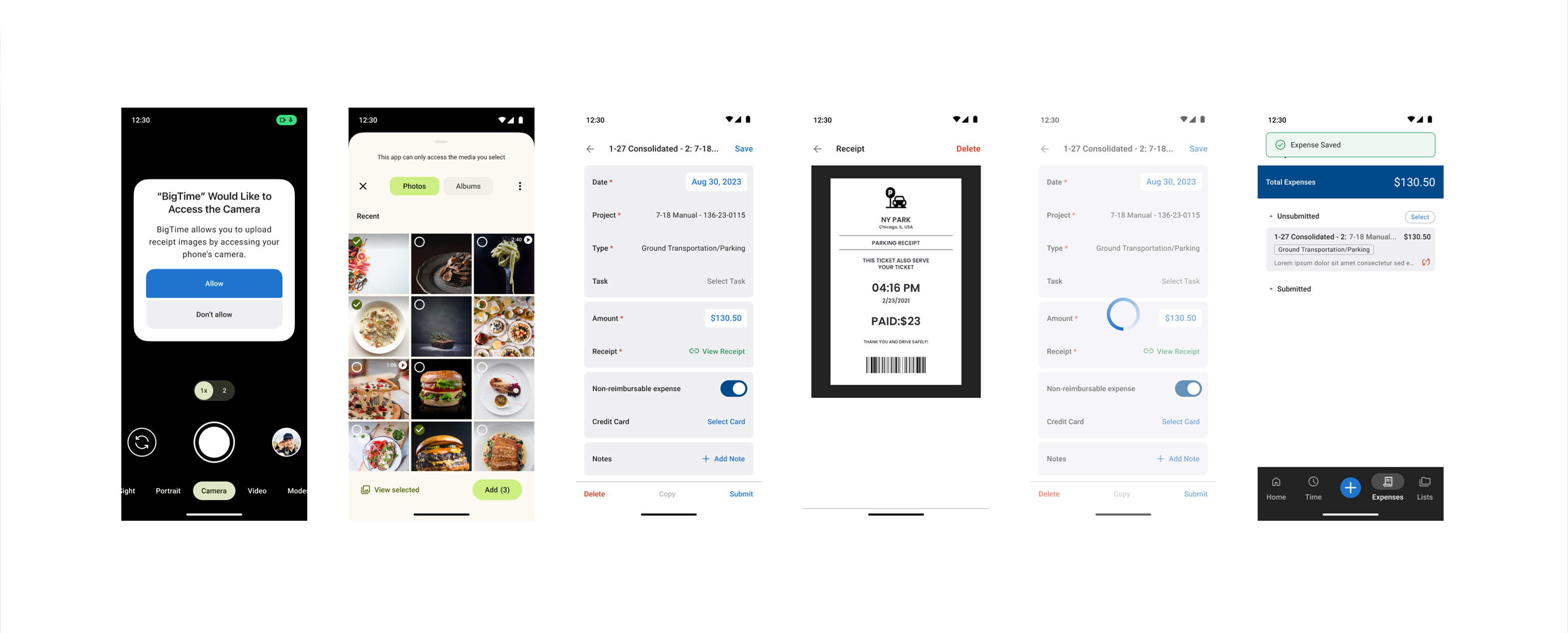
From there, we introduced enhanced features, reimagined the information architecture, and created modular components.
By redesigning the app interface, we were able to meet modern standards and streamline users’ navigation. As a result, BigTime’s users can now enjoy a better app experience, with intuitive access to timesheets and expenses on the go.
Our team’s efforts resulted in a thoughtfully designed and intuitive mobile app that promises to enhance the user experience. With a fully functioning and modernised app, confidence among customers and stakeholders is being restored.
DEPT®/Digital Products can help you strategise, design, and develop custom applications that drive your business.
Questions?
Managing Partner / Growth
Alex Glaser
Discover more


