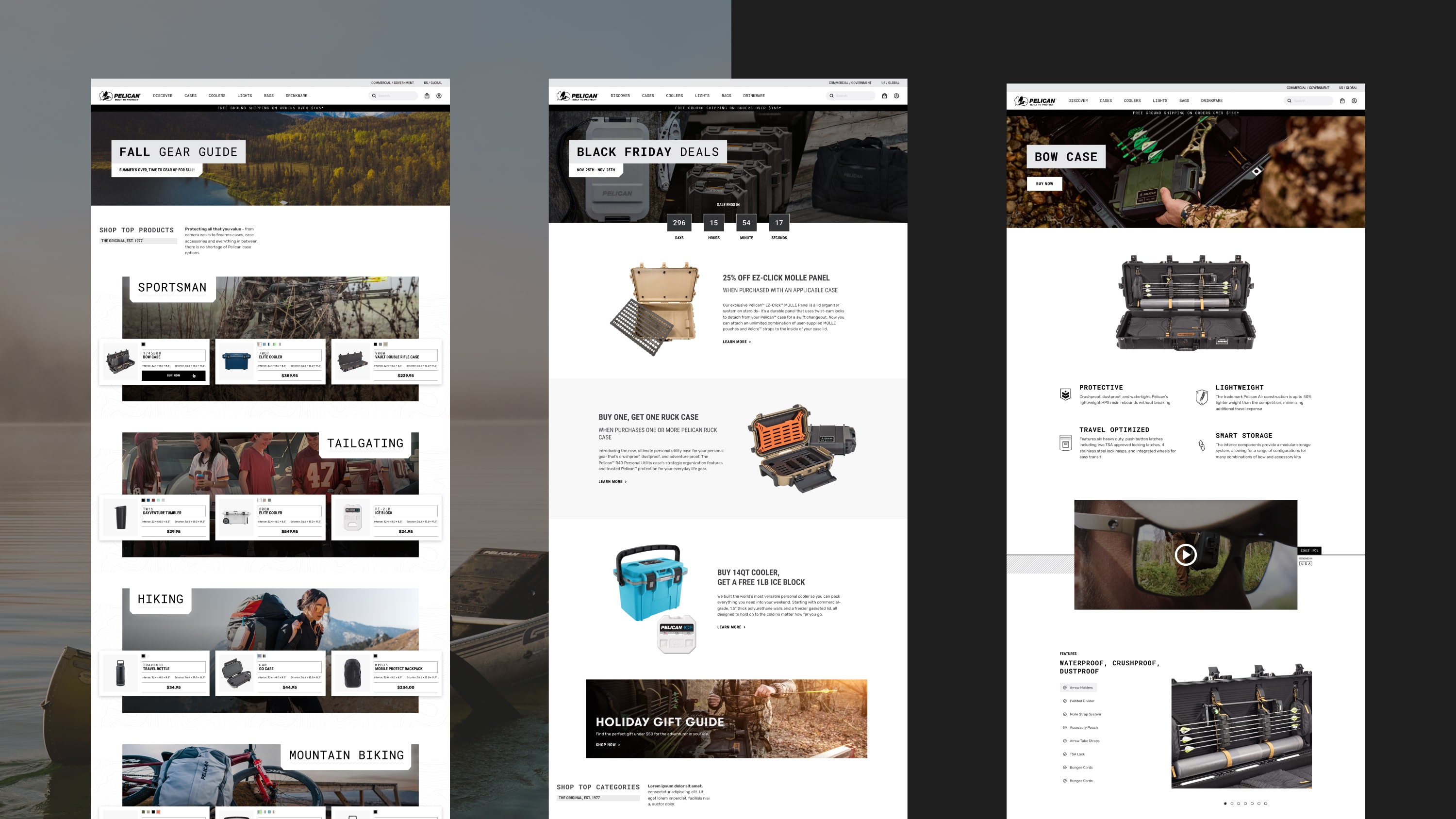
Pelican sought to transition into a direct-to-consumer business model, but to do that, they needed a stellar e-commerce experience.
DEPT®’s designers and product strategists created a design system and e-commerce store to create a seamless buyer’s journey.
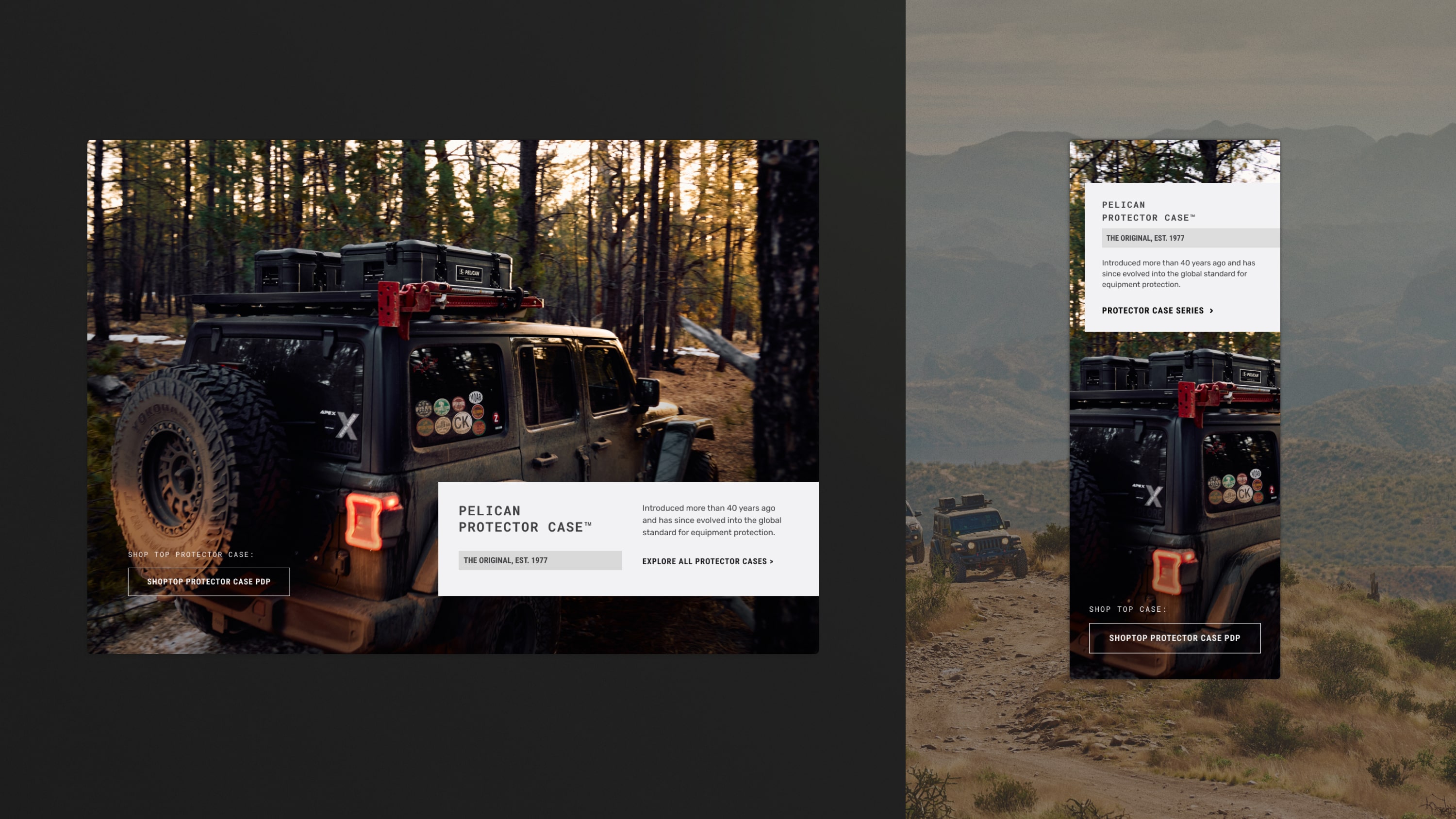
Translating an iconic legacy into a direct-to-consumer (D2C) experience
With crushproof expertise and a lifetime guarantee, Pelican cases are made in the USA and built to last. With over 40 years of military-grade strength, the brand promises protection.
The mission was to create a cohesive foundational ecosystem that educates users on the possibilities of Pelican.
To resonate with new and returning customers, we knew we had to unify the product ecosystem, educate users on the path to purchase, and expand product possibilities. To accomplish these, we broke the project into three phases of work with design priorities underneath each.
Familiarity
- Style guide
- Homepage experience
- Navigation
- Marketing landing pages
Conversation
- Category-level pages (CLP)
- User segment-driven experiences
- Product category-driven experiences
- CLP content purpose guides
Loyalty
- Product listing pages (PLP)
- PLP content purpose guide
- Case accessories landing page experience
- Accessories shopping experience
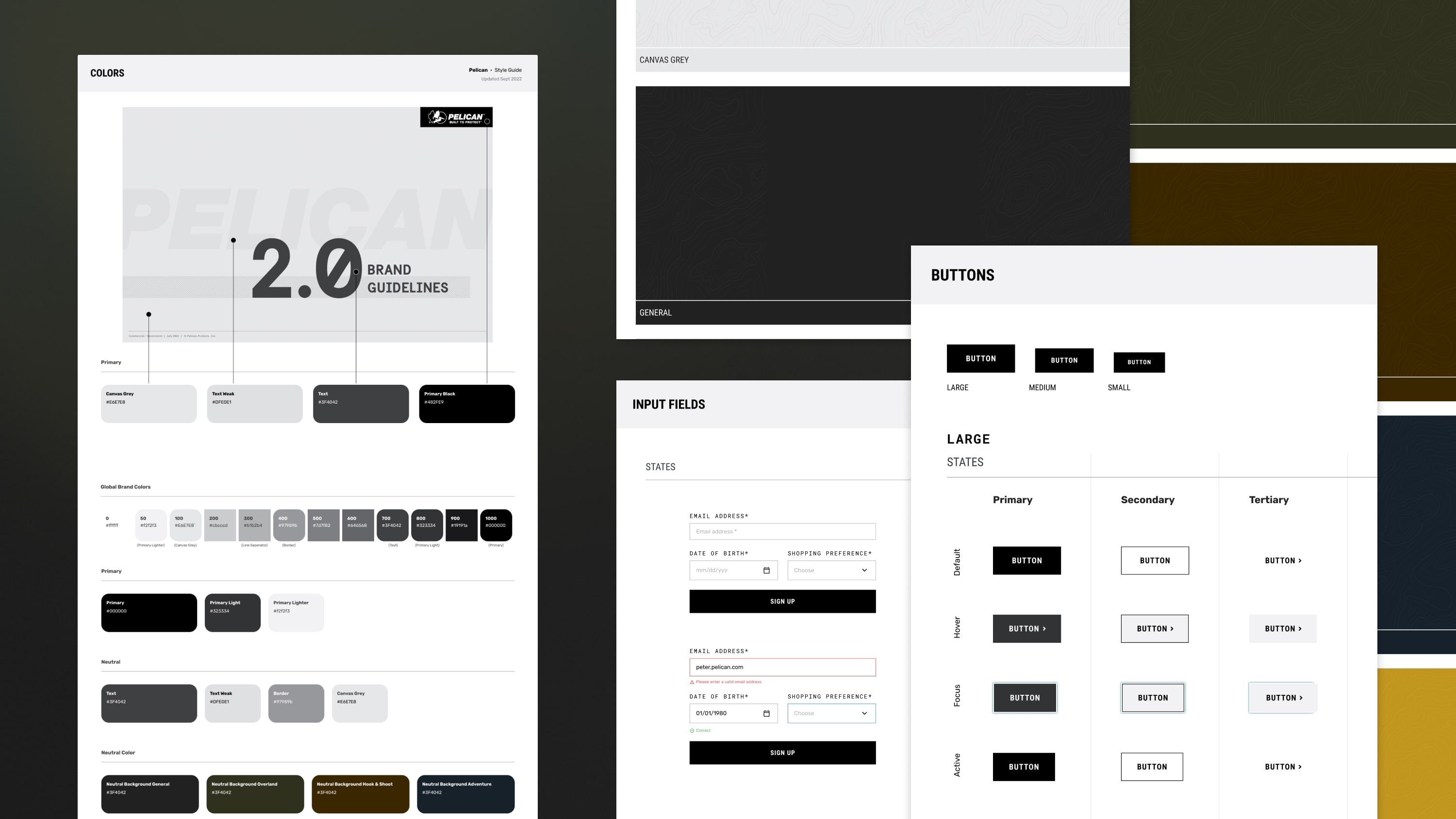
Interpreting Pelican’s brand voice into a site-wide design system
Pelican’s e-commerce experience needed to
- Dazzle users with brand possibilities during the first impression phase
- Unify all product categories with cohesively designed content
- Funnel user to the best product(s) for their individual needs based on search behavior
To accomplish this, we needed to build user trust by consistently contextualizing the legacy of Pelican.
We unified the brand’s priorities and messaging throughout the site ecosystem and headless CMS framework. By grouping products by type, purpose, size, family, or series, we established a cohesive voice for each product category. This also helped build trust with the user via consistent page flows and hierarchy supported by the original Pelican promise of protection.
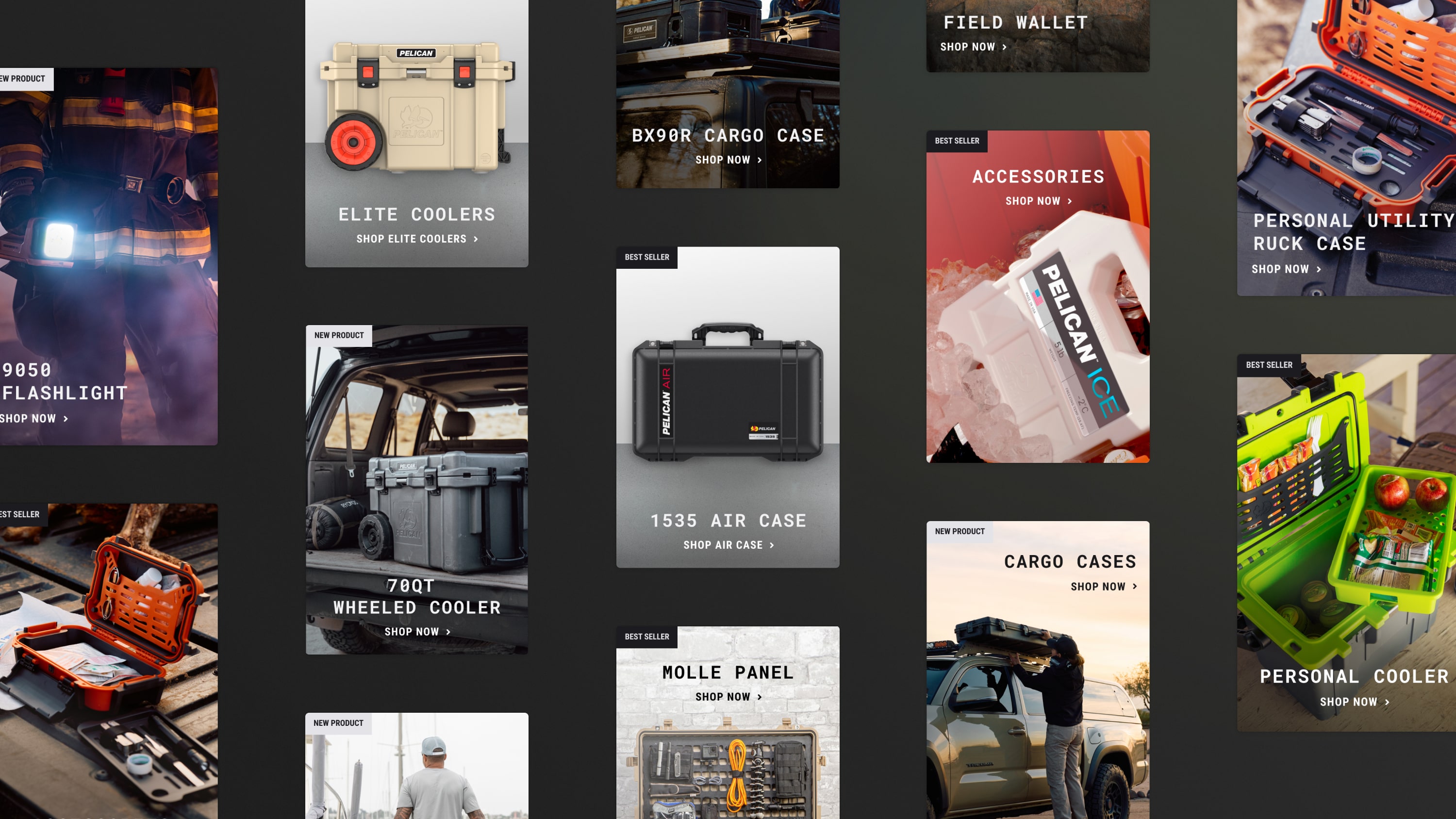
One challenge was humanizing Pelican’s vast product line, which we addressed by highlighting customer reviews, lifestyle imagery, and educational product storytelling. We cross-pollinated the path to purchase, anticipating the user’s purpose and passions based on historical data and stakeholder interview takeaways.

Contextualizing products at meaningful moments
With scalable solutions designed to consider Pelican’s extensive product catalog, we enhanced the typical e-commerce shopping experience.
Our team designed custom components to funnel users to the right product for their needs while aligning current campaigns, foundational product knowledge, and evergreen brand goals.
By enhancing the path to purchase, we gave users a reason to return to the brand post-checkout. Pelican can cross-pollinate other products within the product ecosystem and increase customers’ understanding of accessories.
We built this foundation to allow the Pelican e-commerce team to analyze user interactions over time and refine their strategy based on shopping patterns and purpose for purchase.
Need a fresh e-commerce experience? We specialize in e-commerce experience design.
Questions about design?
Managing Partner / Growth
Alex Glaser
More e-commerce work


