Eneco, one of the biggest energy suppliers in the Netherlands, is a leader in the field of renewable energy. The company has chosen to make sustainability part of a bigger promise: “Welcome to the new world.” A world where sustainability doesn’t hold us back but makes us capable of more. However, this new promise lead the company to want to redesign their website. DEPT® was already working with Eneco when they asked us to help them strategise, conceptualise and design their new company website.
A new and sustainable world
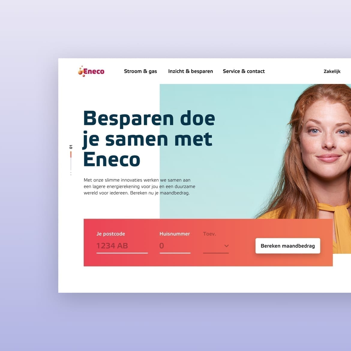
With the message ‘Welcome to the new world’ Eneco is transforming from an energy supplier that supplies electricity and gas to Dutch households to a sustainable service provider that services over 1.2 million people. Our previous collaboration made us the perfect partners to help elevate the company’s digital presence by redesigning the company’s outdated website. Based on interviews, research and data, the new core pillars of the website were going to be service, sales and sustainability. We wanted every website visitor to experience the brand’s promised new world in both a written and visual manner.
We wanted users to experience the brand’s promised new world in both a written and visual manner
A visualisation to make one’s household more sustainable
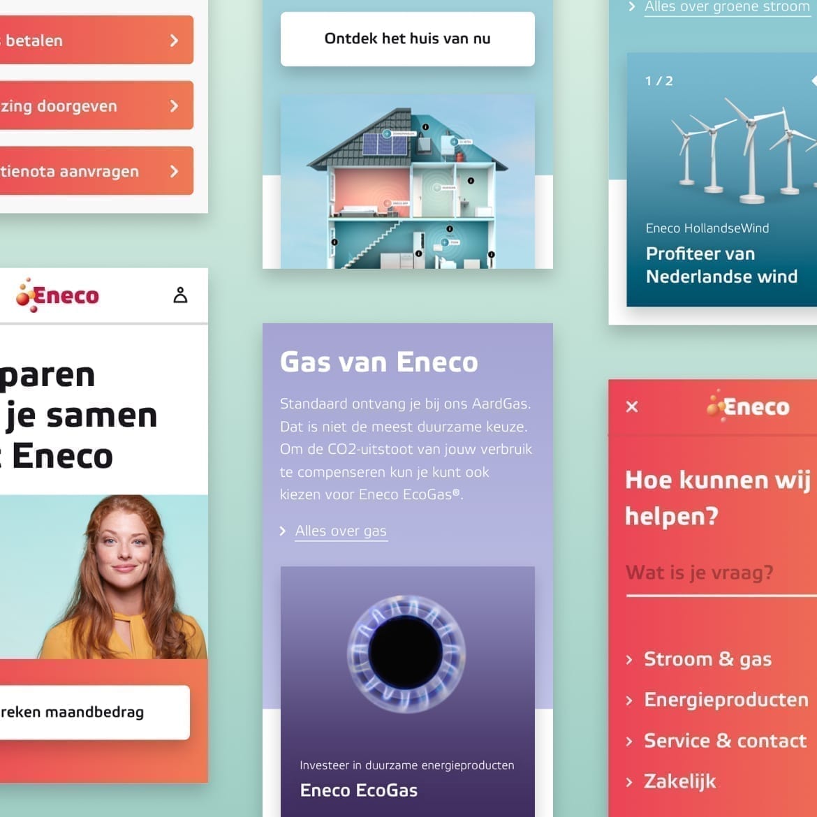
Eneco has a step-by-step approach when it comes to helping its (potential) customers to make their lives more sustainable. We decided to make this process more visual and fun by creating a 3D house which demonstrates how every household can make this a reality. For example, users can see how installing solar panels or a smart thermostat will help them lower their monthly energy bill. So the 3D house offers people an alternative and dynamic way to browse Eneco’s product and service offering.
A powerful CMS to remain future-proof
Eneco wanted a powerful digital foundation for the future. So, together, we implemented Sitecore 9.0 which offers personalisation at a scale in multiple languages. This enabled the utility company to deliver relevant experiences to individual users as customer profiles are stored and organised in a central system and information is synchronised across all other platforms. At the same time, Eneco employees can easily develop, create and expand their content library thanks to Sitecore’s easy to use interface.
Implementation
The aim of our visual concept was to make green energy attractive. To support this goal, we crafted a story around each product and service offering which offered a clear description with a wink. From a conceptual point of view, users don’t solely become Eneco customer, but also members. To enable this, we wanted to load Eneco’s new world with a character that ties in with a form of positive activism.
Positive activism
The challenge was to make the message and promise of the New World tangible. Conceptually, people don’t just become Eneco’s client, they become members. And that is something to celebrate. We wanted to load Eneco’s new world with a character that ties in with a form of positive activism. We extended that feeling throughout the appearance of the entire website. The new style has a wide range of assets and colours, the richness of which defines a flexible brand that is equipped to answer the questions of our time.
Results
To showcase that there were numerous activities and areas to explore no matter the time of year, we created an interactive and inspirational From strategy to design, we delivered to Enerco a new website with a mobile-first design, an imperative for most new platform nowadays. The new platform captured the brand’s personality by tying in pop-style elements. The new website was a success and within six months boasted:
- 850,000 users per month.
- 5,000,000 pageviews per month.
- An average session duration of 02:46 minutes.
- A website rating of 3.2 out of 5 – an increase of 0.8 of a point.
Questions?
Programme Director
Sander Hendriks
Discover more
