Turning Point is a leading social enterprise working extensively with the Government to provide health and social care services at 350 locations across England. Rightsteps, part of Turning Point, supports employee health and wellbeing with counselling and on-demand programmes through its online platform. During the Coronavirus pandemic, Turning Point wanted to make its services more accessible, and collaborated with DEPT® to create a new direct-to-consumer brand: livelife.
Defining a brand proposition
Remote workshops led by DEPT® unearthed livelife’s brand purpose as breaking the stigma of mental health, allowing people to confidently engage in conversations about mental wellbeing. Its long-term aim is to be recognised as the go-to private counselling brand. DEPT® took a deep dive into the niche industry, focusing on key competitors.
DEPT® analysed livelife’s top three competitors across eight areas including: mission and proposition; target audience; price point; colours and type; photography; tone of voice; website, and SEO performance. We saw homogenous brand missions and similar service offerings, which indicated that there was an opportunity for livelife to disrupt the market.

Colours to instil positivity
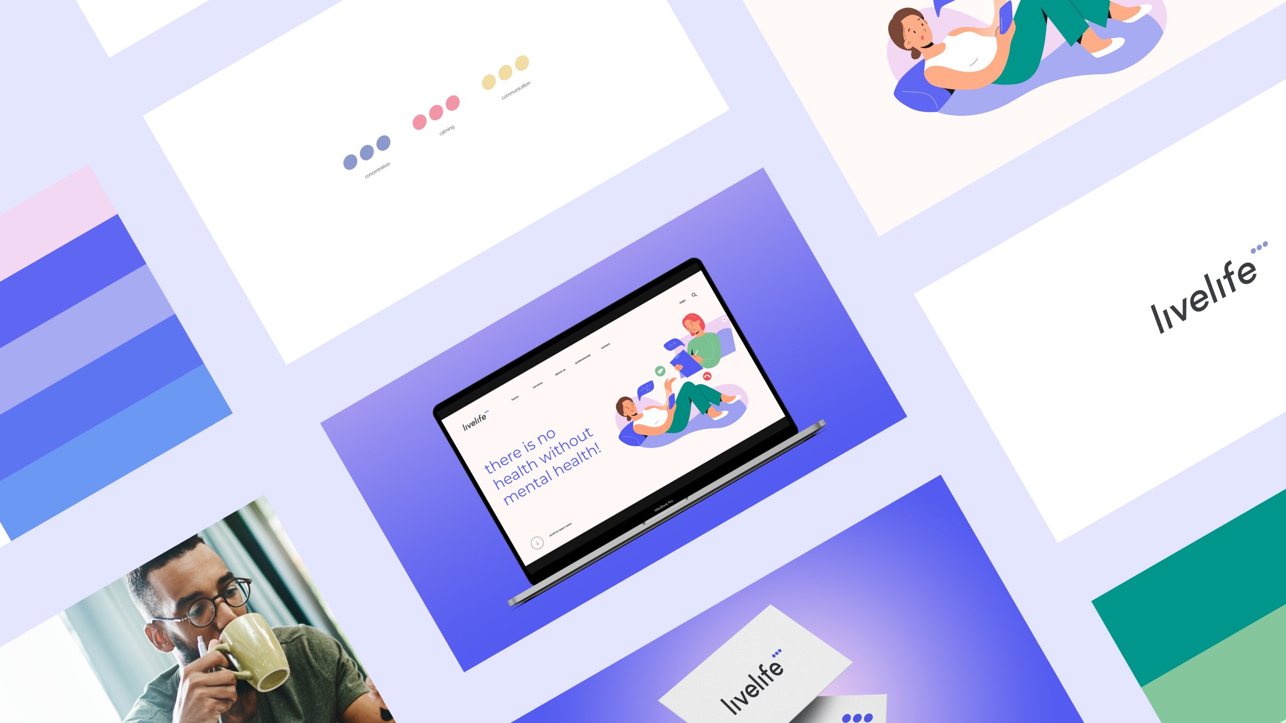
A brand colour palette was created using lavender as the primary colour supported by mint. These colours are known to have a positive impact on mental wellbeing due to their association with flowering plants. They will provide accessibility, simplicity and consistency throughout livelife’s brand communications. Secondary colours were included to be used sparingly throughout illustration and photography to maintain meaning and potency. Gradients were also recommended for digital design to add intrigue and encourage engagement. The third palette is made up of off-blacks and neutral tones to add a softer touch when depicting hierarchy between headlines, subheadings and body copy.
Designed to stimulate mental wellbeing


Inclusive brand imagery
A custom illustration style was created for livelife. It uses bold organic shapes, solid areas of flat colours with minimal detail. Facial expressions avoid details like eyebrows and mouths to reserve judgement. The simple style without shadows or outlines gives an anonymous feel that can appeal to everyone. The illustrations were designed to be unique and easy to understand at a single glance.
DEPT® created a photography style guide to explaining which types of images best represent the brand. livelife should showcase people in comfortable environments to instil feelings of calm and relaxation. Images should feature a diverse range of people that feel authentic and don’t look like professional models. Images should not be taken head-on or staged, although they should adhere to professional photography standards for quality and composition.
Market positioning
Market trends point to rapid industry growth for health and wellness, with an increase in mental health awareness. Additionally, technology is becoming more pivotal in healthcare delivery which places livelife’s online counselling proposition at the centre of the curve.
As part of the positioning strategy, livelife will become a carer, educator and awareness-raiser to truly support its audience. A ‘see, think, do, care’ funnel strategy was crafted utilising content, SEO, paid media, marketing automation and organic social media.
DEPT® worked closely with the team at Turning Point to strategically brand its direct to consumer online counselling service. As part of the research and strategy stages, we set ambitious, yet realistic, goals to work towards.
From a marketing perspective, generating brand awareness is the initial goal as well as becoming an industry thought leader. Its modern brand style created around the notion that there ‘is no health without mental health’ is sure to spark the conversation.

Questions?
VP of Growth, Experience and Engineering
Lizzie Powell
Discover more


