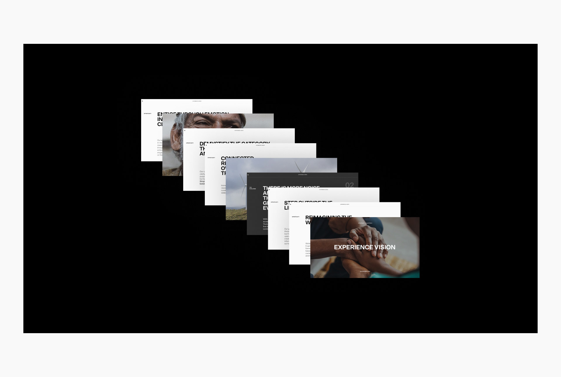
Through deep industry, audience, and brand research, BASIC/DEPT® and DEPT® solidified Tony Blair Institute’s brand essence and emphasized their position as the political wellspring of transformation.
This lens built the foundation for the rest of the work, allowing us to design and develop a destination for insights that inspired curiosity and captivated audiences through compelling storytelling.
A new era
The Tony Blair Institute for Global Change (TBI) focused on building connections with reform-minded political leaders, but the site did not necessarily reflect that.
To the first-time visitor, the site looked to only serve a demographic of a certain age or maturity. In addition to this, the institute’s website was an extensive library of content beyond political reports and commentary—but it wasn’t easy to navigate, nor did it encourage exploration and discovery even among return visitors.
The core challenge was to bring the TBI website into a new era and establish a destination for a range of audiences. One that showcased the institute’s richness and insights by surfacing all of its efforts and the impact it delivers, to both newcomers and an existing audience of political leaders.
Highly accessible, highly intelligent experience
The TBI team desired to encourage deeper, more meaningful relationships between existing and new users, but their current site operated through a transactional model; users were clicking for the content they needed, then leaving. We recognized the site needed to become a more interactive version of itself, allowing users to explore content and really understand the impact of the institute’s work.
So we rooted our work in three pillars:
- Simplify the complexity of the site
- Shift from transaction to relationship
- Balance insight with impact
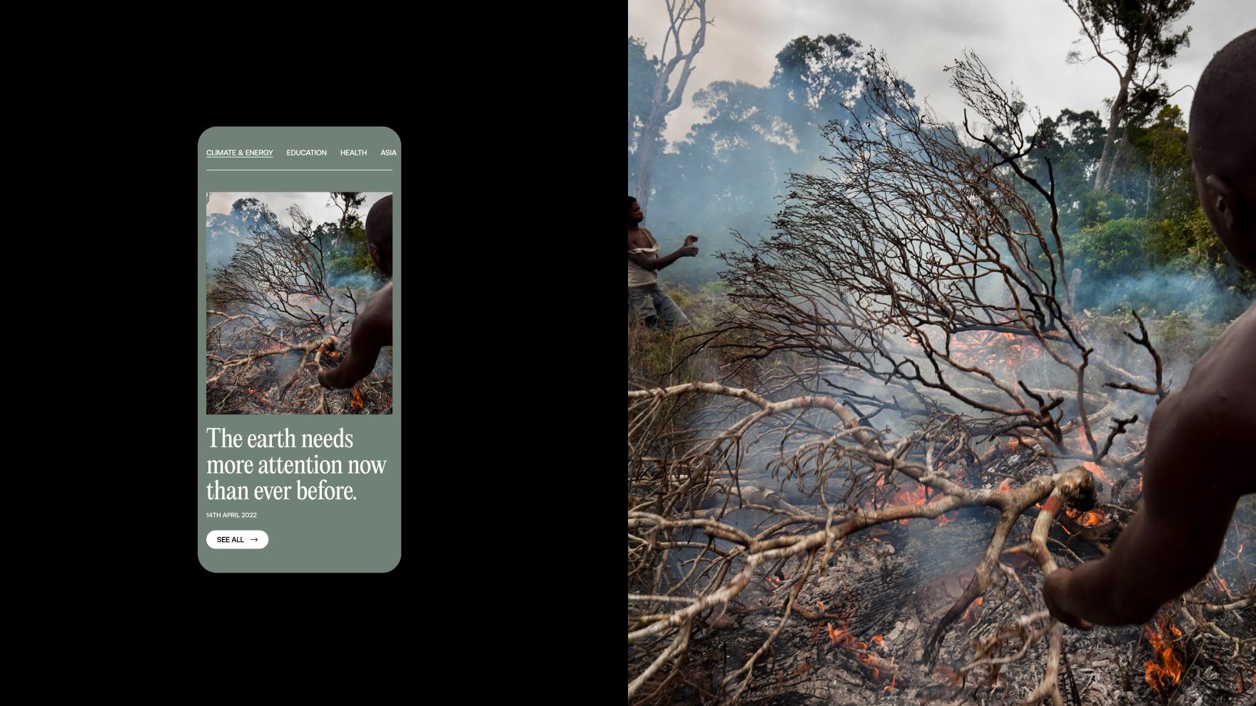
These tenets would help to evolve the site into a highly accessible, highly intelligent experience that surfaces the content people seek through emotion-driven storytelling to ultimately encourage curiosity and exploration.
Experience design
Allowing content to shine with sophisticated design
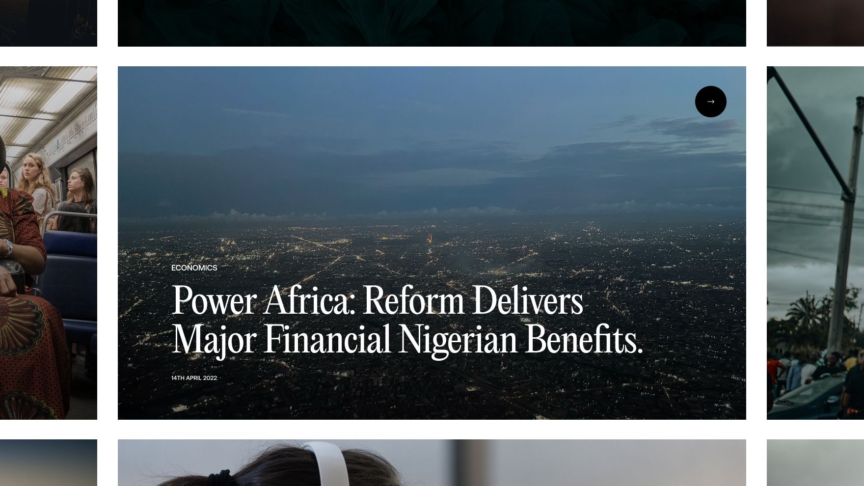
We established a design system that could live across the TBI ecosystem. Starting with a serif font that instilled confidence in the brand and opened the door for a fresh, editorial graphic language we knew would speak volumes. We then crafted a color system that added spirit to the site, while serving as an inherent catalog to the extensive content library.
Encouraging exploration through elevated UX
With such a vast audience, we knew that our content needed to adapt in a variety of ways. To support those wide-spread needs, we aimed to heighten the underlying UX of the site. We explored new features that would provide a rich, utility-driven experience, and provided no dead-ends. This meant replacing the current transactional experience with one that encourages exploration—of new categories, articles, and impact opportunities—through intelligence-backed modules that drive users to unexplored paths.
Challenging traditional conventions of online long-form content
TBI provides incredibly rich information, with some articles nearing 25,000 words of written policy—reading such content online is no small feat. It requires more effort and focus than reading physical paper, meaning we had to get creative. To provide readers with an immersive, focused experience, we approached our long-form stories with module separation, allowing articles to have moments of interaction, exploration, and even space to break off from the main content before seamlessly diving back in. This result is a self-guided curation that keeps users engaged.
…we are now live and the reaction from our people has been overwhelmingly positive. I knew it would be, as this team has not only delivered on the brief but surpassed it. Your thinking, craft, dedication, and collaboration has been magnificent – I’m so happy with where we’ve gotten to.
David Curzon, Director of Creative Strategy and Delivery
Development strategy
Improving the content management process
The old TBI website required developers to edit content, which created inefficiencies and slowed down thought leaders and editors publishing on the platform. Therefore, we decided to migrate them to a new headless CMS that’s easy to use–even if you’re not a developer.
In addition to a new CMS, TBI needed their new website to launch within a strict timeline. Therefore the development needed to be quick and efficient. To accomplish the migration, development, and integrations quickly, we leveraged ADA/DASH™, our proprietary website development accelerator. ADA/DASH™ provided the building blocks for a modern headless site, and allowed us to launch TBI faster than traditional website development.
Finally, TBI had several third party platform integration requirements that we were able to quickly integrate so their team can understand how their website is achieving their goals.
Bringing the design to life
If you browse the TBI website, you’ll notice some impressive experiential elements, including scrolling and transition animations, all of which was developed internally by DEPT® software developers.
All of these front end animations were created with CSS, leveraging TBI’s newly created atomic design system.
The custom video player is also noteworthy. TBI didn’t want to embed videos from YouTube because it could disturb their user’s website experience (ads, random suggested videos, etc.) so they requested a video player that would look cohesive across the site. We were able to host video content within the CMS and develop a video player that features custom buttons, playback speeds, and picture-in-picture functionality.
Explore the Tony Blair Institute
Questions on web design and development?
Discover more
