Patagonia
A branded commerce experience
( Services )
- Commerce
- Customer Experience
Patagonia is a family-owned apparel and outdoor sporting goods outfitter rooted in sustainability.
For Patagonia’s flagship experience, BASIC/DEPT® was tasked with crafting a design solution that brought its massive product and content library to life in a simple yet insightful way. For a brand that truly lives its values, our challenge was to create a digital shopping experience that tells a brand story at every touchpoint.

Being no stranger to storytelling, Patagonia has always maintained a strong voice. Our approach was to elevate this voice and bring it to life in a clear, simple execution while striking a balance between culture, business, and the environment.
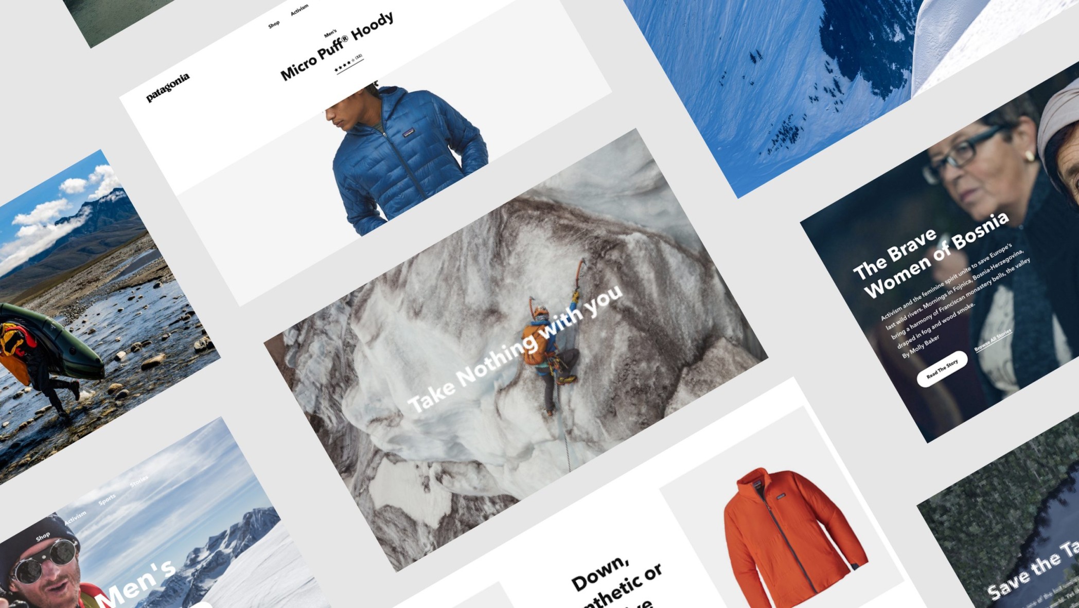
The reimagined eCommerce platform serves as a brand hub for both activism and content through a cohesive digital style guide, UX principles, and a consistent narrative. The experience invokes human emotion and rational understanding and is entirely driven by the brand’s mission. It serves both function and storytelling by transforming value systems.
Relationship
This project called for a deeply collaborative process one that demanded a unique agency-client partnership. BASIC/DEPT® quickly embedded the Patagonia design team into our San Diego HQ and worked in tandem from concept to completion. This set the foundation for a longstanding, successful relationship that extends beyond the traditional boundaries of agency-client servicing.
Our team spearheaded the broader user experience while closely consulting with the in-house team at Patagonia on art direction, design systems, user testing and scripting. As the project progressed, BASIC/DEPT® was given an additional opportunity to own the visual and strategic redesign of Patagonia’s brand initiative, The Footprint Chronicles. In doing so, BASIC/DEPT® achieved a simple, cohesive design system that complemented the larger site.
Navigation & information architecture
A new navigation system considers the full scope of the consumer journey—from initial interaction to finding exactly what they’re looking for. BASIC/DEPT® transformed the experience by organizing content in a clear, logical way, and integrating relevant stories when appropriate. This gives products more context while seamlessly injecting the brand voice throughout the entire journey.
The new navigation prioritizes the overall design’s larger goal for product and purpose-led storytelling through a simple curation strategy. An extensive library of cultural initiatives like Patagonia Action Works, The Footprint Chronicles, and more are properly showcased for easy discovery.

Product filtration
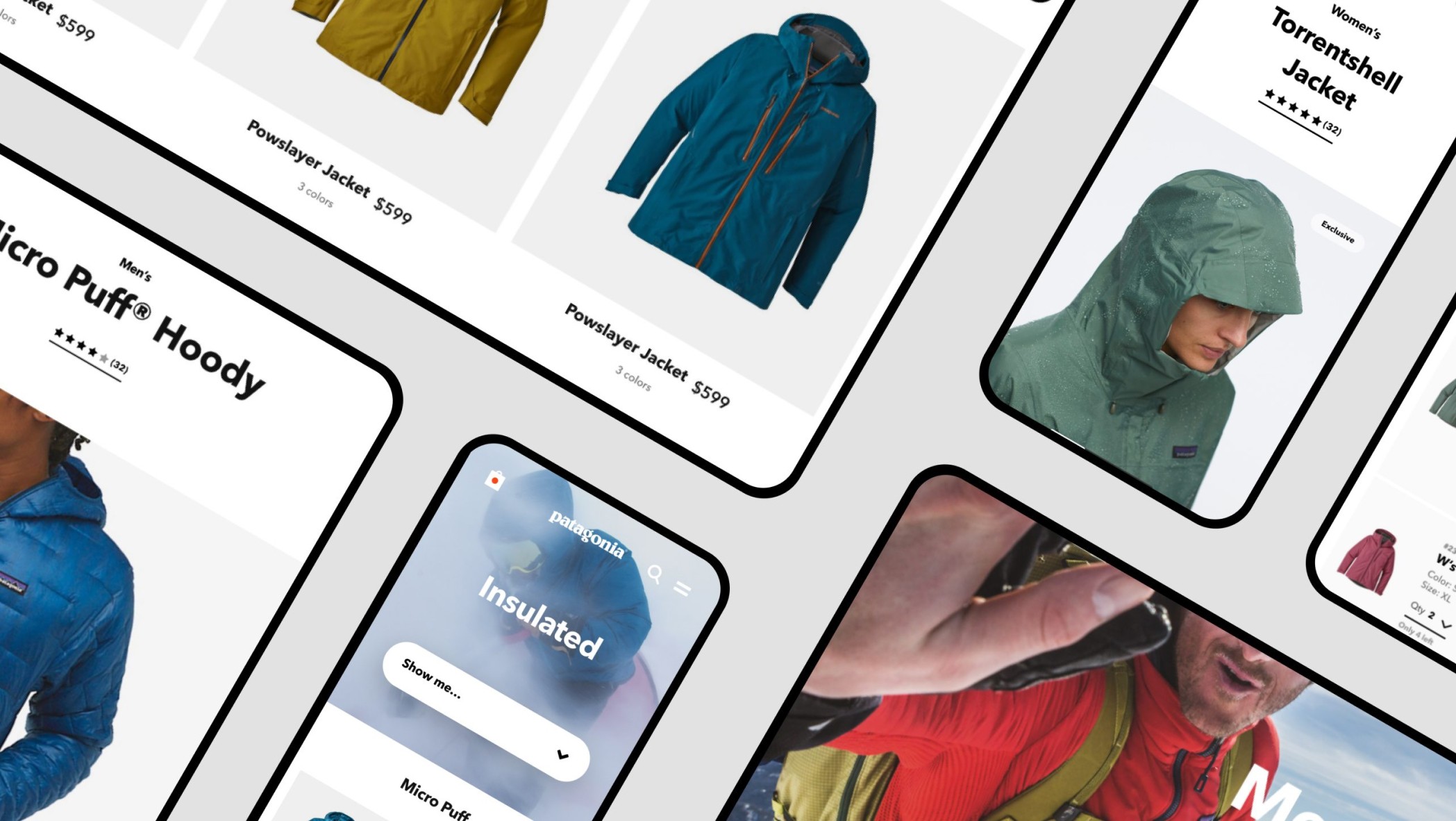
To maintain the simplicity of our design, BASIC/DEPT® needed a powerful filtration tool that could optimize a complex product catalog. The end result was a floating, contextually aware action button that becomes the most prominent prompt on any page. This responsive UX pattern is designed for approachability and progression and successfully helps users browse.
Product education
It was essential that this experience was personalized and always relevant to the consumer. Our goal was to ultimately guide users to the best product for their needs in one simple flow. By implementing an in-line Q&A and product comparison overlay, BASIC/DEPT® was able to help customers decide which product is right for them, saving them the hassle of toggling between product detail pages. As a result, users are directly routed through the sales funnel in one seamless UX flow.
Content strategy
The delicate balance between purpose and product truly came to life throughout our overall content strategy for this redesign. BASIC/DEPT® set out to create a central system that could not only serve as a shopping platform but a brand initiative as well. In doing so, BASIC/DEPT® was able to weave Patagonia’s passion and purpose right into each product story and keep consumers engaged in the brand, even if they were just looking to shop.

Since the launch of Patagonia, mobile revenues have grown by over 25%
Design system
The delicate balance between product and purpose was the driving force behind our entire design system. Focus, clarity, and simplicity became our guiding UX principles, which allowed us to help Patagonia tell compelling stories—while maintaining both emotional feeling and rational understanding. BASIC/DEPT® set out to strip away any excess that did not support our larger goal of one, centralized digital experience.
Constant collaboration between Patagonia’s team and ours—both designers and developers—resulted in a refined digital style guide, with a technical solution to support it. Each element of the redesigned system, from the homepage to navigation to our new product filtering system, was built into the style guide to the highest fidelity. As the project progressed, our development team was embedded into Patagonia’s tech team to offer seamless support in building out The Footprint Chronicles and Patagonia.com.
From this, BASIC/DEPT® built an intuitive content model within the Salesforce Commerce Cloud, while our frontend efforts produced a highly interactive site with meticulously rendered motion to tell The Footprint Chronicle story.
Designing at scale
Patagonia needed a design library that was useful to more than just the design team.
We built a dynamic, atomic-based design system that acted as a centralized library for the Patagonia design and marketing teams to reference. It contained rules for various elements of a comprehensive design structure, guidelines for photography and content usage, component use cases and functionality, as well as high-level guardrails for simple aspects like ADA compliance best practices.
Responsive code
In order to properly prototype, our code had to be built responsively and with purpose.
From the start, we knew this entire system had to be built with the intent of prototyping useful interactions, motion references, and experience references at a component, module, and page level. We were mindful of this every step of the build and even worked with actual brand content when creating user flows, in an effort to help stimulate realistic key journeys throughout the experience. Each element was built responsively and with purpose so that the Patagonia teams could preview various pages and moments exactly as they would appear for a consumer.
Documentation
Our system needed to perform beyond internal documentation. The final product of our efforts aimed to create useful front-end prototypes that Patagonia could use with customers in a testing process that ran concurrently with our design and build. Our digital design library, filled with useful documentation and references, became a vital tool in creating better QA and testing processes, as our live builds of the platform moved forward.
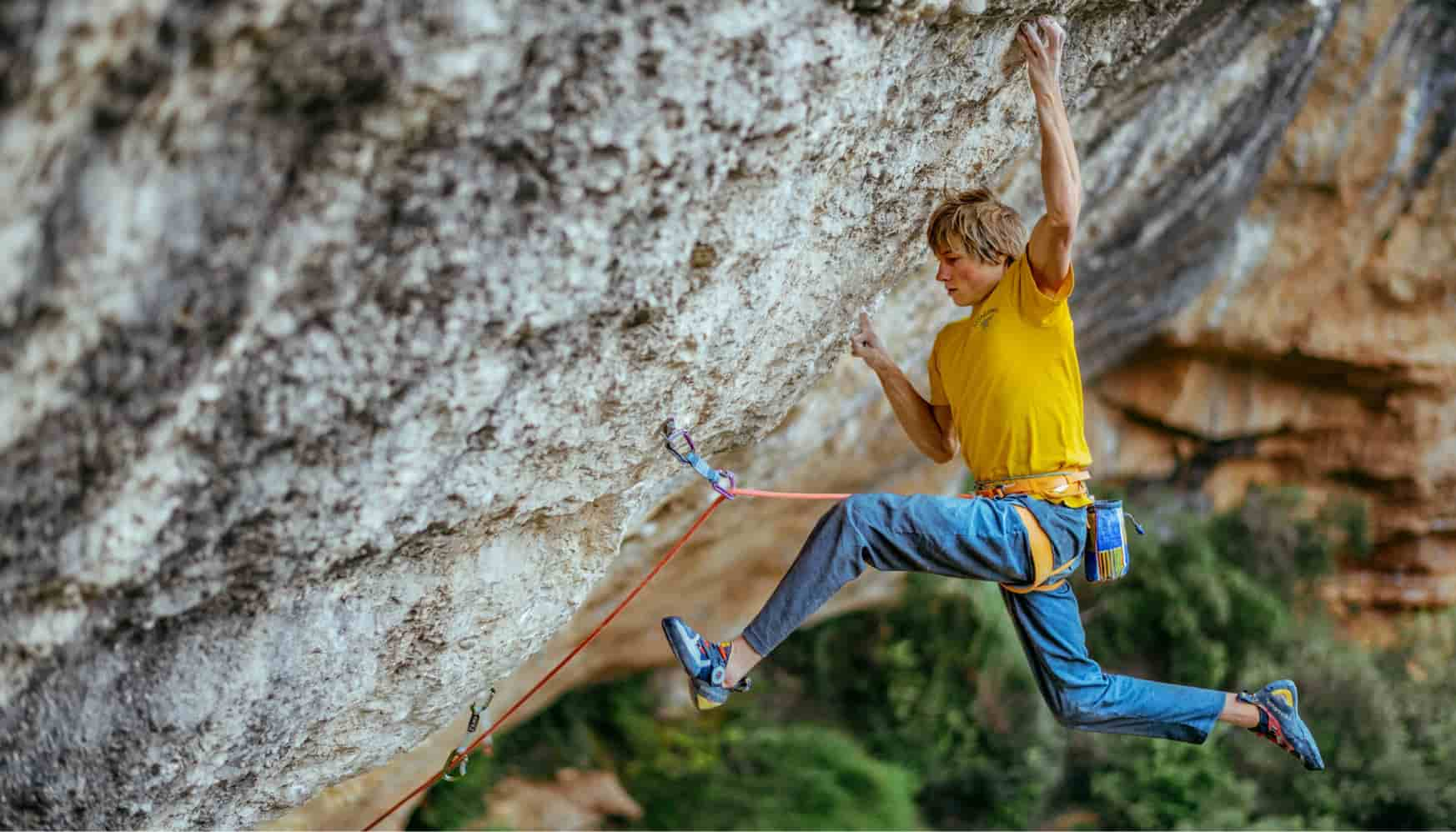
What started as a partnership to reimagine a digital storefront soon became a collaborative consulting engagement. BASIC/DEPT® was asked to help revive one of Patagonia’s transparency-driven brand initiatives—The Footprint Chronicles.
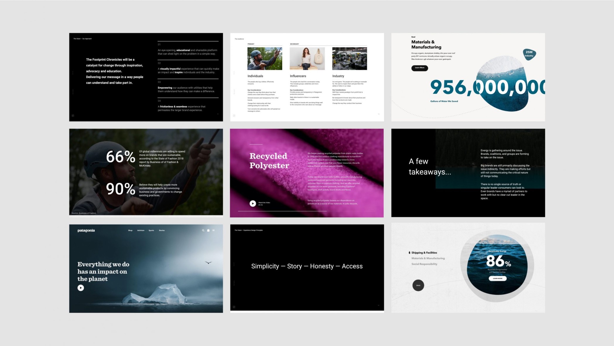
This story of sustainability needed to be told in more than one place, so BASIC/DEPT® developed a system that would surface it in the shopping experience. An informative card structure highlights key details about a product’s carbon footprint to educate the consumer and drive brand purpose, perspective, and conversion.
Give people pause
To shift the consumers’ mindset, BASIC/DEPT® used product detail pages as an opportunity to invite a bigger brand purpose. By gently educating shoppers on how products are made and the impact it has on the planet, we’re able to give them a moment to pause and consider their habits. In doing so, BASIC/DEPT® can convert product seekers into purpose-driven shoppers while telling meaningful product stories.
An immersive story
Our goal with The Footprint Chronicles was to first build empathy with customers, then drive action. Our content strategy and component design allowed us to tell rich, dynamic stories through interactive content that allows users to explore and learn. The flexibility of this design lets us not only educate consumers about the brand mission but impacts real change in the cultural mindset.
A call to action
Our overall strategy and goal for The Footprint Chronicles culminate into one simple storytelling structure. BASIC/DEPT® starts with why each aspect of our mission is important—why these points need to be made and stories be told. Consumers are then given an honest explanation of where BASIC/DEPT® stands in this journey to make and see change. Finally, the brand’s commitment to what’s next. Where does Patagonia progress from here and what can consumers and every brand do to play a role in this shift.
Awards & recognition
Award
Year
Category
Webby Award
2021
Fashion & Beauty
Webby Award
2021
People's Voice Winner
